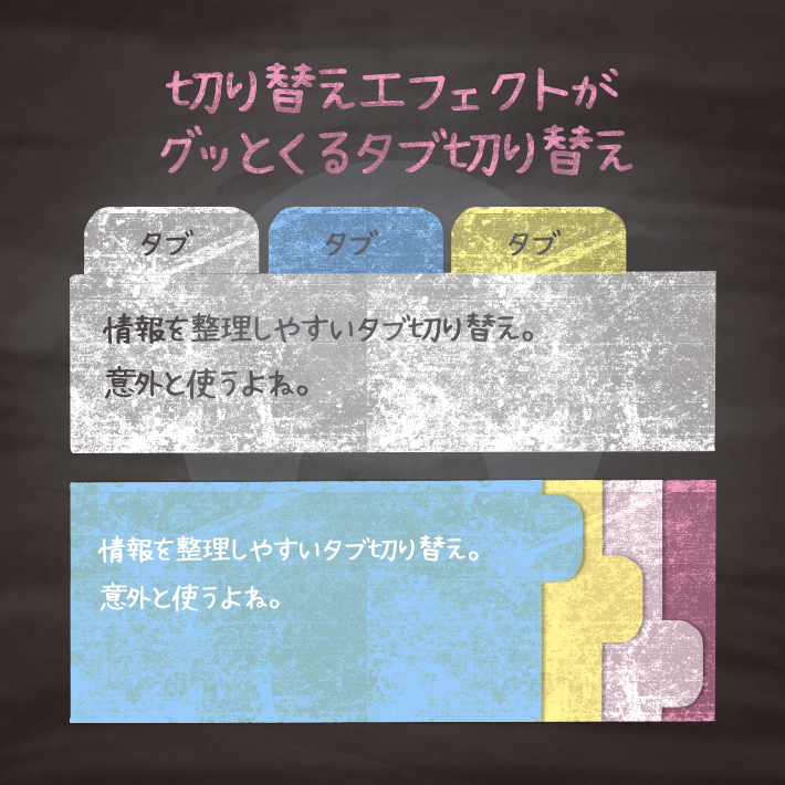
ページ内の情報を整理する時などによく使うタブ切り替え。
CSSとHTMLだけで作る切り替えエフェクトがグッとくるタブ切り替えを用意しました。

First Tab text
Second Tab text
Third Tab text
Force Tab text
<div class="cp_tab">
	<input type="radio" name="cp_tab" id="tab3_1" aria-controls="first_tab03" checked>
	<label for="tab3_1">First Tab</label>
	<input type="radio" name="cp_tab" id="tab3_2" aria-controls="second_tab03">
	<label for="tab3_2">Second Tab</label>
	<input type="radio" name="cp_tab" id="tab3_3" aria-controls="third_tab03">
	<label for="tab3_3">Third Tab</label>
	<input type="radio" name="cp_tab" id="tab3_4" aria-controls="force_tab03">
	<label for="tab3_4">Force Tab</label>
	<div class="cp_tabpanels">
		<div id="first_tab03" class="cp_tabpanel">
		<h2>First Tab</h2>
		<p>First Tab text</p>
		</div>
		<div id="second_tab03" class="cp_tabpanel">
		<h2>Second Tab</h2>
		<p>Second Tab text</p>
		</div>
		<div id="third_tab03" class="cp_tabpanel">
		<h2>Third Tab</h2>
		<p>Third Tab text</p>
		</div>
		<div id="force_tab03" class="cp_tabpanel">
		<h2>Force Tab</h2>
		<p>Force Tab text</p>
		</div>
	</div>
</div>
.cp_tab *, .cp_tab *:before, .cp_tab *:after {
-webkit-box-sizing: border-box;
box-sizing: border-box;
}
.cp_tab {
margin: 1em auto;
}
.cp_tab > input[type='radio'] {
margin: 0;
padding: 0;
border: none;
border-radius: 0;
outline: none;
background: none;
-webkit-appearance: none;
appearance: none;
display: none;
}
.cp_tab .cp_tabpanels {
position: relative;
min-height: 150px;/* エリアの高さ */
}
.cp_tab .cp_tabpanel {
position: absolute;
width: 100%;
opacity: 0;
padding: 0.5em 1em;
transform: translateY(-10px);
-webkit-transition: opacity 0.5s, -webkit-transform 0.5s;
transition: opacity 0.5s, -webkit-transform 0.5s;
transition: transform 0.5s, opacity 0.5s;
transition: transform 0.5s, opacity 0.5s, -webkit-transform 0.5s;
}
.cp_tab > input:first-child:checked ~ .cp_tabpanels > .cp_tabpanel:first-child,
.cp_tab > input:nth-child(3):checked ~ .cp_tabpanels > .cp_tabpanel:nth-child(2),
.cp_tab > input:nth-child(5):checked ~ .cp_tabpanels > .cp_tabpanel:nth-child(3),
.cp_tab > input:nth-child(7):checked ~ .cp_tabpanels > .cp_tabpanel:nth-child(4),
.cp_tab > input:nth-child(9):checked ~ .cp_tabpanels > .cp_tabpanel:nth-child(5),
.cp_tab > input:nth-child(11):checked ~ .cp_tabpanels > .cp_tabpanel:nth-child(6) {
opacity: 1;
transform: translateY(0px);
}
.cp_tab > input:first-child:checked ~ .cp_tabpanels > .cp_tabpanel:first-child {
background: #80CBC4;
}
.cp_tab > input:nth-child(3):checked ~ .cp_tabpanels > .cp_tabpanel:nth-child(2) {
background: #90CAF9;
}
.cp_tab > input:nth-child(5):checked ~ .cp_tabpanels > .cp_tabpanel:nth-child(3) {
background: #F48FB1;
}
.cp_tab > input:nth-child(7):checked ~ .cp_tabpanels > .cp_tabpanel:nth-child(4) {
background: #8BC34A;
}
.cp_tab > label {
position: relative;
display: inline-block;
padding: 5px 10px;
cursor: pointer;
border-radius: 6px 6px 0 0;
font-weight: bold;
}
.cp_tab > input:first-child + label {
background: #80CBC4;
}
.cp_tab > input:nth-child(3) + label {
background: #90CAF9;
}
.cp_tab > input:nth-child(5) + label {
background: #F48FB1;
}
.cp_tab > input:nth-child(7) + label {
background: #8BC34A;
}
.cp_tab > label:hover {
color: #0066cc;
}
.cp_tab > input:focus + label {
color: #ffffff;
}
.cp_tab > input:checked + label {
margin-bottom: -1px;
}
@media (max-width: 480px) {
.cp_tab {
width: 100%;
font-size: 0.8em;
}
.cp_tab label {
padding: 0.5em;
}
}First Tab text
Second Tab text
Third Tab text
Force Tab text
<div class="cp_tab">
	<input type="radio" name="cp_tab" id="tab4_1" checked>
	<label for="tab4_1">First Tab</label>
	<input type="radio" name="cp_tab" id="tab4_2">
	<label for="tab4_2">Second Tab</label>
	<input type="radio" name="cp_tab" id="tab4_3">
	<label for="tab4_3">Third Tab</label>
	<input type="radio" name="cp_tab" id="tab4_4">
	<label for="tab4_4">Force Tab</label>
	<div class="cp_tabpanels">
		<div class="cp_tabpanel">
			<h2>First Tab</h2>
			<p>First Tab text</p>
		</div>
		<div class="cp_tabpanel">
			<h2>Second Tab</h2>
			<p>Second Tab text</p>
		</div>
		<div class="cp_tabpanel">
			<h2>Third Tab</h2>
			<p>Third Tab text</p>
		</div>
		<div class="cp_tabpanel">
			<h2>Force Tab</h2>
			<p>Force Tab text</p>
		</div>
	</div>
</div>
.cp_tab *, .cp_tab *:before, .cp_tab *:after {
-webkit-box-sizing: border-box;
box-sizing: border-box;
}
.cp_tab ::selection {
background-color: #4EC6DE;
}
.cp_tab {
margin: 1em auto;
}
.cp_tab input[type='radio'] {
margin: 0;
padding: 0;
border: none;
border-radius: 0;
outline: none;
background: none;
-webkit-appearance: none;
appearance: none;
display: none;
}
.cp_tab > label {
display: block;
float: left;
margin-right: 5px;
padding: 12px 20px;
cursor: pointer;
transition: background-color 0.3s;
}
.cp_tab > label:hover,
.cp_tab > input:checked + label {
border-radius: 6px 6px 0 0;
background: #DCEDC8;
}
.cp_tab .cp_tabpanels {
clear: both;
perspective: 600px;
min-height: 150px;/* エリアの高さ */
}
.cp_tab .cp_tabpanels .cp_tabpanel {
line-height: 1.4em;
position: absolute;
z-index: 0;
width: 100%;
padding: 10px 30px 40px;
transition: opacity 0.3s, transform 1s;
transform: rotateX(-20deg);
transform-origin: top center;
opacity: 0;
border: 1px solid #DCEDC8;
background: #DCEDC8;
}
.cp_tab #tab4_1:checked ~ .cp_tabpanels .cp_tabpanel:nth-of-type(1),
.cp_tab #tab4_2:checked ~ .cp_tabpanels .cp_tabpanel:nth-of-type(2),
.cp_tab #tab4_3:checked ~ .cp_tabpanels .cp_tabpanel:nth-of-type(3),
.cp_tab #tab4_4:checked ~ .cp_tabpanels .cp_tabpanel:nth-of-type(4) {
z-index: 1;
transform: rotateX(0);
opacity: 1;
}
@media screen and (max-width: 480px) {
.cp_tab {
width: 100%;
}
.cp_tab > label {
display: none;
}
.cp_tab .cp_tabpanels .cp_tabpanel {
position: relative;
margin-bottom: 1em;
padding: 0.5em;
transform: none;
opacity: 1;
border: none;
}
.cp_tab .cp_tabpanels .cp_tabpanel h2 {
border-bottom: 1px solid #7CB342;
padding-bottom: 0.5em;
}
}First Tab text
Second Tab text
<div class="cp_tab">
	<div class="cp_tabpanels">
		<label for="tab5_1">First Tab</label>
		<input id="tab5_1" name="cp_tab" type="radio" checked="checked">
		<div class="cp_tabpanel">
			<h4>First Tab</h4>
			<p>First Tab text</p>
		</div>
	</div>
	<div class="cp_tabpanels">
		<label for="tab5_2">Second Tab</label>
		<input id="tab5_2" name="cp_tab" type="radio">
		<div class="cp_tabpanel">
			<h4>Second Tab</h4>
			<p>Second Tab text</p>
		</div>
	</div>
</div>
*, *:before, *:after {
-webkit-box-sizing: border-box;
box-sizing: border-box;
}
.cp_tab {
display: block;
display: -webkit-flex;
display: flex;
-webkit-flex-wrap: wrap;
flex-wrap: wrap;
margin: 1em auto;
overflow: hidden;
}
.cp_tab input[type='radio'] {
border-bottom: 1px solid rgba(239, 237, 239, 0.5);
cursor: pointer;
-webkit-appearance: none;
appearance: none;
display: block;
width: 100%;
outline: none;
-webkit-transition: all 0.3s ease-in-out;
transition: all 0.3s ease-in-out;
}
.cp_tab .cp_tabpanels label {
cursor: pointer;
display: block;
line-height: 1em;
padding: 2rem 0;
text-align: center;
}
.cp_tab [type="radio"]:hover,
.cp_tab [type='radio']:focus {
border-bottom: 1px solid #fd264f;
}
.cp_tab [type='radio']:checked {
border-bottom: 2px solid #fd264f;
}
.cp_tab [type='radio']:checked + .cp_tabpanel {
opacity: 1;
}
.cp_tab [type='radio'] + .cp_tabpanel {
display: block;
opacity: 0;
padding: 2rem 0;
width: 90%;
-webkit-transition: all 0.3s ease-in-out;
transition: all 0.3s ease-in-out;
}
.cp_tab .cp_tabpanels {
width: 50%;
}
.cp_tab .cp_tabpanels [type='radio'] + .cp_tabpanel {
width: 200%;
margin-left: 200%;
}
.cp_tab .cp_tabpanels [type='radio']:checked + .cp_tabpanel {
margin-left: 0;
}
.cp_tab .cp_tabpanels:last-child [type='radio'] + .cp_tabpanel {
margin-left: 100%;
}
.cp_tab .cp_tabpanels:last-child [type='radio']:checked + .cp_tabpanel {
margin-left: -100%;
}
コピペでできる!CSSとhtmlだけのシンプルなタブ切り替え2種 | copypet.jp|パーツで探す、web制作に使えるコピペサイト。
ページ内の情報を整理する時などによく使うタブ切り替え。 CSSとHTMLだけで作るシンプルなタブ切り替えを用意しました。 横並びのタブと縦並びのタブです。 カスタマイズのベースとしてお使いいただければと思います。…
CSS3などで新たに追加された要素・装飾方法など、日々コードを書いていないと忘れてしまったり、ささっとプロトタイプを作る時などちょっとしたことに時間をかけている暇はない。そんな時に「あ〜、あれストックしときゃよかったなぁ」って困った自分用のストックブログです。カスタマイズなどがしやすいよう、昨今のweb制作に取り入れられる一般的なコードを中心に掲載しています。
@CopypetJp More Info