htmlとcssだけでできる見出し15選です。
見出し次第で、記事の読みやすさは大きく変わります。
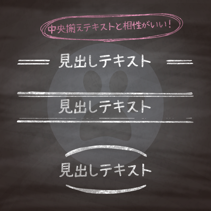
テキストをセンターに寄せた時に相性の良い見出しを集めました。
色は好みで変えていただければ、かまいません。
また、基本htmlは<h1>タグを使用していますが、<h2>〜<h6>などにそのまま変更することができます。
紹介している<h1>タグには、クラス名(.cp_h1title)を付与していますが、こちらも
css部分を下記のように変更すれば、クラスをつけずに使用することも可能です。
h1 {cssの中身}色には6桁の16進数のカラーコード(#000000)も使えますが、他に、
なども使用できます。
RGBA値での指定は、サポートしていないブラウザだと、透明度だけが無視されるのではなく、色指定そのものが認識されずに無効となるので注意が必要です。

<h1 class="cp_h1title">見出しテキスト</h1>.cp_h1title {
color:#C2185B;
text-align: center;
padding: 5px;
border-top: 1px solid #E91E63;
border-bottom: 3px solid #E91E63;
}<h1 class="cp_h1title">見出しテキスト</h1>.cp_h1title {
color: #1565C0;
text-align: center;
padding: 5px;
border-top: 3px double #2196F3;
border-bottom: 3px double #2196F3;
}<h1 class="cp_h1title">見出しテキスト</h1>.cp_h1title {
position: relative;
color:#EF6C00;
text-align: center;
padding: 10px;
}
.cp_h1title::before,
.cp_h1title::after {
position: absolute;
left: 0;
content: '';
width: 100%;
height: 6px;/*ボーダー全体の高さ*/
border-color: #EF6C00;
border-style: solid;
}
.cp_h1title::before {
top: 0;
border-width:2px 0 1px 0;
}
.cp_h1title::after {
bottom: 0;
border-width:1px 0 2px 0;
}<h1 class="cp_h1title">見出しテキスト</h1>.cp_h1title {
position: relative;
color:#00acc1;
text-align: center;
padding: 0 45px;/*文字数が増えた時に線に被らないように線幅以上のサイズで設定*/
}
.cp_h1title::before,
.cp_h1title::after {
position: absolute;
content: '';
top: calc(50% - 1.5px);/*上下中央にする*/
display: inline-block;
width: 40px;
height: 3px;
border-top: 3px solid #00acc1;
}
.cp_h1title::before {
left:0;
}
.cp_h1title::after {
right: 0;
}<h1 class="cp_h1title">見出しテキスト</h1>.cp_h1title {
position: relative;
color:#F4511E;
text-align: center;
padding: 0 85px;/*文字数が増えた時に線に被らないように線幅以上のサイズで設定*/
}
.cp_h1title:before,
.cp_h1title:after {
position: absolute;
content: '';
top: 50%;
width: 80px;
height: 2px;
background: linear-gradient(90deg, transparent, #F4511E 10%, #F4511E 30%, transparent);/*グラデーションを設定*/
}
.cp_h1title:before {
left:0;
transform: rotate(180deg);/*ラインを反転*/
}
.cp_h1title:after {
right: 0;
}<h1 class="cp_h1title">見出しテキスト</h1>.cp_h1title {
position: relative;
color:#01579B;
text-align: center;
padding: 0 45px;/*文字数が増えた時に線に被らないように線幅以上のサイズで設定*/
}
.cp_h1title:before, .cp_h1title:after {
position: absolute;
content: '';
top: calc(50% - 1.5px);/*上下中央にする*/
display: inline-block;
width: 40px;
height: 3px;
border-top: 3px double #03A9F4;
}
.cp_h1title:before {
left:0;
}
.cp_h1title:after {
right: 0;
}<h1 class="cp_h1title">見出しテキスト</h1>.cp_h1title {
position: relative;
display: flex;
justify-content: center;/*左右中央配置*/
}
.cp_h1title:before {
position: absolute;
content: '';
top: 100%;
width: 10%;/*線の長さ*/
height: 5px;/*線の太さ*/
border-radius: 2px;/*線の角を丸くする*/
background-color: #F06292;/*線の色*/
}<h1 class="cp_h1title">見出しテキスト</h1>.cp_h1title {
position: relative;
text-align: center;
}
.cp_h1title:before,
.cp_h1title:after {
position: absolute;
content: '';
top: 50%;
width: 44px;/*線の高さ*/
height: 2px;/*線の太さ*/
background-color: #00897B;/*線の色*/
transform: rotate(-60deg);/*ラインに傾斜をつける*/
}
.cp_h1title:before {
left:0;
}
.cp_h1title:after {
right: 0;
}<h1 class="cp_h1title">見出しテキスト</h1>.cp_h1title {
position: relative;
display: flex;
justify-content: center;/*左右中央配置*/
align-items: center;/*上下中央配置*/
}
.cp_h1title:before {
content: '';
position: absolute;
width: 150px;/*括弧の幅*/
height: 2.5em;/*括弧の高さ*/
border-radius: 50%;
border: 2px solid #F48FB1;/*括弧の線の色と太さ*/
border-left-color: transparent;
border-right-color: transparent;
}<h1 class="cp_h1title">見出しテキスト</h1>.cp_h1title {
position: relative;
text-align: center;
}
.cp_h1title:before,
.cp_h1title:after {
position: absolute;
content:'';
width: 20px;/*カギ括弧の横幅*/
height: 30px;/*カギ括弧の高さ*/
border-style: solid;/*カギ括弧のスタイル*/
border-color: #283593;/*カギ括弧の色*/
}
.cp_h1title:before {
border-width: 2px 0 0 2px;
top:0;
left: 0;
}
.cp_h1title:after {
border-width: 0 2px 2px 0;
bottom:0;
right: 0;
}<h1 class="cp_h1title">見出しテキスト</h1>.cp_h1title {
position: relative;
text-align: center;
}
.cp_h1title:before,
.cp_h1title:after {
position: absolute;
content:'';
width: 8px;/*カギ括弧の横幅*/
height: 100%;/*カギ括弧の高さ*/
border-style: solid;/*カギ括弧のスタイル*/
border-color: #FF7043;/*カギ括弧の色*/
}
.cp_h1title:before {
border-width: 2px 0 2px 2px;
left: 0;
}
.cp_h1title:after {
border-width: 2px 2px 2px 0;
right: 0;
}<h1 class="cp_h1title">見出しテキスト</h1>.cp_h1title {
position: relative;
text-align: center;
background: #FFEE58;
transform: rotate(-1deg) skew(-1deg);/*傾斜*/
box-shadow: 0 0px 0px 0 rgba(0,0,0,0.2), 10px 0 0 0 #FFEE58, -10px 0 0 0 #FFEE58;/*はみ出る分*/
}<h1 class="cp_h1title"><span>見出しテキスト</span></h1>.cp_h1title {
position: relative;
text-align: center;
height: 50px;
overflow: hidden;
}
.cp_h1title:before,
.cp_h1title:after {
position: absolute;
top: 0;
display: block;
width: 20px;
height: 48px;
content: '';
border: 1px solid #00897b;
}
.cp_h1title:after {
right: 0px;
}
.cp_h1title span:before,
.cp_h1title span:after {
position: absolute;
content: '';
display: block;
width: 30px;
height: 2.5em;
background: #fafcfc;
border-right: 1px solid #00897b;
}
.cp_h1title span:before {
left: 8px;
top: -20px;
transform: rotate(160deg);
}
.cp_h1title span:after {
right: 12px;
top: -20px;
transform: rotate(340deg);
z-index: 1;
}<h1 class="cp_h1title">見出しテキスト</h1>.cp_h1title {
position: relative;
color:#ffffff;
background: #AB47BC;
text-align: center;
padding: 0 70px;
overflow: hidden;/*はみ出さないように設定*/
}
.cp_h1title:before,
.cp_h1title:after {
content: '';
position: absolute;
top: -10px;
display: block;
width: 1px;/*線の太さ*/
height: 130%;
background-color: #ffffff;/*線の色*/
transform: rotate(-25deg);/*線の角度*/
}
.cp_h1title:before {
left: 30px;
}
.cp_h1title:after {
right: 30px;
}<div class="cp_h1title"><span>サブテキスト</span><h1>見出しテキスト</h1></div>.cp_h1title {
position: relative;
display: flex;
justify-content: center;/*左右中央配置*/
border: 1px solid #29B6F6;
}
.cp_h1title span {
position: absolute;
top: -1em;
font-size: 80%;
width: fit-content;/*サブテキストの幅分*/
padding: 0 10px;
background: #fafcfc;/*サブテキストの背景*/
}<h1 class="cp_h1title" title="サブテキスト">見出しテキスト</h1>.cp_h1title {
position: relative;
display: flex;
justify-content: center;/*左右中央配置*/
border: 1px solid #29B6F6;
}
.cp_h1title::before {
position: absolute;
content: attr(title);
top: -1em;/*サブテキストの位置*/
font-size: 40%;
padding: 0 10px;
background:#fafcfc;/*サブテキストの背景*/
}
CSS3などで新たに追加された要素・装飾方法など、日々コードを書いていないと忘れてしまったり、ささっとプロトタイプを作る時などちょっとしたことに時間をかけている暇はない。そんな時に「あ〜、あれストックしときゃよかったなぁ」って困った自分用のストックブログです。カスタマイズなどがしやすいよう、昨今のweb制作に取り入れられる一般的なコードを中心に掲載しています。
@CopypetJp More Info