htmlとcssだけでできる見出し26選です。
見出し次第で、記事の読みやすさは大きく変わります。
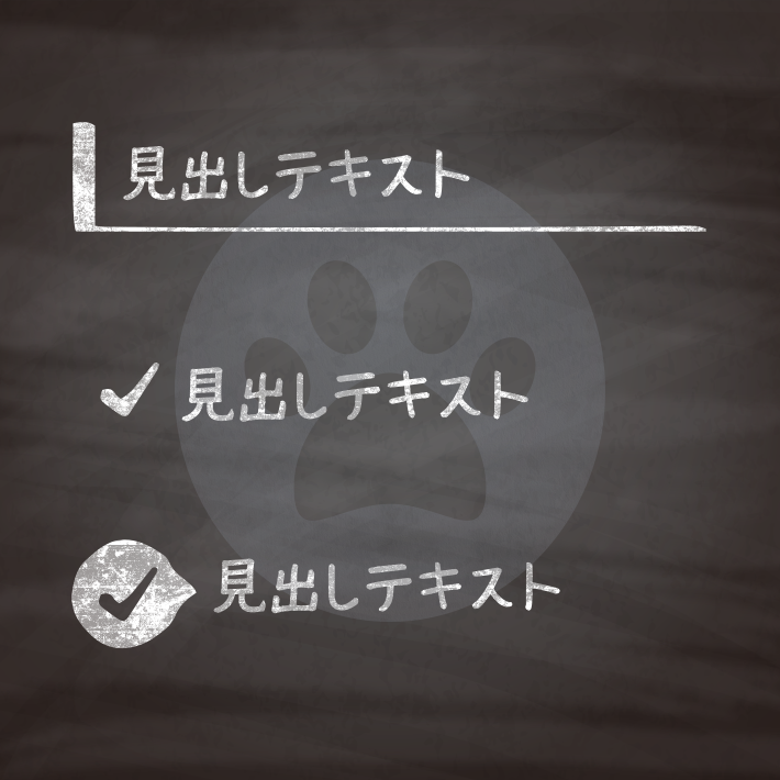
左側にアクセントを付けた見出しを集めました。
色は好みで変えていただければ、かまいません。
また、基本htmlは<h1>タグを使用していますが、<h2>〜<h6>などにそのまま変更することができます。
紹介している<h1>タグには、クラス名(.cp_h1title)を付与していますが、こちらも
css部分を下記のように変更すれば、クラスをつけずに使用することも可能です。
h1 {cssの中身}色には6桁の16進数のカラーコード(#000000)も使えますが、他に、
なども使用できます。
RGBA値での指定は、サポートしていないブラウザだと、透明度だけが無視されるのではなく、色指定そのものが認識されずに無効となるので注意が必要です。

<h1 class="cp_h1title">見出しテキスト</h1>.cp_h1title {
border-left: 10px solid #00BCD4;
}<h1 class="cp_h1title">見出しテキスト</h1>.cp_h1title {
color:#ffffff;
background: #FFAB91;/*背景の色*/
border-left: 10px solid #FF5722;/*左の線*/
border-bottom: 1px solid #FF5722;/*下の線*/
}<h1 class="cp_h1title">見出しテキスト</h1>.cp_h1title {
color:#ffffff;/*フォントの色*/
background: #80DEEA;/*見出し背景の色*/
border-left: 10px solid #00BCD4;/*左の濃い線*/
box-shadow:0px 1px 1px 0px rgba(0,0,0,0.4);/*見出しの影*/
}<h1 class="cp_h1title">見出しテキスト</h1>.cp_h1title {
background: #f1c6c6;
border-left: 8px double #da3c3c;
}<h1 class="cp_h1title">見出しテキスト</h1>.cp_h1title {
border-left: 10px solid #1E88E5;
border-bottom: 3px solid #B0BEC5;
}<h1 class="cp_h1title">見出しテキスト</h1>.cp_h1title {
position: relative;
border-left: 10px solid #FFA000;/*左の線*/
}
.cp_h1title::after {
position: absolute;
content: '';
left: 0;
bottom: 0;
width: 100%;
height: 0;
border-bottom: 3px solid #B0BEC5;/*下の線*/
}<h1 class="cp_h1title">見出しテキスト</h1>.cp_h1title {
position: relative;
display: flex;
align-items: center;
color: #fff;
background: #26a69a;
border-radius: 25px 0 0 25px;
padding-left: 1.5em;
}
.cp_h1title::before {
position: absolute;
content: '●';
left: 10px;
font-size: 80%;
color: #fff;
}<h1 class="cp_h1title">見出しテキスト</h1>.cp_h1title {
position: relative;
background: #FFCA28;
color: #fff;
padding: 0 0 0 2em;/*左の三角形分を開ける*/
}
.cp_h1title:before {
position: absolute;
content: '';
left: 0px;
top: 0px;
border: none;
border-left: 2em solid #fafcfc;/*三角形を設定*/
border-bottom: 2em solid transparent;
}<h1 class="cp_h1title">見出しテキスト</h1>.cp_h1title::first-letter {
font-size: 2em;/*文字サイズ*/
color: #303F9F;
}<h1 class="cp_h1title">見出しテキスト</h1>.cp_h1title {
position: relative;
padding: 0 0 0 20px;
display: flex;
align-items: center;
}
.cp_h1title::after {
position: absolute;
content: '';
left: 0;
width: 12px;
height: 12px;
background-color: #da3c3c;/*四角を作って*/
transform: rotate(45deg);/*45度回転*/
}<h1 class="cp_h1title">見出しテキスト</h1>.cp_h1title {
}
.cp_h1title::before {
content: '\002713';/*チェックマーク*/
/*content: '\00266b';音符*/
/*content: '\002665';ハート*/
/*content: '\00272a';丸囲み星*/
/*content: '\002731';アスタリスク*/
/*content: '\002606';白抜き星*/
/*content: '\002619';葉っぱ*/
/*content: '\025b6';右向きのサンカク*/
/*content: '\025b7';白抜き右向きのサンカク*/
/*content: '\025c6';ひし形*/
/*content: '\025c7';白抜きひし形*/
/*content: '\02749';丸いアスタリスク*/
/*content: '\02668';温泉マーク*/
color: #FF5722;
}<h1 class="cp_h1title">見出しテキスト</h1>.cp_h1title {
position: relative;
color: #fff;
background: #4DD0E1;
border-radius: 0 5px 5px 5px;
padding: 5px 10px;
}
.cp_h1title:after {
position: absolute;
content: '\002713 Check';
color: #fff;
font-size: 50%;/*タブテキストの文字サイズ*/
background: #00ACC1;
left: 0px;/*タブの横位置*/
bottom: 100%;/*タブの縦位置*/
border-radius: 5px 5px 0 0;
padding: 0 5px;
}<h1 class="cp_h1title">見出しテキスト</h1>.cp_h1title {
position: relative;
display: flex;
align-items: center;
padding: 0 0 0 10px;
color: #fff;
background: #9fa9d8;
border-left: 50px solid #5b6ebe;
}
.cp_h1title:before {
position: absolute;
content: "\002713";
left: -40px;
}<h1 class="cp_h1title">見出しテキスト</h1>.cp_h1title {
position: relative;
display: flex;
align-items: center;
color: #fff;
background: #ffb74d;
border-radius: 0 1em 1em 0;
margin-left: 1em;
padding: 0 0 0 1em;
}
.cp_h1title:before {
position: absolute;
content: '\002713';/*チェックマーク*/
left: -1em;
width: 1.5em;/*丸の横幅*/
height: 1.5em;/*丸の縦幅*/
text-align: center;
color: #fff;
background: #fb8c00;/*丸の色*/
border: solid 3px #fafcfc;/*丸の縁*/
border-radius: 50%;
}<h1 class="cp_h1title">見出しテキスト</h1>.cp_h1title {
position: relative;
display: flex;
align-items: center;
padding-left: 40px;
}
.cp_h1title:before{
position: absolute;
content: "\002713";
font-size: 0.7em;
left: 0;
width: 1.5em;
height: 1.5em;
text-align: center;
color: #fff;
background: #1E88E5;
border-radius: 50%;
}
.cp_h1title:after {
position: absolute;
content: '';
left: 0.9em;
display: block;
height: 0;
width: 0;
border-style: solid;
border-width: 6px 0 6px 10.4px;
border-color: transparent transparent transparent #1E88E5;
}<h1 class="cp_h1title">見出しテキスト</h1>.cp_h1title {
position: relative;
color: #ffffff;
background: #F06292;
border-radius: 1em;
padding: 0 10px;
margin-left: 60px;
}
.cp_h1title:before,
.cp_h1title:after {
position: absolute;
content: '●';
color: #F06292;
}
.cp_h1title:before{/*小さい●*/
font-size: 50%;
left: -60px;
bottom: -10px;
}
.cp_h1title:after{/*大きい●*/
font-size: 90%;
left: -35px;
bottom: -5px;
}<h1 class="cp_h1title">見出しテキスト</h1>.cp_h1title {
position: relative;
border: 1px solid #00BCD4;
padding: 5px 10px 5px 30px;
}
.cp_h1title::after {
position: absolute;
content: '';
top: 0.5em;
left: 0.5em;
width: 6px;
height: calc(100% - 1em);/*100%から上下の空き分を除いたもの*/
background-color: #00BCD4;
border-radius: 4px;
}<h1 class="cp_h1title">見出しテキスト</h1>.cp_h1title {
position:relative;
border: 1px solid #F48FB1;
padding: 0 0 0 10px;
}
.cp_h1title:before {
position: absolute;
content: '';
top: 5px;
left: -5px;
width: 10px;
height: calc(100% - 10px);
background: #EC407A;
border-radius: 4px;
}<h1 class="cp_h1title">見出しテキスト</h1>.cp_h1title {
position: relative;
border-bottom: 1px solid #26C6DA;/*下の線*/
padding: 0 0 0 12px;
}
.cp_h1title::before,
.cp_h1title::after {
position: absolute;
content: '';
bottom: 0;
left: 0;
width: 6px;/*左線の太さ*/
}
.cp_h1title::before {
height: 100%;/*左線長い線の長さ*/
background-color: #26C6DA;/*左線長い線の色(上の色)*/
}
.cp_h1title::after {
height: 50%;/*左線短い線の長さ*/
background-color: #1A237E;/*左線短い線の色(下の色)*/
}<h1 class="cp_h1title">見出しテキスト1</h1>
<h1 class="cp_h1title">見出しテキスト2</h1>.cp_h1title {
counter-increment: titleNum;
position: relative;
border-bottom: 1px solid #FFCC80;
padding: 0 0 0 2em;
}
.cp_h1title::before {
position: absolute;
content: counter(titleNum);
font-size: 90%;
top: calc(50% - 0.75em);
left: 0;
color: #fff;
background-color: #FF9800;
width: 1.5em;
height: 1.5em;
text-align: center;
border-radius: 50%;
}<h1 class="cp_h1title">見出しテキスト</h1>.cp_h1title {
position: relative;
border-bottom: 1px solid #00838F;
padding: 0 0 0 40px;
}
.cp_h1title::before,
.cp_h1title::after {
position: absolute;
content: '';
border-radius: 50%
}
.cp_h1title::before {/*大きい丸*/
top: 0.3em;
left: 0.2em;
width: 18px;
height: 18px;
background: rgba(0,131,143,.7);
}
.cp_h1title::after {/*小さい丸*/
top: 0.7em;
left: 0.5em;
width: 13px;
height: 13px;
background: rgba(0,131,143,.5);
}<h1 class="cp_h1title">見出しテキスト</h1>.cp_h1title {
position: relative;
padding: 0 0 0 35px;
}
.cp_h1title::before,
.cp_h1title::after {
position: absolute;
content: '';
width: 20px;
height: 20px;
border: 2px solid #FBC02D;
}
.cp_h1title::before {
top:5px;
left:0;
}
.cp_h1title::after {
top: 15px;
left: 10px;
}<h1 class="cp_h1title">見出しテキスト</h1>.cp_h1title {
position:relative;
padding: 0 0 0 30px;
}
.cp_h1title:before,
.cp_h1title:after {
position: absolute;
content: '';
background: #00BCD4;
width: 25px;
height: 15px;
}
.cp_h1title:before{/*上の四角のサイズと位置*/
top: 10px;
left: 4px;
transform: rotate(35deg);/*上の四角の傾斜*/
}
.cp_h1title:after{/*下の四角のサイズと位置*/
width: 23px;
height: 5px;
top: 30px;
left: 0;
}<h1 class="cp_h1title">見出しテキスト</h1>.cp_h1title {
position: relative;
border-bottom: 1px solid #FFB300;
padding: 0 0 0 35px;
}
.cp_h1title:before,
.cp_h1title:after {
position: absolute;
content: '';
width: 17px;
height: 17px;
top: 30%;
transform: rotate(45deg);
}
.cp_h1title:before {/*左のひし形*/
border: 2px solid #FFB300;
left: 3px;
}
.cp_h1title:after {/*右のひし形*/
left: 10px;
background: rgb(255, 179, 2, 0.5);
}<h1 class="cp_h1title">見出しテキスト</h1>.cp_h1title {
position: relative;
color:#ffffff;
background: #90CAF9;
border-radius: 4px;
padding: 0 0 0 45px;
}
.cp_h1title:before,
.cp_h1title:after {
position: absolute;
content: '';
left: 15px;
}
.cp_h1title:before{/*リボン部分の四角い要素*/
top: -2px;
width: 20px;
height: 23px;
padding: 5px 0 0 0;
background: #1976D2;
}
.cp_h1title:after{/*リボン部分の蝶々型の要素*/
top: 16px;
border: 10px solid;
border-color: transparent #1976D2;
}<h1 class="cp_h1title">見出しテキスト</h1>.cp_h1title {
position:relative;
color:#fff;
background:#EC407A;
padding: 0 5px;
margin-left: 10px;
}
.cp_h1title:before,
.cp_h1title:after {
position: absolute;
content:'';
}
.cp_h1title:before {
content: '<';/*棒と旗をつなぐ「<」*/
color: #FDD835;
font-size: 25px;
top: 0;
left: -12px;
}
.cp_h1title:after {
top: -2px;
left: -10px;
width: 0;
height: 160%;
border: 2px solid #5D4037;
border-radius: 2px;
transform: rotate(-2deg);/*棒の部分を少し斜めに傾ける*/
}
CSS3などで新たに追加された要素・装飾方法など、日々コードを書いていないと忘れてしまったり、ささっとプロトタイプを作る時などちょっとしたことに時間をかけている暇はない。そんな時に「あ〜、あれストックしときゃよかったなぁ」って困った自分用のストックブログです。カスタマイズなどがしやすいよう、昨今のweb制作に取り入れられる一般的なコードを中心に掲載しています。
@CopypetJp More Info