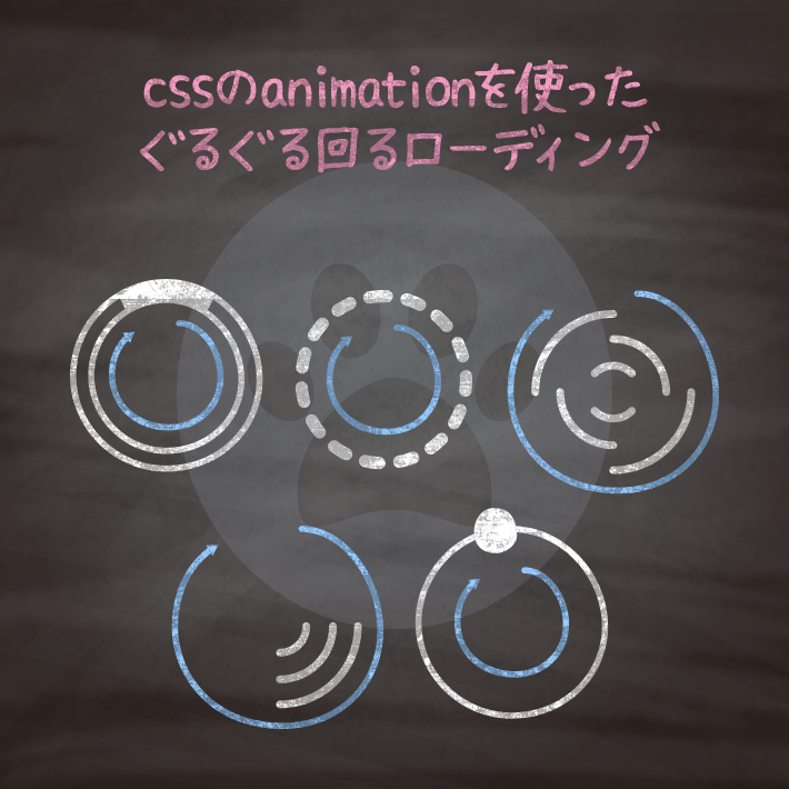
<span class="cp_loading01"> </span>.cp_loading01 {
position: absolute;
top: 50%;
left: 50%;
width: 30px;
height: 30px;
-webkit-transform: translate(-50%,-50%);
transform: translate(-50%,-50%);
}
.cp_loading01 {
border: 1px solid #29b6f6;
border-radius: 50px;
}
.cp_loading01:after {
position: absolute;
top: -6px;
right: -6px;
bottom: -6px;
left: -6px;
content: '';
-webkit-animation: loading01 1s linear infinite;
animation: loading01 1s linear infinite;
border: 6px solid transparent;
border-top-color: #29b6f6;
border-radius: 50px;
box-shadow: 0px 0px 0px 1px #29b6f6;
}
@-webkit-keyframes loading01 {
0% {
-webkit-transform: rotate(0deg);
transform: rotate(0deg);
}
100% {
-webkit-transform: rotate(360deg);
transform: rotate(360deg);
}
}
@keyframes loading01 {
0% {
-webkit-transform: rotate(0deg);
transform: rotate(0deg);
}
100% {
-webkit-transform: rotate(360deg);
transform: rotate(360deg);
}
}<span class="cp_loading02"> </span>.cp_loading02 {
position: absolute;
top: 50%;
left: 50%;
-webkit-transform: translate(-50%,-50%);
transform: translate(-50%,-50%);
}
.cp_loading02::after {
display: inline-block;
width: 30px;
height: 30px;
content: '';
-webkit-animation: loading02 1.5s 0.3s cubic-bezier(0.17,0.37,0.43,0.67) infinite;
animation: loading02 1.5s 0.3s cubic-bezier(0.17,0.37,0.43,0.67) infinite;
border: 3px dotted #009688;
border-radius: 50%;
}
@-webkit-keyframes loading02 {
0% {
-webkit-transform: rotate(0deg);
transform: rotate(0deg);
}
50% {
-webkit-transform: rotate(180deg);
transform: rotate(180deg);
}
100% {
-webkit-transform: rotate(360deg);
transform: rotate(360deg);
}
}
@keyframes loading02 {
0% {
-webkit-transform: rotate(0deg);
transform: rotate(0deg);
}
50% {
-webkit-transform: rotate(180deg);
transform: rotate(180deg);
}
100% {
-webkit-transform: rotate(360deg);
transform: rotate(360deg);
}
}<span class="cp_loading03 cp_item"> </span>.cp_loading03 {
position: absolute;
top: 42%;
left: 42%;
width: 50px;
height: 50px;
}
.cp_loading03.cp_item {
-webkit-animation: loading03 1.5s linear infinite;
animation: loading03 1.5s linear infinite;
border: 4px solid transparent;
border-top-color: #f06292;
border-bottom-color: #f06292;
border-radius: 50px;
}
.cp_loading03.cp_item:before,
.cp_loading03.cp_item:after {
position: absolute;
top: 5px;
right: 5px;
bottom: 5px;
left: 5px;
content: '';
-webkit-animation: loading03_reverse 2s linear infinite;
animation: loading03_reverse 2s linear infinite;
opacity: .6;
border: 2px solid transparent;
border-top-color: #f06292;
border-bottom-color: #f06292;
border-radius: 50px;
filter: alpha(opacity=60);
}
.cp_loading03.cp_item:before {
top: 15px;
right: 15px;
bottom: 15px;
left: 15px;
-webkit-animation: loading03_reverse 3s cubic-bezier(.17,.67,.88,.52) infinite;
animation: loading03_reverse 3s cubic-bezier(.17,.67,.88,.52) infinite;
opacity: .8;
border: 6px solid transparent;
border-top-color: #f06292;
border-bottom-color: #f06292;
filter: alpha(opacity=80);
}
@-webkit-keyframes loading03 {
0% {
-webkit-transform: rotate(0deg);
transform: rotate(0deg);
}
50% {
-webkit-transform: rotate(180deg);
transform: rotate(180deg);
}
100% {
-webkit-transform: rotate(360deg);
transform: rotate(360deg);
}
}
@keyframes loading03 {
0% {
-webkit-transform: rotate(0deg);
transform: rotate(0deg);
}
50% {
-webkit-transform: rotate(180deg);
transform: rotate(180deg);
}
100% {
-webkit-transform: rotate(360deg);
transform: rotate(360deg);
}
}
@-webkit-keyframes loading03_reverse {
0% {
-webkit-transform: rotate(0deg);
transform: rotate(0deg);
}
50% {
-webkit-transform: rotate(180deg);
transform: rotate(180deg);
}
100% {
-webkit-transform: rotate(-360deg);
transform: rotate(-360deg);
}
}
@keyframes loading03_reverse {
0% {
-webkit-transform: rotate(0deg);
transform: rotate(0deg);
}
50% {
-webkit-transform: rotate(180deg);
transform: rotate(180deg);
}
100% {
-webkit-transform: rotate(-360deg);
transform: rotate(-360deg);
}
}<span class="cp_loading04 cp_item"> </span>.cp_loading {
width: 300px;
height: 200px;
margin: 2em auto;
padding: 0.5em;
text-align: center;
position: relative;
overflow: hidden;
}
.cp_loading04 {
position: absolute;
top: 42%;
left: 42%;
width: 50px;
height: 50px;
}
.cp_loading04.cp_item {
-webkit-animation: loading04 1s cubic-bezier(.17,.67,.88,.52) infinite;
animation: loading04 1s cubic-bezier(.17,.67,.88,.52) infinite;
border: 3px solid transparent;
border-top-color: #4dd0e1;
border-radius: 50px;
}
.cp_loading04.cp_item:before,
.cp_loading04.cp_item:after {
position: absolute;
top: 5px;
right: 5px;
bottom: 5px;
left: 5px;
content: '';
-webkit-animation: loading04_reverse 4s cubic-bezier(.58,.17,.67,.83) infinite;
animation: loading04_reverse 4s cubic-bezier(.58,.17,.67,.83) infinite;
opacity: .8;
border: 3px solid transparent;
border-radius: 50px;
filter: alpha(opacity=80);
}
.cp_loading04.cp_item:before {
top: 15px;
right: 15px;
bottom: 15px;
left: 15px;
-webkit-animation: loading04_reverse 8s cubic-bezier(.17,.67,.88,.52) infinite;
animation: loading04_reverse 8s cubic-bezier(.17,.67,.88,.52) infinite;
border-top-color: #FDD835;
}
.cp_loading04.cp_item:after {
border-top-color: #26A69A;
}
@keyframes loading04 {
0% {
-webkit-transform: rotate(0deg);
transform: rotate(0deg);
}
100% {
-webkit-transform: rotate(360deg);
transform: rotate(360deg);
}
}
@keyframes loading04_reverse {
0% {
-webkit-transform: rotate(0deg);
transform: rotate(0deg);
}
100% {
-webkit-transform: rotate(-360deg);
transform: rotate(-360deg);
}
}<div class="cp_loading05">
<div class="cp_holder">
<div class="cp_item"></div>
</div>
</div>.cp_loading05 {
position: absolute;
top: 50%;
left: 50%;
width: 45px;
height: 45px;
-webkit-transform: translate(-50%,-50%);
transform: translate(-50%,-50%);
border: 4px solid #FFA726;
border-radius: 50%;
}
.cp_loading05 .cp_holder {
position: absolute;
top: 0;
left: 12px;
width: 12px;
height: 38px;
-webkit-transform-origin: 50% 50%;
transform-origin: 50% 50%;
-webkit-animation: loading05 2s cubic-bezier(.58,.17,.67,.83) infinite;
animation: loading05 2s cubic-bezier(.58,.17,.67,.83) infinite;
}
.cp_loading05 .cp_item {
position: absolute;
top: -11px;
left: 0;
width: 16px;
height: 16px;
border-radius: 50%;
background: #FF5722;
}
@-webkit-keyframes loading05 {
0% {
-webkit-transform: rotate(0deg);
transform: rotate(0deg);
}
100% {
-webkit-transform: rotate(360deg);
transform: rotate(360deg);
}
}
@keyframes loading05 {
0% {
-webkit-transform: rotate(0deg);
transform: rotate(0deg);
}
100% {
-webkit-transform: rotate(360deg);
transform: rotate(360deg);
}
}
cssのanimation設定ってどんな動きができるの?いい感じに設定するにはどうしたらいい? | copypet.jp|パーツで探す、web制作に使えるコピペサイト。
cssのanimationプロパティってどんな設定をするとどんな動きになるのか、意外とわかっていない人も多いのでは?…
コピペでできる!cssとhtmlのみで作る基本的な動きのアニメーションサンプル | copypet.jp|パーツで探す、web制作に使えるコピペサイト。
cssのanimationでできることって実際どんな感じなのよ?ぶっちゃけ解説はいいから動きが見たいってことで。 基本的な動きのアニメーションサンプルをご紹介します。…
CSS3などで新たに追加された要素・装飾方法など、日々コードを書いていないと忘れてしまったり、ささっとプロトタイプを作る時などちょっとしたことに時間をかけている暇はない。そんな時に「あ〜、あれストックしときゃよかったなぁ」って困った自分用のストックブログです。カスタマイズなどがしやすいよう、昨今のweb制作に取り入れられる一般的なコードを中心に掲載しています。
@CopypetJp More Info