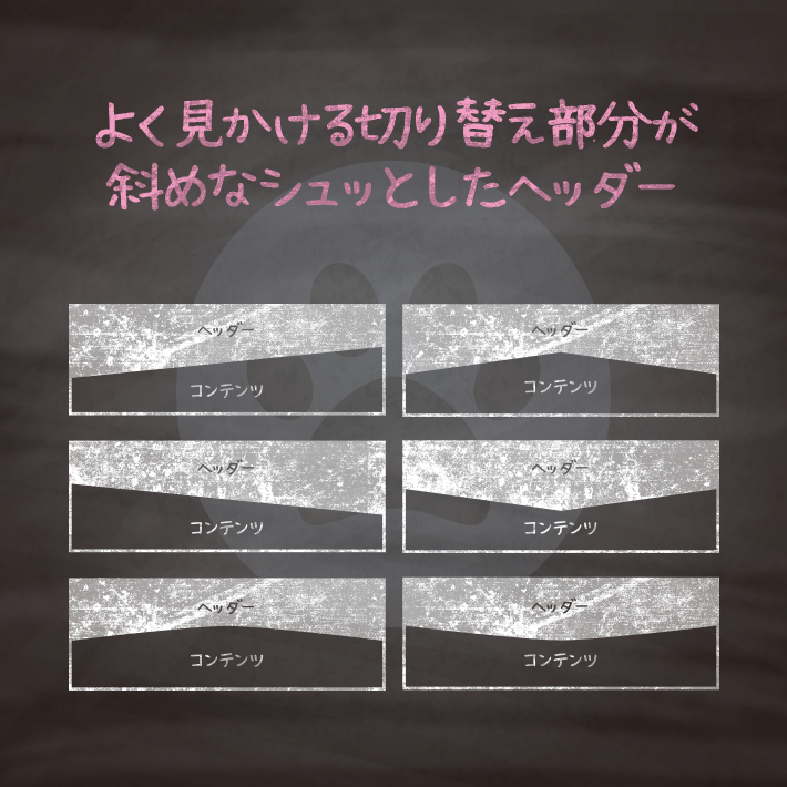
ブログやランディングページでよく見かける切り替え部分を斜めにしたヘッダーです。
コンテンツとコンテンツの切り替えで使用するとシュッとした感じのサイトになりますね。
毎度毎度SVGを用意して作るのが面倒なので、良く使いそうなパターンをご用意しました。
こちらは直接SVGを指定するバージョンです。
レスポンシブにも対応していますが、好みに合わせて微調整した方がいいかもしれません。

<header>
<h1>Header</h1>
<svg xmlns="http://www.w3.org/2000/svg" viewBox="0 0 100 100" preserveAspectRatio="none">
<polygon points="0,100 100,0 100,100"/>
</svg>
</header>
<article>
<section>
<h2>Content</h2>
</section>
</article>
header {
position: relative;
height: 200px;
background: #00bcd4;
}
svg {
position: absolute;
bottom: 0;
width: 100%;
height: 100px;
fill: #80deea;
}
section {
background: #80deea;
}
h1,h2 {
margin: 0;
padding: 1em 0;
text-align: center;
color: #ffffff;
}<header>
<h1>Header</h1>
<svg xmlns="http://www.w3.org/2000/svg" viewBox="0 0 100 100" preserveAspectRatio="none">
<polygon points="0,0 100,100 0,100"/>
</svg>
</header>
<article>
<section>
<h2>Content</h2>
</section>
</article>header {
position: relative;
height: 200px;
background: #00bcd4;
}
svg {
position: absolute;
bottom: 0;
width: 100%;
height: 100px;
fill: #80deea;
}
section {
background: #80deea;
}
h1,h2 {
font-size: 2em;
margin: 0;
padding: 1em 0;
text-align: center;
color: #ffffff;
}<header>
<h1>Header</h1>
<svg xmlns="http://www.w3.org/2000/svg" viewBox="0 0 100 100" preserveAspectRatio="none">
<polygon points="0,0 50,50 100,0"/>
</svg>
</header>
<article>
<section>
<h2>Content</h2>
</section>
</article>header {
position: relative;
height: 100px;
background: #00bcd4;
}
svg {
position: absolute;
bottom: -100px;
width: 100%;
height: 100px;
fill: #00bcd4;
}
section {
height: 200px;
background: #80deea;
}
h1,h2 {
font-size: 2em;
margin: 0;
padding: 1em 0;
text-align: center;
color: #ffffff;
}
h2 {
padding: 3em 0 1em;
}<header>
<h1>Header</h1>
<svg xmlns="http://www.w3.org/2000/svg" viewBox="0 0 100 100" preserveAspectRatio="none">
<polygon points="100,100 50,50 0,100"/>
</svg>
</header>
<article>
<section>
<h2>Content</h2>
</section>
</article>header {
position: relative;
height: 200px;
background: #00bcd4;
}
svg {
position: absolute;
bottom: 0;
width: 100%;
height: 100px;
fill: #80deea;
}
section {
background: #80deea;
}
h1,h2 {
font-size: 2em;
margin: 0;
padding: 1em 0;
text-align: center;
color: #ffffff;
}<header>
<h1>Header</h1>
<svg xmlns="http://www.w3.org/2000/svg" viewBox="0 0 100 100" preserveAspectRatio="none">
<path d="M0,0 Q50,50 100,0"></path>
</svg>
</header>
<article>
<section>
<h2>Content</h2>
</section>
</article>header {
position: relative;
height: 150px;
background: #00bcd4;
}
svg {
position: absolute;
bottom: -100px;
width: 100%;
height: 100px;
fill: #00bcd4;
}
section {
height: 150px;
background: #80deea;
}
h1,h2 {
font-size: 2em;
margin: 0;
padding: 1em 0;
text-align: center;
color: #ffffff;
}
h2 {
padding: 2em 0 1em;
}<header>
<h1>Header</h1>
<svg xmlns="http://www.w3.org/2000/svg" viewBox="0 0 100 100" preserveAspectRatio="none">
<path d="M0,50 Q50,0 100,50"></path>
</svg>
</header>
<article>
<section>
<h2>Content</h2>
</section>
</article>header {
position: relative;
height: 150px;
background: #00bcd4;
background-size: cover;
}
svg {
position: absolute;
bottom: -50px;
width: 100%;
height: 100px;
fill: #80deea;
}
section {
height: 150px;
background: #80deea;
}
h1,h2 {
font-size: 2em;
margin: 0;
padding: 1em 0;
text-align: center;
color: #ffffff;
}
CSS3などで新たに追加された要素・装飾方法など、日々コードを書いていないと忘れてしまったり、ささっとプロトタイプを作る時などちょっとしたことに時間をかけている暇はない。そんな時に「あ〜、あれストックしときゃよかったなぁ」って困った自分用のストックブログです。カスタマイズなどがしやすいよう、昨今のweb制作に取り入れられる一般的なコードを中心に掲載しています。
@CopypetJp More Info