吾輩は猫である。名前はまだ無い。どこで生れたかとんと見当がつかぬ。何でも薄暗いじめじめした所でニャーニャー泣いていた事だけは記憶している... read more
記事タイトル
吾輩は猫である。名前はまだ無い。どこで生れたかとんと見当がつかぬ。何でも薄暗いじめじめした所でニャーニャー泣いていた...
Read more
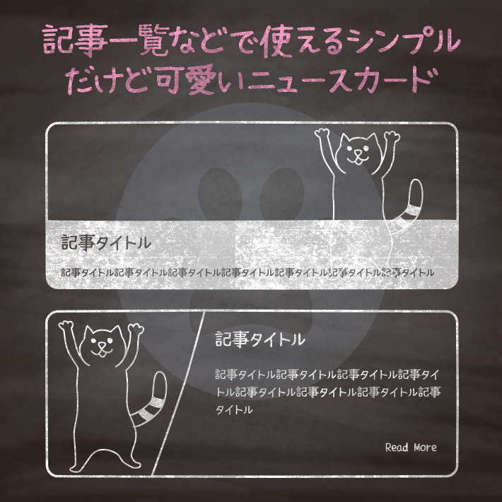
ブログのトップページなどで一覧を表示する時に一つ一つの記事をブロック状に並べたりすると思いますが、
複数繰り返すパーツなのでシンプルでわかりやすいものがいいですよね。
そのパーツに使えそうな、ブログカードやニュースカードをご紹介。

吾輩は猫である。名前はまだ無い。どこで生れたかとんと見当がつかぬ。何でも薄暗いじめじめした所でニャーニャー泣いていた事だけは記憶している。吾輩はここで始めて人間というものを見た...
Read More<div class="cp_card01">
<div class="photo"><div class="photo1"></div></div>
<ul class="details">
<li class="author"><a href="#">copypet</a></li>
<li class="date">2018.06.21</li>
<li class="tags">
<ul>
<li><a href="#">css</a></li>
<li><a href="#">html</a></li>
</ul>
</li>
</ul>
<div class="description">
<h1>記事タイトル</h1>
<h2>サブタイトルやキャッチコピーなど</h2>
<p class="text">テキストテキストテキストテキストテキストテキストテキスト...</p>
<a href="#">Read More</a>
</div>
</div>
.cp_card01 {
	font-size: 14px;
	line-height: 1.45em;
	position: relative;
	overflow: hidden;
	margin: 0 auto 1.6%;
	-webkit-transition: height 0.3s ease;
	        transition: height 0.3s ease;
	border-radius: 3px;
	background: #ffffff;
	-webkit-box-shadow: 0 3px 7px -3px rgba(0, 0, 0, 0.3);
	        box-shadow: 0 3px 7px -3px rgba(0, 0, 0, 0.3);
}
.cp_card01::after {
	font-family: FontAwesome;
	content: '\f1b0';
	position: absolute;
	bottom: 60px;
	right: -20px;
	color: rgba(236, 239, 241, 0.7);
	font-size: 180px;
	transform: rotate(-26deg);
	z-index: 0;
}
.cp_card01:hover .details {
	left: 0;
}
.cp_card01 .photo {
	position: relative;
	height: 200px;
	overflow: hidden;
}
.cp_card01:hover .photo1 {
	-webkit-transform: rotate(5deg) scale(1.3);
	        transform: rotate(5deg) scale(1.3);
}
.cp_card01 .photo .photo1 {
	height: 100%;
	background: url('images.jpg') center no-repeat;
	background-size: cover;
	-webkit-transition: all 0.5s ease;
	        transition: all 0.5s ease;
}
.cp_card01 .details {
	font-family: 'Open Sans';
	position: absolute;
	top: 0;
	left: -100%;
	-webkit-box-sizing: border-box;
	        box-sizing: border-box;
	height: 200px;
	margin: 0;
	padding: 10px 15px;
	list-style: none;
	-webkit-transition: all 0.3s ease;
	        transition: all 0.3s ease;
	color: #ffffff;
	background: rgba(40,53,147, 0.6);
}
.cp_card01 .details > li {
	padding: 3px 0;
}
.cp_card01 .details li::before,
.cp_card01 .details .tags ul::before {
	font-family: FontAwesome;
	margin-right: 10px;
	vertical-align: middle;
}
.cp_card01 .details .author::before {
	content: '\f007';
}
.cp_card01 .details .date::before {
	content: '\f133';
}
.cp_card01 .details .tags ul {
	margin: 0;
	padding: 0;
	list-style: none;
}
.cp_card01 .details .tags ul::before {
	content: '\f02b';
}
.cp_card01 .details .tags li {
	display: inline-block;
	margin-right: 3px;
}
.cp_card01 .details a {
	color: inherit;
}
.cp_card01 .details a:hover {
	color: #283593;
}
.cp_card01 .description {
	position: relative;
	padding: 10px;
	z-index: 1;
}
.cp_card01 .description h1 {
	font-size: 1.4em;
	line-height: 1em;
	margin: 0 0 10px 0;
}
.cp_card01 .description h2 {
	font-size: 1em;
	line-height: 1.2em;
	margin: 1.2% 0;
	color: #9b9b9b;
}
.cp_card01 .description p {
	position: relative;
	margin: 0;
	padding-top: 20px;
}
.cp_card01 .description p::after {
	position: absolute;
	top: 6px;
	left: 0;
	width: 20%;
	height: 6px;
	content: '';
	background: #283593;
}
.cp_card01 .description a {
	float: right;
	margin-bottom: 10px;
	color: #283593;
	text-decoration: none;
}
.cp_card01 .description a::after {
	font-family: FontAwesome;
	margin-left: -10px;
	content: '\f061';
	-webkit-transition: all 0.3s ease;
	        transition: all 0.3s ease;
	vertical-align: middle;
	opacity: 0;
}
.cp_card01 .description a:hover::after {
	margin-left: 5px;
	opacity: 1;
}<div class="cp_card02">
<div class="photo photo1"></div>
<ul class="details">
<li class="author"><a href="#">copypet</a></li>
<li class="date">2018.06.21</li>
<li class="tags">
<ul>
<li><a href="#">css</a></li>
<li><a href="#">html</a></li>
</ul>
</li>
</ul>
<div class="description">
<h1>記事タイトル</h1>
<h2>サブタイトルなど</h2>
<p class="text">吾輩は猫である。名前はまだ無い。どこで生れたかとんと見当がつかぬ。何でも薄暗いじめじめした所で...</p>
<a href="#">Read More</a>
</div>
</div>
.cp_card02 {
	font-size: 14px;
	line-height: 1.45em;
	position: relative;
	overflow: hidden;
	height: 200px;
	margin: 0 auto 1.6%;
	-webkit-transition: height 0.3s ease;
	        transition: height 0.3s ease;
	border-radius: 3px;
	background: #ffffff;
	-webkit-box-shadow: 0 3px 7px -3px rgba(0, 0, 0, 0.3);
	        box-shadow: 0 3px 7px -3px rgba(0, 0, 0, 0.3);
}
.cp_card02:hover .details {
	left: 0;
}
.cp_card02:hover.alt .details {
	right: 0;
}
.cp_card02.alt .details {
	right: -100%;
	left: inherit;
}
.cp_card02 .photo {
	position: relative;
	float: left;
	width: 40%;
	height: 100%;
	-webkit-transition: all 0.5s ease;
	        transition: all 0.5s ease;
}
.cp_card02:hover .photo {
	-webkit-transform: rotate(5deg) scale(1.3);
	        transform: rotate(5deg) scale(1.3);
}
.cp_card02 .photo.photo1 {
	background: url('images.jpg') center no-repeat;
	background-size: cover;
}
.cp_card02 .details {
	position: absolute;
	top: 0;
	left: -100%;
	width: 40%;
	height: 200px;
	margin: 0;
	padding: 10px 15px;
	list-style: none;
	-webkit-transition: all 0.3s ease;
	        transition: all 0.3s ease;
	color: #ffffff;
	background: rgba(255,87,34, 0.4);
}
.cp_card02 .details > li {
	padding: 3px 0;
}
.cp_card02 .details li::before,
.cp_card02 .details .tags ul::before {
	font-family: FontAwesome;
	margin-right: 10px;
	vertical-align: middle;
}
.cp_card02 .details .author::before {
	content: '\f007';
}
.cp_card02 .details .date::before {
	content: '\f133';
}
.cp_card02 .details .tags ul {
	margin: 0;
	padding: 0;
	list-style: none;
}
.cp_card02 .details .tags ul::before {
	content: '\f02b';
}
.cp_card02 .details .tags li {
	display: inline-block;
	margin-right: 3px;
}
.cp_card02 .details a {
	color: inherit;
}
.cp_card02 .details a:hover {
	color: #ff5722;
}
.cp_card02 .description {
	position: relative;
	z-index: 0;
	float: left;
	width: 60%;
	padding: 10px;
	min-height: 200px;
}
.cp_card02 .description::before {
	position: absolute;
	z-index: -1;
	top: 0;
	bottom: 0;
	left: -15px;
	width: 100%;
	content: '';
	-webkit-transform: skewX(-8deg);
	        transform: skewX(-8deg);
	background: #ffffff;
}
.cp_card02 .description h1 {
	font-size: 1.4em;
	line-height: 1em;
	margin: 0 0 10px 0;
}
.cp_card02 .description h2 {
	font-size: 1em;
	line-height: 1.2em;
	margin: 1.2% 0;
	color: #9b9b9b;
}
.cp_card02 .description p {
	position: relative;
	margin: 0;
	padding-top: 20px;
}
.cp_card02 .description p::after {
	position: absolute;
	top: 6px;
	left: 0;
	width: 20%;
	height: 6px;
	content: '';
	background: #ff5722;
}
.cp_card02 .description a {
	float: right;
	margin-bottom: 10px;
	text-decoration: none;
	color: #ff5722;
}
.cp_card02 .description a::after {
	font-family: FontAwesome;
	margin-left: -10px;
	content: '\f061';
	-webkit-transition: all 0.3s ease;
	        transition: all 0.3s ease;
	vertical-align: middle;
	opacity: 0;
}
.cp_card02 .description a:hover::after {
	margin-left: 5px;
	opacity: 1;
}
@media screen and (max-width: 480px) {
	.cp_card02 .description h1 {
		font-size: 1.3em;
	}
}
吾輩は猫である。名前はまだ無い。どこで生れたかとんと見当がつかぬ。何でも薄暗いじめじめした所でニャーニャー泣いていた事だけは記憶している... read more
<div class="cp_card03">
	<a href="#"><img src="images1.jpg" alt="cover" class="cover" /></a>
	<div class="header">
		<div class="details">
			<h1>記事タイトル</h1>
			<h2>サブタイトルやキャッチコピーなど</h2>
		</div>
	</div>

	<div class="description">
		<div class="column1">
			<span class="tag">css</span>
			<span class="tag">html</span>
		</div>
		<div class="text">
			<p>吾輩は猫である。名前はまだ無い。どこで生れたかとんと見当がつかぬ。何でも薄暗いじめじめした所でニャーニャー泣いていた事だけは記憶している... <a href="#">read more</a></p>
		</div>
	</div>
</div>
.cp_card03 {
	position: relative;
	margin: 0 auto;
	border-radius: 3px;
	background: #f0f0ed;
	-webkit-box-shadow: 0 3px 7px -3px rgba(0, 0, 0, 0.3);
	        box-shadow: 0 3px 7px -3px rgba(0, 0, 0, 0.3);
}
.cp_card03 .header {
	position: relative;
	z-index: 1;
	overflow: hidden;
	height: 240px;
	margin: 0;
	border-radius: 3px 3px 0 0;
}
.cp_card03 .header::before {
	position: absolute;
	z-index: -1;
	top: 0;
	left: 0;
	overflow: hidden;
	width: 100%;
	height: 100%;
	content: '';
	-webkit-transform: skewY(-3.2deg);
	        transform: skewY(-3.2deg);
	-webkit-transform-origin: 0 0;
	        transform-origin: 0 0;
	background: url('bg_images.jpg');

	-webkit-backface-visibility: hidden;
}
.cp_card03 .cover {
	position: absolute;
	z-index: 2;
	top: 120px;
	left: 20px;
	max-width: 140px;
	height: auto;
}
.cp_card03 .header .details {
	padding: 110px 0 0 180px;
}
.cp_card03 .header .details h1 {
	font-size: 1.4em;
	position: relative;
	margin-bottom: 13px;
	color: #ffffff;
}
.cp_card03 .header .details h2 {
	font-size: 1em;
	font-weight: normal;
	margin-bottom: 15px;
	color: #c7c1ba;
}
.cp_card03 .description {
	padding: 0 0.7em 1em 0;
	color: #8c8b88;
	display: -webkit-box;
	display: -ms-flexbox;
	display: flex;
}
.cp_card03 .description .column1 {
	-webkit-box-flex: 1;
	    -ms-flex: 1;
	        flex: 1;
	height: 100%;
	padding: 70px 0 0 0;
	text-align: center;
}
.cp_card03 .description .text {
	-webkit-box-flex: 2;
	    -ms-flex: 2;
	        flex: 2;
}
.cp_card03 .description .tag {
	font-size: 0.8em;
	margin-right: 4px;
	padding: 3px 8px;
	cursor: pointer;
	border-radius: 10px;
	background: #ffffff;
}
.cp_card03 .description .tag:hover {
	background: #dddddd;
}
.cp_card03 .description a {
	display: block;
	margin-bottom: 10px;
	text-decoration: none;
	color: #039BE5;
}
.cp_card03 .description a::after {
	font-family: FontAwesome;
	margin-left: -10px;
	content: '\f061';
	-webkit-transition: all 0.3s ease;
	        transition: all 0.3s ease;
	vertical-align: middle;
	opacity: 0;
}
.cp_card03 .description a:hover::after {
	margin-left: 5px;
	opacity: 1;
}
@media screen and (max-width: 480px) {
	.cp_card03 .description {
		display: block;
		padding: 0.5em 0.7em;
	}
	.cp_card03 .cover {
		max-width: 100px;
		height: auto;
		top:170px;
		left: 10px;
	}
	.cp_card03 .header .details {
		padding: 150px 0 0 140px;
	}
	.cp_card03 .description .column1 {
		padding: 20px 0 0 0;
	}
}
カテゴリー
吾輩は猫である。名前はまだ無い。どこで生れたかとんと見当がつかぬ。何でも薄暗いじめじめした所でニャーニャー泣いていた事だけは記憶している...
Read More<div class="cp_card04">
<div class="photo"><img src="images.jpg" alt=""></div>
<div class="details">
<div class="category"><p>カテゴリー</p></div>
<div class="date"><span class="day">2016.06.21</span></div>
</div>
<div class="description">
<h1>記事タイトル</h1>
<div class="text">
<p>吾輩は猫である。名前はまだ無い。どこで生れたかとんと見当がつかぬ。何でも薄暗いじめじめした所でニャーニャー泣いていた事だけは記憶している...</p>
<a href="#0" class="">Read More</a>
</div>
</div>
</div>
.cp_card04 {
	overflow: hidden;
	border-radius: 3px;
	margin-top: 2rem;
	margin-bottom: 2rem;
	margin-left: auto;
	margin-right: auto;
	position: relative;
	background-color: #fff;
	-webkit-box-shadow: 0 3px 7px -3px rgba(0, 0, 0, 0.3);
	        box-shadow: 0 3px 7px -3px rgba(0, 0, 0, 0.3);
					transition: all 0.25s ease-in;
				  border-bottom: 5px solid transparent;
}
.cp_card04 .photo {
	height: 200px;
	overflow: hidden;
}
.cp_card04:hover {
  -webkit-transform: translateY(-5px);
          transform: translateY(-5px);
  border: none;
  border-bottom: 5px solid #00BCD4;
}
.cp_card04 .details {
	display: -webkit-box;
	display: -ms-flexbox;
	display: flex;
	padding: 1em 1em 0 1em;
	font-size: 0.8em;
}
.cp_card04 .date {
	-webkit-box-flex: 1;
	    -ms-flex: 1;
	        flex: 1;
	text-align: right;
}
.cp_card04 .category {
	-webkit-box-flex: 2;
	    -ms-flex: 2;
	        flex: 2;
}
.cp_card04 .category p {
	font-size: 0.8em;
	padding: 3px 8px;
	cursor: pointer;
	width: 8em;
	margin: 0;
	border-radius: 10px;
	background: #00BCD4;
	text-align: center;
	color: #ffffff;
}
.cp_card04 .description {
	padding: 0 1em;
}
.cp_card04 .description h1 {
	font-size: 1.4em;
	margin: 0;
	margin-bottom: 0.5em;
}
.cp_card04 .description .text p {
	margin: 0;
}
.cp_card04 .description a {
	float: right;
	margin-bottom: 10px;
	text-decoration: none;
	color: #00BCD4;
}
.cp_card04 .description a:after {
	font-family: FontAwesome;
	margin-left: -10px;
	content: '\f061';
	-webkit-transition: all 0.3s ease;
	        transition: all 0.3s ease;
	vertical-align: middle;
	opacity: 0;
}
.cp_card04 .description a:hover:after {
	margin-left: 5px;
	opacity: 1;
}<div class="cp_card05">
<div class="details">
<div class="date">
<span class="day">2018.06.21</span>
</div>
<ul class="meta">
<li><a href="#" class="fa fa-bookmark-o"></a></li>
<li><a href="#" class="fa fa-heart-o"><span>18</span></a></li>
<li><a href="#" class="fa fa-comment-o"><span>3</span></a></li>
</ul>
</div>
<div class="description">
<div class="content">
<span class="author">copypet</span>
<h1><a href="#">記事タイトル</a></h1>
<p class="text">吾輩は猫である。名前はまだ無い。どこで生れたかとんと見当がつかぬ。何でも薄暗いじめじめした所でニャーニャー泣いていた...</p>
<a href="#" class="button">Read more</a>
</div>
</div>
</div>.cp_card05 {
position: relative;
overflow: hidden;
min-height: 330px;
border-radius: 3px;
background: url(images.jpg) center/cover no-repeat;
background-color: #ffffff;
-webkit-box-shadow: 0 3px 7px -3px rgba(0, 0, 0, 0.3);
box-shadow: 0 3px 7px -3px rgba(0, 0, 0, 0.3);
}
.cp_card05:hover .description {
-webkit-transform: translateY(0);
transform: translateY(0);
}
.cp_card05 input[type='checkbox'] {
display: none;
}
.cp_card05 input[type='checkbox']:checked + .meta {
-webkit-transform: translateY(-60px);
transform: translateY(-60px);
}
.cp_card05:hover .meta span {
-webkit-transform: translate(-50%, -10px);
transform: translate(-50%, -10px);
opacity: 1;
}
.cp_card05 .details {
padding: 1em;
color: #ffffff;
}
.cp_card05 .details::before,
.cp_card05 .details::after {
display: table;
content: '';
}
.cp_card05 .details::after {
clear: both;
}
.cp_card05 .details .date {
font-size: 12px;
float: left;
}
.cp_card05 .description {
position: absolute;
bottom: 0;
width: 100%;
-webkit-transition: -webkit-transform 0.3s;
transition: -webkit-transform 0.3s;
transition: transform 0.3s;
transition: transform 0.3s, -webkit-transform 0.3s;
-webkit-transform: translateY(40px);
transform: translateY(40px);
color: #ffffff;
background: rgba(0, 0, 0, 0.4);
}
.cp_card05 .description .content {
position: relative;
z-index: 1;
padding: 1em;
}
.cp_card05 .description .author {
font-size: 12px;
}
.cp_card05 .description h1 {
font-size: 1.4em;
margin-top: 10px;
}
.cp_card05 .description h1 a {
color: #ffffff;
text-decoration: none;
}
.cp_card05 .description .text {
height: 3em;
margin: 0;
}
.cp_card05 .description .button {
font-size: 12px;
font-weight: 700;
line-height: 1;
position: relative;
display: block;
width: 100px;
margin: 2em auto 1em;
text-align: center;
color: #ffffff;
text-decoration: none;
}
.cp_card05 .description .button::after {
position: absolute;
top: 50%;
right: 0;
font-family: FontAwesome;
content: '\f061';
-webkit-transition: all 0.3s;
transition: all 0.3s;
-webkit-transform: translate(0, -50%);
transform: translate(0, -50%);
opacity: 0;
}
.cp_card05 .description .button:hover::after {
-webkit-transform: translate(5px, -50%);
transform: translate(5px, -50%);
opacity: 1;
}
.cp_card05 .meta {
float: right;
margin: 0;
padding: 0;
list-style-type: none;
}
.cp_card05 .meta::before,
.cp_card05 .meta::after {
display: table;
content: '';
}
.cp_card05 .meta::after {
clear: both;
}
.cp_card05 .meta li {
position: relative;
display: inline-block;
margin: 0 5px;
}
.cp_card05 .meta a {
color: #ffffff;
text-decoration: none;
}
.cp_card05 .meta span {
font-size: 10px;
position: absolute;
top: 0;
left: 50%;
-webkit-transition: all 0.3s;
transition: all 0.3s;
-webkit-transform: translate(-50%, 0);
transform: translate(-50%, 0);
opacity: 0;
}
@media screen and (max-width: 480px) {
.cp_card05 .description .text {
height: 6em;
}
}吾輩は猫である。名前はまだ無い。どこで生れたかとんと見当がつかぬ。何でも薄暗いじめじめした所でニャーニャー泣いていた...
<div class="cp_card06">
	<div class="details">
		<span class="day">21</span>
		<span class="month">06</span>
		<span class="year">2018</span>
	</div>
	<div class="description">
		<div class="content">
			<span class="author">copypet</span>
			<h1><a href="#">記事タイトル</a></h1>
			<p class="text">吾輩は猫である。名前はまだ無い。どこで生れたかとんと見当がつかぬ。何でも薄暗いじめじめした所でニャーニャー泣いていた...</p>
			<label for="showmeta" class="meta_button"><span></span></label>
		</div>
		<input type="checkbox" id="showmeta" />
		<ul class="meta">
			<li><a href="#" class="fa fa-bookmark"></a></li>
			<li><a href="#" class="fa fa-heart"><span>47</span></a></li>
			<li><a href="#" class="fa fa-comment"><span>8</span></a></li>
		</ul>
	</div>
</div>
.cp_card06 {
	position: relative;
	overflow: hidden;
	min-height: 390px;
	border-radius: 3px;
	background: url(images.jpg) 20% 1%/cover no-repeat;
	background-color: #ffffff;
	-webkit-box-shadow: 0 3px 7px -3px rgba(0, 0, 0, 0.3);
	        box-shadow: 0 3px 7px -3px rgba(0, 0, 0, 0.3);
}
.cp_card06:hover .description {
	-webkit-transform: translateY(0);
	        transform: translateY(0);
}
.cp_card06 input[type='checkbox'] {
	display: none;
}
.cp_card06 input[type='checkbox']:checked + .meta {
	-webkit-transform: translateY(-60px);
	        transform: translateY(-60px);
}
.cp_card06 .details {
	position: absolute;
	top: 0;
	left: 0;
	padding: 0.8em;
	color: #ffffff;
	border-radius: 0 0 3px 0;
	background-color: #ff9800;
}
.cp_card06 .details span {
	display: block;
	text-align: center;
}
.cp_card06 .details .day {
	font-size: 24px;
	font-weight: 700;
	text-shadow: 2px 3px 2px rgba(0, 0, 0, 0.18);
}
.cp_card06 .details .month {
	text-transform: uppercase;
}
.cp_card06 .details .month,
.cp_card06 .details .year {
	font-size: 12px;
}
.cp_card06 .description {
	position: absolute;
	bottom: 0;
	width: 100%;
	-webkit-transition: -webkit-transform 0.3s;
	        transition: -webkit-transform 0.3s;
	        transition:         transform 0.3s;
	        transition:         transform 0.3s, -webkit-transform 0.3s;
	-webkit-transform: translateY(80px);
	        transform: translateY(80px);
}
.cp_card06 .description .content {
	position: relative;
	z-index: 1;
	padding: 1em;
	background-color: #ff9800;
	-webkit-box-shadow: 2px -4px 6px 1px rgba(50, 50, 50, 0.14);
	        box-shadow: 2px -4px 6px 1px rgba(50, 50, 50, 0.14);
}
.cp_card06 .description .author {
	font-size: 12px;
}
.cp_card06 .description h1 {
	font-size: 1.4em;
	margin-top: 10px;
}
.cp_card06 .description h1 a {
	color: #ffffff;
}
.cp_card06 .description .text {
	height: 3em;
	margin: 0 0 1em 0;
}
.cp_card06 .meta {
	position: absolute;
	z-index: -1;
	top: 0;
	left: 0;
	width: 100%;
	margin: 0;
	padding: 0;
	list-style-type: none;
	-webkit-transition: -webkit-transform 0.3s;
	        transition: -webkit-transform 0.3s;
	        transition:         transform 0.3s;
	        transition:         transform 0.3s, -webkit-transform 0.3s;
	-webkit-transform: translateY(0);
	        transform: translateY(0);
	text-align: center;
}
.cp_card06 .meta::before,
.cp_card06 .meta::after {
	display: table;
	content: '';
}
.cp_card06 .meta::after {
	clear: both;
}
.cp_card06 .meta li {
	position: relative;
	display: inline-block;
	float: left;
	width: 33.333333%;
	height: 60px;
	background-color: #8BC34A;
}
.cp_card06 .meta a {
	font-size: 24px;
	position: absolute;
	top: 50%;
	left: 50%;
	-webkit-transform: translate(-50%, -50%);
	        transform: translate(-50%, -50%);
	text-decoration: none;
	color: #ffffff;
}
.cp_card06 .meta span {
	font-size: 10px;
	position: absolute;
	top: -10px;
	left: 50%;
	-webkit-transform: translate(-50%, 0);
	        transform: translate(-50%, 0);
}
.cp_card06 .meta_button {
	position: absolute;
	z-index: 999;
	top: 16px;
	right: 16px;
	width: 25px;
	cursor: pointer;
	text-align: center;
}
.cp_card06 .meta_button span {
	position: relative;
	display: inline-block;
	width: 5px;
	height: 5px;
	color: #ffffff;
	border-radius: 50%;
	background-color: #ffffff;
}
.cp_card06 .meta_button span::after,
.cp_card06 .meta_button span::before {
	position: absolute;
	display: block;
	width: 5px;
	height: 5px;
	content: '';
	border-radius: 50%;
	background-color: currentColor;
}
.cp_card06 .meta_button span::before {
	left: -10px;
}
.cp_card06 .meta_button span::after {
	right: -10px;
}
@media screen and (max-width: 480px) {
	.cp_card06 .data {
		-webkit-transform: translateY(7em);
		        transform: translateY(7em);
	}
	.cp_card06 .description .text {
		height: 5em;
		margin: 0 0 1em 0;
	}
}
吾輩は猫である。名前はまだ無い。どこで生れたかとんと見当がつかぬ。何でも薄暗いじめじめした所でニャーニャー泣いていた事だけは記憶している...
<div class="cp_card07">
	<div class="photo">
		<div class="details">
			<div class="day">21</div>
			<div class="month">Jun</div>
		</div>
		<img src="image.jpg"/>
	</div>
	<div class="description">
		<div class="category">カテゴリー</div>
		<h1><a href="#">記事タイトル</a></h1>
		<h2>サブタイトルやキャッチコピーなど</h2>
		<p class="text">吾輩は猫である。名前はまだ無い。どこで生れたかとんと見当がつかぬ。何でも薄暗いじめじめした所でニャーニャー泣いていた事だけは記憶している...</p>
		<div class="meta"><span class="timestamp"><i class="fa fa-clock-o"></i> 10 mins ago</span><span class="comments"><i class="fa fa-comments"></i><a href="#"> 20 comments</a></span></div>
	</div>
</div>
.cp_card07 {
position: relative;
z-index: 1;
display: block;
min-width: 270px;
-webkit-transition: all 0.3s linear 0s;
transition: all 0.3s linear 0s;
border-radius: 3px;
background: #ffffff;
-webkit-box-shadow: 0 3px 7px -3px rgba(0, 0, 0, 0.3);
box-shadow: 0 3px 7px -3px rgba(0, 0, 0, 0.3);
}
.cp_card07:hover .photo img {
-webkit-transform: scale(1.1);
transform: scale(1.1);
opacity: 0.6;
}
.cp_card07 .photo {
overflow: hidden;
height: 360px;
border-radius: 3px 3px 0 0;
background: #000000;
}
.cp_card07 .photo .details {
font-weight: 700;
position: absolute;
z-index: 1;
top: -20px;
right: -20px;
width: 75px;
height: 75px;
padding: 14.5px 0;
text-align: center;
color: #ffffff;
border-radius: 100%;
background: #e74c3c;
}
.cp_card07 .photo .details .day {
font-size: 18px;
}
.cp_card07 .photo .details .month {
font-size: 12px;
text-transform: uppercase;
}
.cp_card07 .photo img {
display: block;
width: 120%;
-webkit-transition: all 0.3s linear 0s;
transition: all 0.3s linear 0s;
}
.cp_card07 .description {
position: absolute;
bottom: 0;
width: 100%;
padding: 1em;
-webkit-transition: all 0.3s cubic-bezier(0.37, 0.75, 0.61, 1.05) 0s;
transition: all 0.3s cubic-bezier(0.37, 0.75, 0.61, 1.05) 0s;
background: #ffffff;
}
.cp_card07 .description .category {
position: absolute;
top: -34px;
left: 10px;
padding: 5px 15px;
height: 34px;
text-transform: uppercase;
color: #ffffff;
border-radius: 3px 3px 0 0;
background: #e74c3c;
}
.cp_card07 .description h1 {
font-size: 1.4em;
margin: 0;
padding: 0 0 0.1em;
color: #333333;
}
.cp_card07 .description h1 a {
text-decoration: none;
color: #333333;
}
.cp_card07 .description h2 {
font-size: 16px;
margin: 0;
padding: 0 0 5px;
color: #e74c3c;
}
.cp_card07 .description .text {
font-size: 14px;
line-height: 1.8em;
height: 0;
opacity: 0;
color: #666666;
margin: 0;
}
.cp_card07 .description .meta {
margin: 0px 0 0;
color: #999999;
}
.cp_card07 .description .meta .timestamp {
margin: 0 16px 0 0;
}
.cp_card07 .description .meta a {
text-decoration: none;
color: #999999;
}
.cp_card07:hover .description .text {
height: auto;
opacity: 1;
}
CSS3などで新たに追加された要素・装飾方法など、日々コードを書いていないと忘れてしまったり、ささっとプロトタイプを作る時などちょっとしたことに時間をかけている暇はない。そんな時に「あ〜、あれストックしときゃよかったなぁ」って困った自分用のストックブログです。カスタマイズなどがしやすいよう、昨今のweb制作に取り入れられる一般的なコードを中心に掲載しています。
@CopypetJp More Info