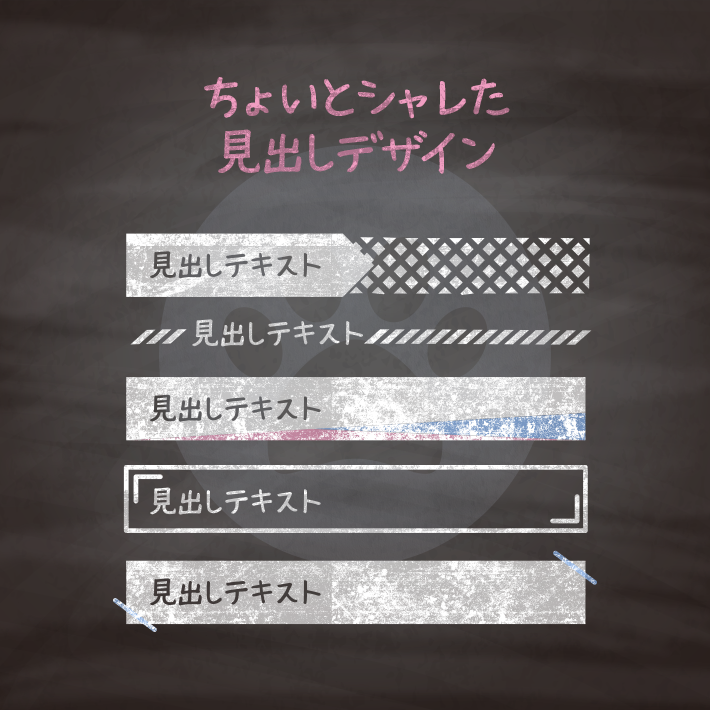
見出し次第で、記事の読みやすさは大きく変わります。
今回はちょいとシャレたデザインの見出しを集めました。
ほんのちょっとの手間でグッといい感じにできちゃいますよ。
紹介している<h1>タグには、クラス名(.cp_h1title)を付与していますが、こちらも
css部分を下記のように変更すれば、クラスをつけずに使用することも可能です。
h1 {cssの中身}ちなみによく出てくる擬似要素の::beforeと::afterって何よ?って方はこちらをご覧ください。

で?そもそも擬似要素の::before(:before)と::after(:after)って何がどうなってどう使えるの? | copypet.jp|パーツで探す、web制作に使えるコピペサイト。
copypet.jpでも頻繁に使っている::before(:before)と::after(:after)ですが、コピペだけしていると調整やプラスアルファのデザインを加えたい時に悩んでしまうこともあるでしょう。 とりあえずコピペすりゃええと思うが、だがしかし・・・何がどうなっているかは知っておきたい。とこっそり思っておられる方のために「何とな〜くわかる」から「知ってる!知ってる!」ぐらいになるよう説明しておきます。…

<h1 class="cp_h1title">見出しテキスト</h1>.cp_h1title {
position: relative;
background: #fffff2;/*見出しの色*/
box-shadow: 0 0 2px 0 rgba(0, 0, 0, 0.2);
padding: 10px 15px;
}
.cp_h1title::before,
.cp_h1title::after {
position: absolute;
content: '';
width: 0;
height: 60px;/*ラインの長さ*/
border-left: 1px solid #e60012;/*ラインの太さ・形状・色*/
transform: rotate(-45deg);/*ラインの傾き*/
}
.cp_h1title::before {/*左のライン位置*/
bottom: -20px;
left: 10px;
}
.cp_h1title::after {/*右のライン位置*/
top: -20px;
right: 10px;
}<h1 class="cp_h1title">見出しテキスト</h1>.cp_h1title {
position: relative;
color: #ffffff;
background: #0d47a1;/*見出しの色*/
text-shadow: 0 1px 1px rgba(0, 0, 0, 0.6);/*テキストの影*/
padding: 10px 15px;
}
.cp_h1title::before,
.cp_h1title::after {
position: absolute;
content: '';
width: 0;
height: 60px;/*ラインの長さ*/
border-left: 4px double #4dd0e1;/*ラインの太さ・形状・色*/
transform: rotate(45deg);/*ラインの傾き*/
}
.cp_h1title::before {/*左のライン位置*/
top: -20px;
left: 10px;
}
.cp_h1title::after {/*右のライン位置*/
bottom: -20px;
right: 10px;
}<h1 class="cp_h1title">見出しテキスト</h1>.cp_h1title {
position: relative;
border: 1px solid #ec407a;
padding: 5px 10px;
}
.cp_h1title::before,
.cp_h1title::after {/*カギ括弧のサイズ*/
position: absolute;
content: '';
width: 10px;
height: 20px;
border: solid #ec407a;
border-width: 1px 0 0 1px;
}
.cp_h1title::before {/*左のカギ括弧の位置*/
top: 3px;
left: 3px;
}
.cp_h1title::after {/*右のカギ括弧の位置*/
bottom: 3px;
right: 3px;
transform: rotate(180deg);/*180度回転*/
}<h1 class="cp_headline04">見出しテキスト</h1>.cp_h1title {
position: relative;
color: #ffffff;
background:#29b6f6;
border-radius: 8px;
padding: 5px 15px;
}
.cp_h1title::before,
.cp_h1title::after {
position: absolute;
content: '';
width: 20px;
height: 20px;
border: solid #b3e5fc;
border-width: 2px 0 0 2px;
border-radius: 8px 0 0 0;
}
.cp_h1title::before {/*左のカギ括弧の位置*/
top: 3px;
left: 3px;
}
.cp_h1title::after {/*右のカギ括弧の位置*/
bottom: 3px;
right: 3px;
transform: rotate(180deg);/*180度回転*/
}<h1 class="cp_h1title"><span>見出しテキスト</span></h1>.cp_h1title {
position: relative;
color: #ffffff;
background-color: #ffb300;
border-radius: 3px;
transform: skewX(-15deg);
padding: 5px 10px;
}
.cp_h1title::after {/*カギ括弧*/
position: absolute;
content: '';
width: 90px;
height: 20px;
border: solid #ffecb3;
border-width: 0 1px 1px 0;
border-radius: 0 0 3px 0;
}
.cp_h1title::after {
right: 3px;
bottom: 3px;
}<h1 class="cp_h1title">見出しテキスト</h1>.cp_h1title {
position: relative;
color: #ffffff;
background: #311b92;/*見出しの色*/
background-image:/*見出しの背景*/
linear-gradient( 45deg, rgba(69,39,160 ,1) 25%, transparent 25%, transparent 75%, rgba(69,39,160 ,1) 75%, rgba(69,39,160 ,1)),
linear-gradient( -45deg, rgba(69,39,160 ,1) 25%, transparent 25%, transparent 75%, rgba(69,39,160 ,1) 75%, rgba(69,39,160 ,1));
background-position: 0 0, 10px 10px;
background-size: 20px 20px;
text-shadow: 0 1px 1px rgba(0, 0, 0, 0.6);
padding: 5px 10px;
}
.cp_h1title::before,
.cp_h1title::after {
position: absolute;
content: '';
width: 0;
height: 60px;/*ラインの長さ*/
border: solid #9c27b0;/*ラインの太さ・形状・色*/
border-width: 0 0 0 1px;
transform: rotate(45deg);/*ラインの傾き*/
}
.cp_h1title::before {/*左のライン位置*/
top: -20px;
left: 10px;
}
.cp_h1title::after {/*右のライン位置*/
bottom: -20px;
right: 10px;
}<h1 class="cp_h1title"><span見出しテキスト</span></h1>.cp_h1title {
position: relative;
color: #ffffff;
background: #4db6ac;/*全体の背景(一番薄い色)*/
overflow: hidden;/*はみ出た分を非表示に*/
padding: 5px 10px;
}
.cp_h1title span {
position: relative;
z-index: 1;
}
.cp_h1title::before,
.cp_h1title::after {
position: absolute;
content: '';
top: 0;
left: 0;
width: 110%;
height: 100%;
}
.cp_h1title::before {
background: #009688;/*2番目に薄い色*/
transform-origin: bottom right;/*右下を起点に*/
transform: rotate(1.5deg);/*1.5度傾斜*/
}
.cp_h1title::after {
background: #00796b;/*3番目に薄い色*/
transform-origin: bottom left;/*左下を起点に*/
transform: rotate(-2.5deg);/*-2.5度傾斜*/
}<h1 class="cp_h1title"><div class="glow"> </div>見出しテキスト</h1>.cp_h1title {
position: relative;
z-index: 0;
color: #f8f8f8;
background-color: #d81b60;/*見出しの背景色*/
background-image:/*見出しの背景*/
linear-gradient(45deg,#c2185b 25%, #c2185b 25%,transparent 25%, transparent 75%,#c2185b 75%, #c2185b 75%),
linear-gradient(-45deg,#c2185b 25%, #c2185b 25%,transparent 25%, transparent 75%,#c2185b 75%, #c2185b 75%);
background-size: 10px 10px;
text-shadow: 0 1px 1px rgba(0, 0, 0, 0.2);/*テキストの影*/
padding: 5px 10px;
}
.glow {
position: absolute;
z-index: 1;
top: 0;
width: 40px;
height: 100%;
animation: flow 3s linear infinite;
background: #ffffff;
background:
linear-gradient(to right, rgba(255,255,255,0) 0%,rgba(255,255,255,0) 1%,#ffffff 100%);
transform: skew(20deg);/*グロウの傾斜*/
}
@keyframes flow {
0% { left: -20%;opacity: 0; }
50% { left: 50%;opacity: 0.3; }
100% { left: 100%;opacity: 0; }
}<h1 class="cp_h1title"><span>見出しテキスト</span></h1>.cp_h1title {
color: #f8f8f8;
background-color: #303f9f;
background-image:
linear-gradient(45deg,#283593 25%, transparent 25%,transparent 50%, #283593 50%,#283593 75%, transparent 75%,transparent),
linear-gradient(-45deg,#283593 25%, transparent 25%,transparent 50%, #283593 50%,#283593 75%, transparent 75%,transparent);
background-size: 10px 10px;
box-shadow: 0 1px 1px 0 rgba(0, 0, 0, 0.2);
text-shadow: 0 1px 1px rgba(0, 0, 0, 0.2);
border-radius: 4px;
line-height: 1em;
}
.cp_h1title span {
position: relative;
display: inline-block;
border-radius: 4px 0px 0px 4px;
background: #4dd0e1;
line-height: 1em;
padding: 5px 10px;
}
.cp_h1title span::after {
position: absolute;
top: 0;
right: -0.68em;
display: inline-block;
width: 0;
height: 0;
content: '';
border-width: 0.69em 0 0.69em 0.69em;
border-style: solid;
border-color: transparent transparent transparent #4dd0e1;
}<h1 class="cp_h1title"><span>見出しテキスト</span></h1>.cp_h1title {
position: relative;
color: #424242;
background-color: #ffffff;/*背景色と合わせる*/
background-image:
linear-gradient(-45deg,#9e9e9e 25%, transparent 25%,transparent 50%, #9e9e9e 50%,#9e9e9e 75%, transparent 75%,transparent);
background-size: 10px 10px;
height: 0.5em;
}
.cp_h1title span {
position: absolute;
display: inline-block;
margin-top: -0.5em;
margin-left: 0.8em;
background: #ffffff;/*背景色と合わせる*/
padding: 0 10px;
}<h1 class="cp_h1title"><span class="main">見出しテキスト</span><span class="sub">サブテキスト</span></h1>.cp_h1title {
position: relative;
line-height: 1;
border-bottom: 1px solid #303f9f;
padding-bottom: 10px;
}
.cp_h1title span.main {
position: relative;
color: #ffffff;
background: #303f9f;
padding: 5px 10px;
}
.cp_h1title span.main::after {
position: absolute;
content: '';
top: 0;
right: -10px;
border-width: 10px 10px 0 0;
border-style: solid;
border-color: #303f9f transparent transparent transparent;
}
.cp_h1title span.sub {
position: absolute;
right: 0;
bottom: 50%;
color: #424242;
font-size: 70%;
width: 100%;
text-align: right;
}<h1 class="cp_h1title"><span>見出しテキスト</span></h1>.cp_h1title {
position: relative;
border-bottom: 2px solid #bdbdbd ;
padding: 3px 0;
}
.cp_h1title span {
position: relative;
color: #f8f8f8;
background: #424242;
padding: 5px 10px;
}
.cp_h1title span::after {
position: absolute;
content: '';
top: 0;
right: -10px;
width: 0;
border-width: calc(1em + 20px) 0 0 10px;
border-style: solid;
border-color: transparent transparent transparent #bdbdbd;
}
CSS3などで新たに追加された要素・装飾方法など、日々コードを書いていないと忘れてしまったり、ささっとプロトタイプを作る時などちょっとしたことに時間をかけている暇はない。そんな時に「あ〜、あれストックしときゃよかったなぁ」って困った自分用のストックブログです。カスタマイズなどがしやすいよう、昨今のweb制作に取り入れられる一般的なコードを中心に掲載しています。
@CopypetJp More Info