<div class="cp_page">
  <!-- 表示しておくページのコンテンツ -->
  <a href="#cp_popup_block" class="cp_popup_op">OPEN</a>
</div>
<div id="cp_popup_block" class="cp_popup">
  <div class="cp_popupitem">
  <!-- POPUPで表示するコンテンツ -->
  <h1>h1テキスト</h1>
  <h2>h2テキスト</h2>
  <p>テキスト</p>
  <!-- /POPUPで表示するコンテンツ -->
  <a href="" class="cp_popup_cl"></a>
  </div>
</div>
/*POPUPするウィンドウ*/
.cp_popup {
position: fixed;
top: 0;
right: 0;
width: 100%;
height: 100vh;
display: none;/*最初は非表示に設定*/
}
#cp_popup_block:target {
display: flex;/*OPENをクリックしたらflexとして表示*/
}
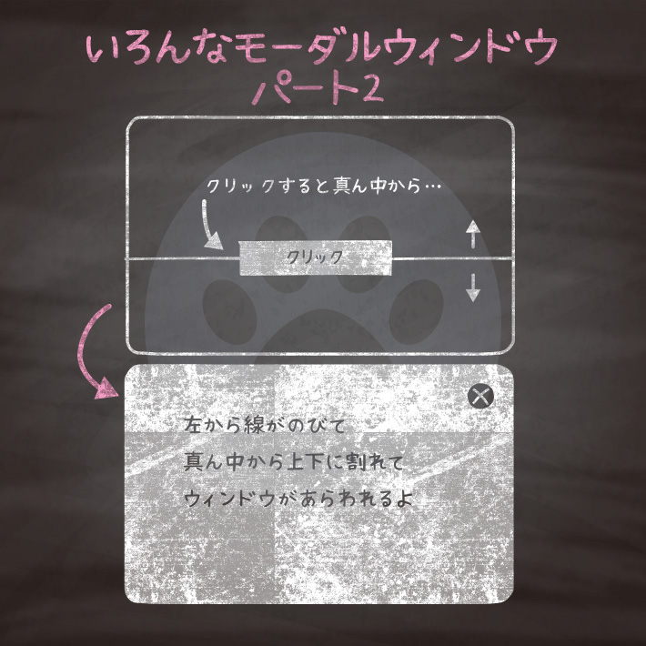
.cp_popup:before {/*上下に開くアニメーション*/
position: fixed;
content: '';
left: 0;
top: 50%;
background: #ffffff;
width: 100%;
animation: open-animation 0.6s cubic-bezier(0.83, 0.04, 0, 1.16) 0.65s both;
}
.cp_popup:after {/*横にラインが出るアニメーション*/
position: absolute;
content: '';
top: 50%;
left: 0;
width: 0;
height: 2px;
background-color: #ffffff;
animation: line-animation 0.6s cubic-bezier(0.83, 0.04, 0, 1.16) both;
}
.cp_popupitem {/*フェードで現れるアイテム*/
position: relative;
padding: 5% 15%;
animation: fade 0.5s ease-out 1.3s both;
}
.cp_popup_cl {/*クローズボタン背景*/
position: fixed;
top: 1em;
right: 1em;
width: 30px;
height: 30px;
background: #1b2538;
clip-path: circle(50% at 50% 50%);
}
.cp_popup_cl::before {/*クローズボタンの「×」*/
position: absolute;
content: '';
background: #ffffff;
width: 10px;
height: 10px;
margin: 10px;
clip-path: polygon(20% 0%, 0% 20%, 30% 50%, 0% 80%, 20% 100%, 50% 70%, 80% 100%, 100% 80%, 70% 50%, 100% 20%, 80% 0%, 50% 30%);
}
/*ベースの設定*/
.cp_page {
background-color: #1b2538;
display: flex;
min-height: 100vh;/*ページ全体を覆う*/
/*ページのコンテンツを真ん中に設置*/
align-items: center;
justify-content: center;
}
.cp_page a {
text-decoration: none;
}
.cp_popup_op {/*オープンボタン*/
color: #ffffff;
padding: 15px 30px;
border: 1px solid #ffffff;
}
/*アニメーションの設定*/
@keyframes line-animation {
/*横にラインが出るアニメーション*/
0% { width: 0; opacity: 1;}
99% { width: 100%; opacity: 1;}
100% { width: 100%; opacity: 0;}
}
@keyframes open-animation {
/*上下に割れるアニメーション*/
0% { height: 0; top: 50%;}
100% { height: 100vh; top: 0;}
}
@keyframes fade {
/*POPUPするアイテムのフェードイン*/
0% { opacity: 0;}
100% { opacity: 1;}
}<div class="cp_page">
<a class="cp_modal_op" href="#cp_modal_tab">OPEN</a>
</div>
<div class="cp_modal_area" id="cp_modal_tab">
<div class="cp_modal_cont">
<h3>h3テキスト</h3>
<p>テキスト</p>
<a href=""><span class="cp_popup_cl"></span></a>
</div>
<a href=""></a>
</div>/*ベースの設定*/
.cp_page {
display: flex;
min-height: 500px;/*ページ全体を覆う*/
/*ページのコンテンツを真ん中に設置*/
align-items: center;
justify-content: center;
}
a.cp_modal_op {/*OPENボタン*/
display: block;
width: 200px;
text-align: center;
text-decoration: none;
color: #424242;
background: #e0e0e0;
border-radius: 5px;
margin: auto;
padding: 20px;
}
/*POPUPするウィンドウ*/
.cp_modal_area {
position: fixed;
z-index: -1;
top: 0;
bottom: 0;
left: 0;
width: 100%;
height: 100%;
background: rgba(0,0,0,0.7);
transition: all 0.5s ease-in-out;
opacity: 0;/*最初は非表示に設定*/
}
.cp_modal_area:target {
z-index: 1;
transition: all 0.5s ease-in-out;
opacity: 1;/*OPENをクリックしたら表示*/
}
.cp_modal_cont {/*POPUPするウィンドウのコンテンツ*/
position: relative;
top: 50%;
left: 50%;
width: 80%;
height: 100px;
transition: all 0.5s ease-in-out;
transform: translate(-50%, -200%);/*最初は200%上に設置*/
opacity: 0;/*最初は非表示に設定*/
border-radius: 4px;
outline: 1px solid transparent;
background: #ffffff;
padding: 20px;
}
.cp_modal_area:target .cp_modal_cont {
z-index: 9999;
transition: all 0.5s ease-in-out;
transition-delay: 0.5s;
transform: translate(-50%, -50%);/*OPENをクリックしたら真ん中に表示*/
opacity: 1;/*OPENをクリックしたら表示*/
}
.cp_modal_area a{/*POPUPコンテンツをクリックしても閉じるように全体をaで囲む*/
position: absolute;
top: 0;
left: 0;
display: block;
width: 100%;
height: 100%;
}
.cp_popup_cl {/*クローズボタン背景*/
position: absolute;
top: 10px;
right: 10px;
width: 30px;
height: 30px;
background: #1b2538;
clip-path: circle(50% at 50% 50%);
}
.cp_popup_cl::before {/*クローズボタンの「×」*/
position: absolute;
content: '';
background: #ffffff;
width: 10px;
height: 10px;
margin: 10px;
clip-path: polygon(20% 0%, 0% 20%, 30% 50%, 0% 80%, 20% 100%, 50% 70%, 80% 100%, 100% 80%, 70% 50%, 100% 20%, 80% 0%, 50% 30%);
}
CSS3などで新たに追加された要素・装飾方法など、日々コードを書いていないと忘れてしまったり、ささっとプロトタイプを作る時などちょっとしたことに時間をかけている暇はない。そんな時に「あ〜、あれストックしときゃよかったなぁ」って困った自分用のストックブログです。カスタマイズなどがしやすいよう、昨今のweb制作に取り入れられる一般的なコードを中心に掲載しています。
@CopypetJp More Info