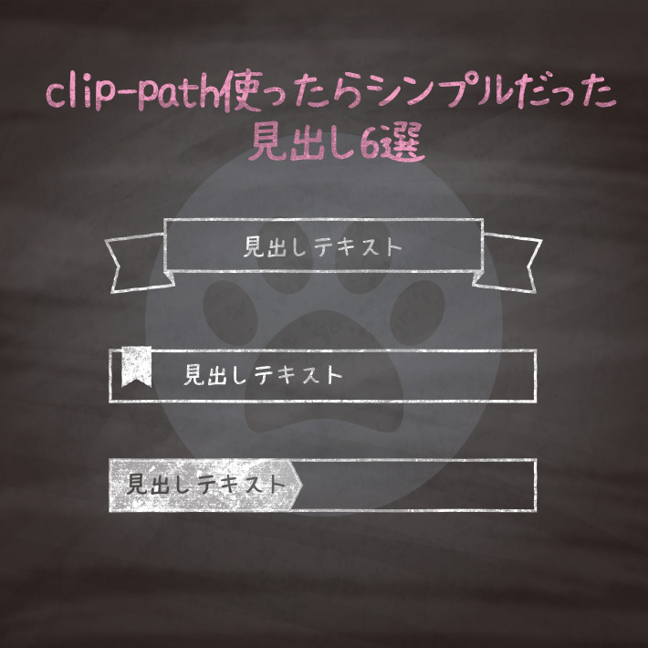
htmlとcssだけでできる見出し6選です。
過去に公開している見出しは、borderで三角形を無理やり作ったりしていましたが、
[clip-path]がほとんどのブラウザで対応可能になったので、[clip-path]で表現できるものはそちらに切り替えました。
色は好みで変えていただければ、かまいません。
また、基本htmlは<h1>タグを使用していますが、<h2>〜<h6>などにそのまま変更することができます。
紹介している<h1>タグには、クラス名(.cp_h1title)を付与していますが、こちらも
css部分を下記のように変更すれば、クラスをつけずに使用することも可能です。
h1 {cssの中身}色には6桁の16進数のカラーコード(#000000)も使えますが、他に、
なども使用できます。
RGBA値での指定は、サポートしていないブラウザだと、透明度だけが無視されるのではなく、色指定そのものが認識されずに無効となるので注意が必要です。

<h1 class="cp_h1title">見出しテキスト</h1>.cp_h1title {
background: #FFCA28;
color: #fff;
padding: 0 0 0 50px;
clip-path: polygon(50px 0, 100% 0%, 100% 100%, 0% 100%);
}<h1 class="cp_h1title">見出しテキスト</h1>.cp_h1title {
position: relative;
display: flex;
align-items: center;
padding-left: 1.5em;
}
.cp_h1title:before,
.cp_h1title:after {
position: absolute;
background: #1E88E5;
text-align: center;
}
.cp_h1title:before{
content: ".cp_h1title {
position: relative;
display: flex;
align-items: center;
padding-left: 1.5em;
}
.cp_h1title:before,
.cp_h1title:after {
position: absolute;
background: #1E88E5;
text-align: center;
}
.cp_h1title:before{
content: "\002713";/*チェックマーク*/
color: #fff;
font-size: 0.7em;
left: 0;
width: 1.5em;
height: 1.5em;
clip-path: circle(50% at 50% 50%);/*丸*/
}
.cp_h1title:after {
content: '';
left: 1em;
width: 8px;
height: 10px;
clip-path: polygon(0 0, 0% 100%, 100% 50%);/*三角形*/
}
2713";/*チェックマーク*/
color: #fff;
font-size: 0.7em;
left: 0;
width: 1.5em;
height: 1.5em;
clip-path: circle(50% at 50% 50%);/*丸*/
}
.cp_h1title:after {
content: '';
left: 1em;
width: 8px;
height: 10px;
clip-path: polygon(0 0, 0% 100%, 100% 50%);/*三角形*/
}<h1 class="cp_h1title">見出しテキスト</h1>.cp_h1title {
position: relative;
padding: 0 0 0 20px;
display: flex;
align-items: center;
}
.cp_h1title::after {
position: absolute;
content: '';
left: 0;
width: 18px;
height: 18px;
background-color: #da3c3c;
clip-path: polygon(50% 0%, 100% 50%, 50% 100%, 0% 50%);
}<h1 class="cp_h1title">見出しテキスト</h1>.cp_h1title {
position: relative;
border-bottom: 1px solid #00838F;
padding: 0 0 0 40px;
}
.cp_h1title::before,
.cp_h1title::after {
position: absolute;
content: '';
clip-path: circle(50% at 50% 50%);
}
.cp_h1title::before {/*大きい丸*/
top: 0.3em;
left: 0.2em;
width: 18px;
height: 18px;
background: rgba(0,131,143,.7);
}
.cp_h1title::after {/*小さい丸*/
top: 0.7em;
left: 0.5em;
width: 13px;
height: 13px;
background: rgba(0,131,143,.5);
}<h1 class="cp_h1title">見出しテキスト</h1>.cp_h1title {
position: relative;
color:#ffffff;
background: #90CAF9;
border-radius: 4px;
padding: 0 0 0 45px;
}
.cp_h1title:before{
position: absolute;
content: '';
top: -2px;
left: 15px;
width: 20px;/*リボンの幅*/
height: 30px;/*リボンの高さ*/
background: #1976D2;/*リボンの色*/
clip-path: polygon(0 0, 100% 0%, 100% 100%, 50% 80%, 0 100%);/*リボンの形*/
}<h1 class="cp_h1title"><span>見出しテキスト</span></h1>.cp_h1title {
color: #f8f8f8;
background-color: #303f9f;
background-image:
linear-gradient(45deg,#283593 25%, transparent 25%,transparent 50%, #283593 50%,#283593 75%, transparent 75%,transparent),
linear-gradient(-45deg,#283593 25%, transparent 25%,transparent 50%, #283593 50%,#283593 75%, transparent 75%,transparent);
background-size: 10px 10px;
box-shadow: 0 1px 1px 0 rgba(0, 0, 0, 0.2);
text-shadow: 0 1px 1px rgba(0, 0, 0, 0.2);
border-radius: 4px;
}
.cp_h1title span {
position: relative;
display: inline-block;
background: #4dd0e1;
clip-path: polygon(0% 0%, 95% 0%, 100% 50%, 95% 100%, 0% 100%);
border-radius: 4px 0px 0px 4px;
padding: 0 10px;
}
<h1 class="cp_h1title"><span>見出しテキスト</span></h1>.cp_h1title {
position: relative;
color: #f8f8f8;
background: #fa7d7a;
text-align: center;
width: fit-content;
margin: auto;
padding: 0px 10px;
box-shadow: 0 1px 2px 0px rgba(0, 0, 0, 0.3),
0 0px 0px 0px rgba(0, 0, 0, 0.7)inset;
}
.cp_h1title::before,
.cp_h1title::after {/*外側のリボン*/
position: absolute;
content: '';
bottom: -6px;
background: #fa7d7a;
width: 40px;
height: 40px;
clip-path: polygon(0% 0%, 100% 0%, 100% 100%, 0% 100%, 30% 50%);
z-index: -2;
}
.cp_h1title::before {
left: -32px;
transform: rotate(-4deg);
}
.cp_h1title::after {
right: -32px;
transform: rotate(4deg) scale(-1, 1);/*角度をつけて左右反転*/
}
.cp_h1title span::before,
.cp_h1title span::after {/*リボンの折り返しの影*/
position: absolute;
content: '';
top: 100%;
background: #f0470c;
width: 10px;
height: 5px;
clip-path: polygon(0% 0%, 100% 0%, 100% 100%);
z-index: -1;
}
.cp_h1title span::before {
left: 0;
}
.cp_h1title span::after {
right: 0;
transform: scale(-1, 1);/*左右反転*/
}
CSS3などで新たに追加された要素・装飾方法など、日々コードを書いていないと忘れてしまったり、ささっとプロトタイプを作る時などちょっとしたことに時間をかけている暇はない。そんな時に「あ〜、あれストックしときゃよかったなぁ」って困った自分用のストックブログです。カスタマイズなどがしやすいよう、昨今のweb制作に取り入れられる一般的なコードを中心に掲載しています。
@CopypetJp More Info