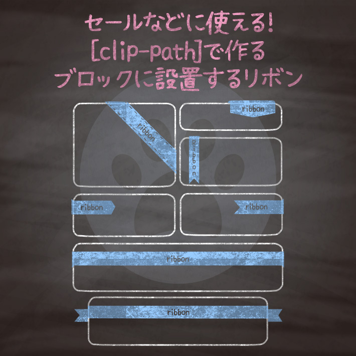
ECサイトなどでよくつかうセールやポイントとしてブロック(商品や画像など)につけるリボン。
こちらではステッチ付きやブロック上部の全体をおおう大きなリボンタイプなどをご用意。

<div class="cp_card">
コンテンツ
  <div class="cp_ribbon05_2">
    <div class="cp_ribbon">Ribbon</div>
  </div>
</div>
.cp_card {
position: relative;/*リボンをかけたいコンテンツボックスにセット*/
width: 300px;
height: 300px;
background: #ffffff;
margin: auto;
padding: 5px;
box-shadow: 0 0 5px rgba(0, 0, 0, 0.3);
}
/*リボンの部分*/
.cp_ribbon05_2 .cp_ribbon {
position: absolute;
top: 25px;
right: -40px;
width: 160px;
height: 30px;
background-color: #F48FB1;
color: #ffffff;
text-align: center;
line-height: 1.8;
box-shadow: 0 4px 6px rgba(0, 0, 0, 0.1);
clip-path: polygon(20% 0%, 80% 0%, 100% 100%, 0% 100%);
transform: rotate(45deg);
}
/*リボンのステッチ*/
.cp_ribbon05_2 .cp_ribbon::before {
position: absolute;
top: 2px;
content: '';
display: block;
width: 160px;
height: 24px;
border: 1px dashed #ffffff;
box-shadow: 0px 0px 0px 3px #F48FB1;
}
/*リボンの影の部分*/
.cp_ribbon05_2::before,
.cp_ribbon05_2::after {
position: absolute;
content: '';
width: 6px;
height: 6px;
background-color: #EC407A;
clip-path: polygon(0 0, 0 100%, 100% 100%);
}
.cp_ribbon05_2:before {
top: -6px;
right: 101px;
}
.cp_ribbon05_2:after {
top: 101px;
right: -6px;
}<div class="cp_card">
コンテンツ
<div class="cp_ribbon06_2">
<div class="cp_ribbon">Ribbon</div>
</div>
</div>.cp_card {
position: relative;/*リボンをかけたいコンテンツボックスにセット*/
width: 300px;
height: 300px;
background: #ffffff;
margin: auto;
padding: 5px;
box-shadow: 0 0 5px rgba(0, 0, 0, 0.3);
}
/*リボンの位置*/
.cp_ribbon06_2 {
position: absolute;
top: -6px;
right: 10px;
}
/*リボン全体の背景*/
.cp_ribbon06_2 .cp_ribbon {
position: relative;
display: block;
width: 90px;
font-size: 1em;
line-height: 1;
padding: 12px 0px 12px;
text-align: center;
color: #ffffff;
border-top-right-radius: 8px;
background: #4DD0E1;
clip-path: polygon(0% 0%, 100% 0, 100% 85%, 50% 100%, 0 85%);
}
/*リボンの影の部分*/
.cp_ribbon06_2::before,
.cp_ribbon06_2::after {
position: absolute;
content: '';
}
.cp_ribbon06_2::before {/*リボンの影上のラウンドの部分*/
top: 0;
left: -5px;
width: 5px;
height: 5px;
background: #4DD0E1;
}
.cp_ribbon06_2::after {/*リボンの影の半円の部分*/
top: -5px;
left: -10px;
width: 10px;
height: 10px;
background: #00ACC1;
clip-path: circle(50.0% at 50% 100%);
}<div class="cp_card">
コンテンツ
<div class="cp_ribbon07_2">
<div class="cp_ribbon">Ribbon</div>
</div>
</div>.cp_card {
position: relative;/*リボンをかけたいコンテンツボックスにセット*/
width: 300px;
height: 300px;
background: #ffffff;
margin: auto;
padding: 5px;
box-shadow: 0 0 5px rgba(0, 0, 0, 0.3);
}
/*リボンの位置*/
.cp_ribbon07_2 {
position: absolute;
top: -6px;
left: 15px;
}
/*リボンの設定*/
.cp_ribbon07_2 .cp_ribbon {
position: relative;
display: flex;
align-items: center;
writing-mode:vertical-rl;
text-orientation: upright;
width: 40px;
padding: 10px 0px 20px;
color: #ffffff;
background: #FFC107;
border-top-left-radius: 3px;
clip-path: polygon(0% 0%, 100% 0, 100% 100%, 50% 90%, 0% 100%);
}
/*リボンの影部分*/
.cp_ribbon07_2:before {
position: absolute;
content: '';
top: 0px;
right: -6px;
width: 6px;
height: 6px;
background-color: #FF8F00;
clip-path: polygon(0 0, 0% 100%, 100% 100%);
}<div class="cp_card">
コンテンツ
<div class="cp_ribbon08_2">
<div class="cp_ribbon">Ribbon</div>
</div>
</div>.cp_card {
position: relative;/*リボンをかけたいコンテンツボックスにセット*/
width: 300px;
height: 300px;
background: #ffffff;
margin: auto;
padding: 5px;
box-shadow: 0 0 5px rgba(0, 0, 0, 0.3);
}
/*リボンの位置*/
.cp_ribbon08_2 {
position: absolute;
top: 20px;
left: -8px;
}
/*リボン内のテキスト*/
.cp_ribbon08_2 .cp_ribbon {
position: relative;
display: flex;
align-items: center;
width: 100%;
height: 40px;
padding: 0 5px 0 10px;
color: #ffffff;
background: #4CAF50;
clip-path: polygon(0% 0%, 85% 0%, 100% 50%, 85% 100%, 0% 100%);
}
.cp_ribbon08_2:before {/*リボンの影部分*/
position: absolute;
content: '';
top: -8px;
left: 0;
width: 8px;
height: 8px;
background-color: #2E7D32;
clip-path: polygon(100% 0, 0% 100%, 100% 100%);
}<div class="cp_card">
コンテンツ
<div class="cp_ribbon09_2">
<div class="cp_ribbon">Ribbon</div>
</div>
</div>.cp_card {
position: relative;/*リボンをかけたいコンテンツボックスにセット*/
width: 300px;
height: 300px;
background: #ffffff;
margin: auto;
padding: 5px;
box-shadow: 0 0 5px rgba(0, 0, 0, 0.3);
}
/*リボンの位置*/
.cp_ribbon09_2 {
position: absolute;
top: 15px;
right: -6px;
}
.cp_ribbon09_2 .cp_ribbon {
display: flex;
align-items: center;
height: 40px;
padding: 0 10px 0 20px;
color: #ffffff;
background: #21759a;
clip-path: polygon(0 0, 100% 0%, 100% 100%, 0 100%, 15% 50%);
}
/*リボンの影部分*/
.cp_ribbon09_2:before {
position: absolute;
content: '';
top: -6px;
right: 0;
width: 6px;
height: 6px;
background: #14455b;
clip-path: polygon(0 0, 0% 100%, 100% 100%);
}<div class="cp_card">
コンテンツ
<div class="cp_ribbon10_2">
<div class="cp_ribbon">Ribbon</div>
</div>
</div>.cp_card {
position: relative;/*リボンをかけたいコンテンツボックスにセット*/
width: 300px;
height: 300px;
background: #ffffff;
margin: auto;
padding: 35px 5px 0;
border: 2px solid #9575CD;
box-shadow: 0 0 5px rgba(0, 0, 0, 0.3);
}
/*リボンの位置*/
.cp_ribbon10_2 {
position: absolute;
top: -6px;
left: -6px;
}
/*リボンの設定*/
.cp_ribbon10_2 .cp_ribbon {
padding: 5px 30px 5px 10px;
color: #ffffff;
background-color: #9575CD;
clip-path: polygon(0 0, 100% 0%, 80% 100%, 0% 100%);
}
/*リボンの影*/
.cp_ribbon10_2::before {
position: absolute;
content: '';
top: 100%;
left: 0;
width: 6px;
height: 6px;
background-color: #5E35B1;
clip-path: polygon(0 0, 100% 100%, 100% 0);
}<div class="cp_card">
コンテンツ
<div class="cp_ribbon11_2">
<div class="cp_ribbon">Ribbon</div>
</div>
</div>.cp_card {
position: relative;/*リボンをかけたいコンテンツボックスにセット*/
width: 300px;
height: 300px;
background: #ffffff;
margin: auto;
padding: 60px 5px 0;
box-shadow: 0 0 5px rgba(0, 0, 0, 0.3);
}
/*リボンの設定*/
.cp_ribbon11_2 {
line-height: 50px;
position: absolute;
top: 15px;
display: flex;
justify-content: center;
align-items: center;
width: calc(100% + 10px);
height: 40px;
margin-right: -10px;
margin-left: -10px;
text-align: center;
color: #ffffff;
background: #2196F3;
}
/*リボンの影の共通設定*/
.cp_ribbon11_2:before,
.cp_ribbon11_2:after {
position: absolute;
top: 100%;
content: '';
width: 6px;
height: 6px;
background-color: #1565C0;
clip-path: polygon(0 0, 100% 100%, 100% 0);
}
.cp_ribbon11_2:before {
left: 0;
}
.cp_ribbon11_2:after {
right: 0;
transform: scale(-1, 1);/*左右反転*/
}<div class="cp_card">
コンテンツ
<div class="cp_ribbon12_2">
<div class="cp_ribbon">Ribbon</div>
</div>
</div>.cp_card {
position: relative;/*リボンをかけたいコンテンツボックスにセット*/
width: 300px;
height: 300px;
background: #ffffff;
margin: auto;
padding: 70px 5px 0;
box-shadow: 0 0 5px rgba(0, 0, 0, 0.3);
}
/*リボンの設定*/
.cp_ribbon12_2 {
position: absolute;
top: 15px;
left: -10px;
width: calc(100% + 20px);
}
/*リボンの帯部分*/
.cp_ribbon12_2 .cp_ribbon {
position: relative;
display: flex;
justify-content: center;
align-items: center;
height: 40px;
color: #ffffff;
background: #F48FB1;
z-index: 0;
}
/*カットされたリボンの共通設定*/
.cp_ribbon12_2:before,
.cp_ribbon12_2:after {
position: absolute;
bottom: -10px;
content: '';
width: 40px;
height: 40px;
background-color: #F06292;
clip-path: polygon(0 0, 100% 0%, 100% 100%, 0 100%, 35% 50%);
z-index: -1;
}
.cp_ribbon12_2:before {
left: -30px;
}
.cp_ribbon12_2:after {
right: -30px;
transform: scale(-1, 1);/*左右反転*/
}
/*リボンの影の共通設定*/
.cp_ribbon12_2 .cp_ribbon:before,
.cp_ribbon12_2 .cp_ribbon:after {
position: absolute;
top: 100%;
content: '';
width: 10px;
height: 10px;
background-color: #C2185B;
clip-path: polygon(0 0, 100% 100%, 100% 0);
}
.cp_ribbon12_2 .cp_ribbon:before {
left: 0;
}
.cp_ribbon12_2 .cp_ribbon:after {
right: 0;
transform: scale(-1, 1);/*左右反転*/
}
コピペでできる!cssとhtmlだけのコーナーにつけるシンプルなリボンデザイン4種 | copypet.jp|パーツで探す、web制作に使えるコピペサイト。
ECサイトなどでよくつかうセールやポイントとしてブロック(商品や画像など)の四隅につけるリボン。 こちらではそれぞれ右上下・左上下の四隅につけるシンプルなデザインをご紹介。…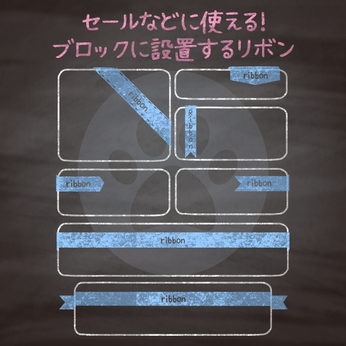
コピペでできる!cssとhtmlだけのブロックの一部につけるリボンデザイン8種 - コピペっと copypet.jp|パーツで探す、web制作に使えるコピペサイト。
ECサイトなどでよくつかうセールやポイントとしてブロック(商品や画像など)につけるリボン。 こちらではステッチ付きやブロック上部の全体をおおう大きなリボンタイプなどをご用意。……
CSS3などで新たに追加された要素・装飾方法など、日々コードを書いていないと忘れてしまったり、ささっとプロトタイプを作る時などちょっとしたことに時間をかけている暇はない。そんな時に「あ〜、あれストックしときゃよかったなぁ」って困った自分用のストックブログです。カスタマイズなどがしやすいよう、昨今のweb制作に取り入れられる一般的なコードを中心に掲載しています。
@CopypetJp More Info