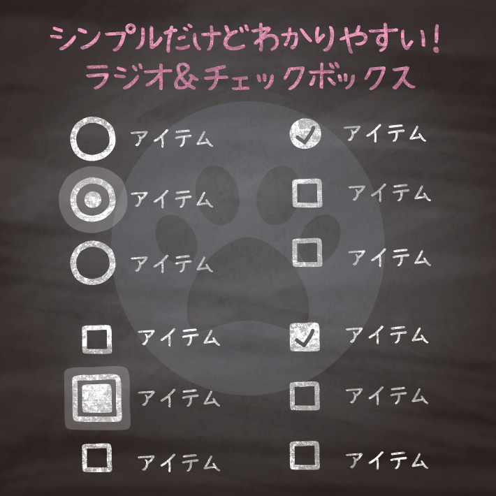
フォームはサイトにはかならず必要になってくるアイテムですが、わかりやすく間違えにくいものにしたいですよね。
ラジオボタン[input type=”radio”]とチェックボックス[input type=”checkbox”]のデザインで、
シンプルだけどわかりやすいデザインを集めました。

<div class="cp_ipradio10">
  <label>
    <input type="radio" name="cpipr10" checked>
    <span class="option-input"></span>
    <span class="text">ネコ</span>
  </label>
  <label>
    <input type="radio" name="cpipr10">
    <span class="option-input"></span>
    <span class="text">イヌ</span>
  </label>
  <label>
    <input type="radio" name="cpipr10">
    <span class="option-input"></span>
    <span class="text">ウサギ</span>
  </label>
</div>
.cp_ipradio10 {
margin: 6em 2em;
}
/*通常時のラベルの設定*/
.cp_ipradio10 label {
position: relative;
display: flex;
justify-content: flex-start;
align-items: center;
margin: 12px 0;
cursor: pointer;
}
/*デフォルトのラジオボタンの設定*/
.cp_ipradio10 input[type=radio] {
opacity: 0;
}
/* ラジオボタンの設定 */
.cp_ipradio10 .option-input {
position: relative;
width: 16px;
height: 16px;
border: 2px solid #666666;
border-radius: 50%;
margin-right: 16px;
}
.cp_ipradio10 .option-input::before,
.cp_ipradio10 .option-input::after {
position: absolute;
content: '';
display: block;
width: inherit;
height: inherit;
border-radius: inherit;
transform: scale(0);
transform-origin: center center;
}
.cp_ipradio10 .option-input:before {
background: #666666;
opacity: 0;
transition: .3s;
}
.cp_ipradio10 .option-input::after {
background: #da3c41;
opacity: .4;
transition: .6s;
}
/* テキスト設定 */
.cp_ipradio10 .text {
color: #666666;
}
/*checked時のサイズと色の設定*/
.cp_ipradio10 input:checked + .option-input::before {
opacity: 1;
transform: scale(.6);
}
/*focus・hover時のサイズと色の設定*/
.cp_ipradio10 input:hover + .option-input,
.cp_ipradio10 input:focus + .option-input {
border: 2px solid #da3c41;
}
.cp_ipradio10 input:hover + .option-input:before,
.cp_ipradio10 input:focus + .option-input:before {
background: #da3c41;
}
.cp_ipradio10 input:hover ~ .text {
color: #da3c41;
}
.cp_ipradio10 input:focus + .option-input::after,
.cp_ipradio10 input:active + .option-input::after {
opacity: .1;
transform: scale(2.6);
}
<div class="inputradio11">
  <label for="input1">ネコ</label>
  <input id="input1" name="radio" type="radio" />
  <label for="input2">イヌ</label>
  <input id="input2" name="radio" type="radio" />
  <label for="input3">ウサギ</label>
  <input id="input3" name="radio" type="radio" />
  <label for="input4">リス</label>
  <input id="input4" name="radio" type="radio" />
  <label for="input5">トリ</label>
  <input id="input5" name="radio" type="radio" />
  <span class="slider"></span>
</div>
.inputradio11 {
position:relative;
width:50%;
margin:0 auto;
display: flex;
flex-direction: column;
}
/*デフォルトのラジオボタンの設定*/
.inputradio11 input[type='radio'] {
display: none;
}
.inputradio11 label{
position: relative;
display: flex;
align-items: center;
cursor:pointer;
margin-bottom: 30px;
padding-left: 40px;
}
.inputradio11 label::before {
position: absolute;
left: 0;
content: '';
display: block;
width: 30px;
height: 30px;
background:rgba(218,60,65,.5);
border-radius:50%;
cursor:pointer;
}
.inputradio11 .slider {
position: absolute;
left: 0;
top: 0;
width: 20px;
height: 20px;
margin: 2px 0 0 5px;
background: #da3c41;
border-radius: 50%;
animation-duration: .3s;
transition: 0.2s top .05s ease-in-out;
}
/*クリックした時に下に動く*/
#input1:checked ~ .slider{ animation-name: input1; top:0; }
#input2:checked ~ .slider{ animation-name: input2; top:20%; }
#input3:checked ~ .slider{ animation-name: input3; top:40%; }
#input4:checked ~ .slider{ animation-name: input4; top:60%; }
#input5:checked ~ .slider{ animation-name: input5; top:80%; }
/*クリックした時のアニメーション*/
@keyframes input1{ 30%, 70% { transform:scale(0.5); } }
@keyframes input2{ 30%, 70% { transform:scale(0.5); } }
@keyframes input3{ 30%, 70% { transform:scale(0.5); } }
@keyframes input4{ 30%, 70% { transform:scale(0.5); } }
@keyframes input5{ 30%, 70% { transform:scale(0.5); } }<div class="cp_ipcheck10">
<label>
<input type="checkbox" name="cpipr10" checked>
<span class="option-input"></span>
<span class="text">ネコ</span>
</label>
<label>
<input type="checkbox" name="cpipr10">
<span class="option-input"></span>
<span class="text">イヌ</span>
</label>
<label>
<input type="checkbox" name="cpipr10">
<span class="option-input"></span>
<span class="text">ウサギ</span>
</label>
</div>.cp_ipcheck10 {
margin: 6em 2em;
}
/*通常時のラベルの設定*/
.cp_ipcheck10 label {
position: relative;
display: flex;
justify-content: flex-start;
align-items: center;
margin: 12px 0;
cursor: pointer;
}
/*デフォルトのチェックボックスの設定*/
.cp_ipcheck10 input[type=checkbox] {
opacity: 0;
}
/* チェックボックスの設定 */
.cp_ipcheck10 .option-input {
position: relative;
width: 16px;
height: 16px;
border: 2px solid #666666;
border-radius: 30%;
margin-right: 16px;
}
.cp_ipcheck10 .option-input::before,
.cp_ipcheck10 .option-input::after {
position: absolute;
content: '';
display: block;
width: inherit;
height: inherit;
border-radius: inherit;
transform: scale(0);
transform-origin: center center;
}
.cp_ipcheck10 .option-input:before {
background: #666666;
opacity: 0;
transition: .3s;
}
.cp_ipcheck10 .option-input::after {
background: #da3c41;
opacity: .4;
transition: .6s;
}
/* テキスト設定 */
.cp_ipcheck10 .text {
color: #666666;
}
/*checked時のサイズと色の設定*/
.cp_ipcheck10 input:checked + .option-input::before {
opacity: 1;
transform: scale(.6);
}
/*focus・hover時のサイズと色の設定*/
.cp_ipcheck10 input:hover + .option-input,
.cp_ipcheck10 input:focus + .option-input {
border: 2px solid #da3c41;
}
.cp_ipcheck10 input:hover + .option-input:before,
.cp_ipcheck10 input:focus + .option-input:before {
background: #da3c41;
}
.cp_ipcheck10 input:hover ~ .text {
color: #da3c41;
}
.cp_ipcheck10 input:focus + .option-input::after,
.cp_ipcheck10 input:active + .option-input::after {
opacity: .1;
transform: scale(2.6);
}<div class="inputcheck11">
<label>
<input type="checkbox" name="check" checked />
<span class="label-text">ネコ</span>
</label>
<label>
<input type="checkbox" name="check" />
<span class="label-text">イヌ</span>
</label>
<label>
<input type="checkbox" name="check" disabled />
<span class="label-text">ウサギ</span>
</label>
</div>.inputcheck11 input[type=checkbox] {
display: none;
}
.inputcheck11 label {
color: #666;
cursor: pointer;
}
.inputcheck11 .label-text {
position: relative;
display: flex;
align-items: center;
padding-left: 30px;
}
/*チェックボックスの設定*/
.inputcheck11 .label-text::before {
position: absolute;
left: 0;
content: '';
width: 20px;
height: 20px;
border: 1px solid #666;
border-radius: 3px;
}
.inputcheck11 input[type=checkbox]:checked + .label-text::before {
position: absolute;
left: 0;
content: '';
width: 20px;
height: 20px;
border-radius: 3px;
background: #06a3e9;
border: 1px solid #06a3e9;
animation: click-wave 180ms ease-in;
}
/*checked時のチェックボックスのチェックマーク*/
.inputcheck11 input[type=checkbox]:checked + .label-text::after {
position: absolute;
left: 4px;
content: "✔︎";
color: #ffffff;
}
/*無効の設定*/
.inputcheck11 input[type=checkbox]:disabled + .label-text {
color: #aaa;
cursor: not-allowed;
}
/*クリックした時のアニメーション*/
@keyframes click-wave {
0% {
transform: scale(0);
}
90% {
transform: scale(1.4);
}
100% {
transform: scale(1);
}
}<div class="cp_ipcheck12">
<label><input type="checkbox" name="cpipr12">ネコ</label>
<label><input type="checkbox" name="cpipr12">イヌ</label>
<label><input type="checkbox" name="cpipr12">ウサギ</label>
</div>.cp_ipcheck12 {
margin: 6em 2em;
}
.cp_ipcheck12 label {
display: flex;
align-items: center;
cursor: pointer;
}
/*通常時のチェックボックスの設定*/
.cp_ipcheck12 input[type="checkbox"] {
position: relative;
display: flex;
align-items: center;
justify-content: center;
width: 22px;
height: 22px;
border: 2px solid #666666;
cursor: pointer;
transition: .5s ease;
/*デフォルト値を無効に*/
appearance: none;
outline: none;
}
.cp_ipcheck12 input[type="checkbox"]:after {
position: absolute;
content: '';
transform-origin: center center;
transition: .5s ease;
opacity: 0;
}
/*checked時の設定*/
.cp_ipcheck12 input[type="checkbox"]:checked {
border-radius: 100%;
background-color: #da3c41;
border: 2px solid #da3c41;
}
.cp_ipcheck12 input[type="checkbox"]:checked:after {
content: '✔︎';
color: #ffffff;
opacity: 1;
transform: scale(1, 1);
transition: opacity .5s ease;
}
コピペでできる!cssとhtmlのみでフォームのラジオボタンをわかりやすくするデザイン10選 | copypet.jp|パーツで探す、web制作に使えるコピペサイト。
フォームはサイトにはかならず必要になってくるアイテムですが、わかりやすく間違えにくいものにしたいですよね。 ラジオボタン[input type="radio"]のデザインにエフェクトを追加することで、 今までよりワンランク上のわかりやすさを手に入れましょう。…
コピペでできる!cssとhtmlのみでフォームのチェックボックスをわかりやすくするデザイン10選 | copypet.jp|パーツで探す、web制作に使えるコピペサイト。
フォームはサイトにはかならず必要になってくるアイテムですが、わかりやすく間違えにくいものにしたいですよね。 チェックボックス[input type="checkbox"]のデザインにエフェクトを追加することで、 今までよりワンランク上のわかりやすさを手に入れましょう。…
CSS3などで新たに追加された要素・装飾方法など、日々コードを書いていないと忘れてしまったり、ささっとプロトタイプを作る時などちょっとしたことに時間をかけている暇はない。そんな時に「あ〜、あれストックしときゃよかったなぁ」って困った自分用のストックブログです。カスタマイズなどがしやすいよう、昨今のweb制作に取り入れられる一般的なコードを中心に掲載しています。
@CopypetJp More Info