htmlとcssだけでできるカウント付きリストデザイン10選です。
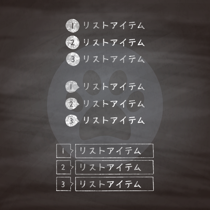
いわゆる[ol]のようにカウンタを利用して作るカウント付きのリストデザインです。
cssでカウンタを利用する場合初期値をリセットしなければなりません。
リセット後には要素にカウンタの値を加えるため、 counter() 関数を使用します。
<ol class="cp_listsample">
	<li>item</li>
	<li>item</li>
	<li>item</li>
	<li>item</li>
</ol>
ol.cp_listsample {
counter-reset: number; /* section のカウンタを 0 にセット */
}
ol.cp_listsample li:before {
counter-increment: number; /* number カウンタを増加 */
content: counter(number); /* カウンタを表示 */
}また、文字列を付与させることも可能です。
counter-reset: カウンタ名(任意);
counter-increment: カウンタ名(上と同じカウンタ名);
content:counter(上と同じカウンタ名) “付与したい文字”;
ol {
	counter-reset: number; /* カウンタ名(任意) */
}
ol li:before {
	counter-increment: number; /* カウンタ名(上と同じカウンタ名) */
	content: counter(number) "付与したい文字"; /* カウンタを表示 */
}カウンタを入れ子にする場合は自動的に子要素で生成されますが、
counters() 関数を使って、入れ子となったカウンタの異なる階層の間に、文字列を挿入することができます。
ol {
	counter-reset: number;                /* 各 ol 要素に新しいインスタンスの number カウンタを生成 */
	list-style-type: none;
}
li:before {
	counter-increment: number;            /* number カウンタのこのインスタンスのみ増加 */
	content: counters(number, ".") " ";   /* "." で区切られた number カウンタのインスタンスの値を付加 */
}
<ol class="cp_clist">
  <li>css</li>
  <li>html</li>
  <li>copy</li>
  <li>easy</li>
</ol>
ol.cp_clist {
padding: 0;
counter-reset:cp_clist; /*数字をリセット*/
list-style-type: none;
}
ol.cp_clist li {
position: relative;
margin: 0 0 0 30px;
}
ol.cp_clist li::before {
position: absolute;
display: flex;
justify-content: center;
align-items: center;
/* カウントさせる */
counter-increment: cp_clist;
content: counter(cp_clist);
/*装飾*/
background: #F4511E;
color: #fff;
width: 20px;
height: 20px;
border-radius: 50%;
/*位置の調整*/
margin-top: 2px;
margin-left: -30px;
}<ol class="cp_clist">
<li>css</li>
<li>html</li>
<li>copy</li>
<li>easy</li>
</ol>ol.cp_clist {
padding: 0;
counter-reset:cp_clist; /*数字をリセット*/
list-style-type: none;
}
ol.cp_clist li {
position: relative;
margin: 0 0 0 30px;
}
ol.cp_clist li::before {
position: absolute;
display: flex;
justify-content: center;
align-items: center;
/* カウントさせる */
counter-increment: cp_clist;
content: counter(cp_clist);
/*装飾*/
background: #03A9F4;
color: #fff;
border-radius: 50%;
width: 20px;
height: 20px;
/*位置の調整*/
padding: 0;
margin: 2px 0 0 -30px;
}
ol.cp_clist li::after {
position: absolute;
top: 7px;
left: -15px;
content: '';
border-top: 5px solid transparent;
border-bottom: 5px solid transparent;
border-left: 10px solid #03A9F4;
}<ol class="cp_clist">
<li>css</li>
<li>html</li>
<li>copy</li>
<li>easy</li>
</ol>ol.cp_clist {
padding: 0;
counter-reset:cp_clist; /*数字をリセット*/
list-style-type: none;
}
ol.cp_clist li{
position:relative;
margin: 0 0 0 25px;
}
ol.cp_clist li::before {
position: absolute;
display: flex;
justify-content: center;
align-items: center;
/* カウントさせる */
counter-increment: cp_clist;
content: counter(cp_clist);
/*装飾*/
background: #4CAF50;
color:#fff;
height: 20px;
width: 20px;
border-radius: 50% 1%;
/*位置の調整*/
padding: 0;
margin: 2px 0 0 -25px;
}<ol class="cp_clist">
<li>css</li>
<li>html</li>
<li>copy</li>
<li>easy</li>
</ol>ol.cp_clist {
padding: 0;
counter-reset:cp_clist; /*数字をリセット*/
list-style-type: none;
}
ol.cp_clist li {
position:relative;
background: #F8BBD0;
padding: 0 5px;
margin: 0 0 10px 30px;
}
ol.cp_clist li:before {
position: absolute;
display: flex;
justify-content: center;
align-items: center;
/* カウントさせる */
counter-increment: cp_clist;
content: counter(cp_clist);
/*装飾*/
font-weight: bold;
color: #fff;
background: #F06292;
width: 20px;
height: 20px;
text-align: center;
/*位置の調整*/
padding: 0;
margin: 2px 0 0 -30px;
}
ol.cp_clist li:after {
position: absolute;
top: 9px;
left: -7px;
content:'';
border-top: 4px solid transparent;
border-bottom: 4px solid transparent;
border-left: 7px solid #F06292;
}<ol class="cp_clist">
<li>css</li>
<li>html</li>
<li>copy</li>
<li>easy</li>
</ol>ol.cp_clist {
padding: 0;
counter-reset:cp_clist; /*数字をリセット*/
list-style-type: none;
}
ol.cp_clist li {
position:relative;
border: solid 1px #00BCD4;
border-radius:20px;
min-height: 30px;
padding:0 20px 0 40px;
margin: 0 0 7px 0px;
transition: 0.3s;
}
ol.cp_clist li::before {
position: absolute;
top: 0px;
left: 0px;
display: flex;
justify-content: center;
align-items: center;
/* カウントさせる */
counter-increment: cp_clist;
content: counter(cp_clist);
/*装飾*/
background: #00BCD4;
color: #fff;
width: 30px;
height: 30px;
border-radius: 50%;
/*位置の調整*/
padding: 0;
margin: 0 0 0 0px;
}
ol.cp_clist li:hover{
background: #00BCD4;
color: #fff;
}
ol.cp_clist li:hover:before {
background: #fff;
color: #00BCD4;
}<ol class="cp_clist">
<li>css</li>
<li>html</li>
<li>copy</li>
<li>easy</li>
</ol>ol.cp_clist {
padding: 0;
counter-reset:cp_clist; /*数字をリセット*/
list-style-type: none;
}
ol.cp_clist li {
position: relative;
padding: 0 5px;
margin: 0 0 5px 0px;
min-height: 28px;
background: #FFAB91;
color: #333;
transition: all .3s ease-out;
}
ol.cp_clist li::before {
position: absolute;
top: 0;
left: -10px;
display: flex;
justify-content: center;
align-items: center;
/* カウントさせる */
counter-increment: cp_clist;
content: counter(cp_clist);
/*装飾*/
color: #fff;
background: #FF5722;
height: 28px;
width: 28px;
/*位置の調整*/
padding: 0;
margin: 0px 0 0 -30px;
}
ol.cp_clist li::after {
content: '';
position: absolute;
top: 14px;
left: -28px;
margin-top: -6px;
border: 6px solid transparent;
transition: all .3s ease-out;
}
/*hover時の設定*/
ol.cp_clist li:hover {
background: #FFCCBC;
}
ol.cp_clist li:hover::after {
left: -6px;
border-left-color: #FF5722;
}<ol class="cp_clist">
<li>css</li>
<li>html</li>
<li>copy</li>
<li>easy</li>
</ol>ol.cp_clist {
padding: 0;
counter-reset:cp_clist; /*数字をリセット*/
list-style-type: none;
}
ol.cp_clist li {
position: relative;
min-height: 30px;
padding: 2px 10px 2px 30px;
margin: 0 0 10px 0;
background: #9FA8DA;
color: #333;
border-radius: 5px;
transition: all .3s ease-out;
}
ol.cp_clist li::before{
position: absolute;
top: 0;
left: 0;
display: flex;
justify-content: center;
align-items: center;
/* カウントさせる */
counter-increment: cp_clist;
content: counter(cp_clist);
/*装飾*/
background: #3F51B5;
color: #fff;
height: 28px;
width: 28px;
border: 3px solid #fff;
border-radius: 50%;
/*位置の調整*/
padding: 0;
margin: 0 0 0 -20px;
transition: all .3s ease-out;
}
/*hover時の設定*/
ol.cp_clist li:hover{
background: #C5CAE9;
}
ol.cp_clist li:hover::before{
left: 10px;
transform: rotate(360deg);
}<ol class="cp_clist">
<li>css</li>
<li>html</li>
<li>copy</li>
<li>easy</li>
</ol>ol.cp_clist {
padding: 0;
counter-reset:cp_clist; /*数字をリセット*/
list-style-type: none;
}
ol.cp_clist li {
position: relative;
display: flex;
align-items: center;
margin: 10px;
padding: 0 10px 0 40px;
min-height: 30px;
border: 1px dotted #f1c6c6;
transition: 0.3s;
}
ol.cp_clist li:nth-child(4n+2){
border-color:#8cd9bc;
}
ol.cp_clist li:nth-child(4n+3){
border-color:#9575CD;
}
ol.cp_clist li:nth-child(4n+4){
border-color:#f8e5ab;
}
ol.cp_clist li:before {
position: absolute;
left: 0;
display: flex;
justify-content: center;
align-items: center;
/* カウントさせる */
counter-increment: cp_clist;
content: counter(cp_clist);
/*装飾*/
color: #fff;
width: 30px;
height: 30px;
}
ol.cp_clist li:nth-child(4n+1):before{
background: #F06292;
}
ol.cp_clist li:nth-child(4n+2):before{
background: #4DB6AC;
}
ol.cp_clist li:nth-child(4n+3):before{
background: #9575CD;
}
ol.cp_clist li:nth-child(4n+4):before{
background: #FFB74D;
}
/*hover時の設定*/
ol.cp_clist li:hover {
color:#fff;
}
ol.cp_clist li:nth-child(4n+1):hover{
background: #F06292;
}
ol.cp_clist li:nth-child(4n+1):hover:before{
background: #fff;
color: #F06292;
}
ol.cp_clist li:nth-child(4n+2):hover{
background: #4DB6AC;
}
ol.cp_clist li:nth-child(4n+2):hover:before{
background: #fff;
color: #4DB6AC;
}
ol.cp_clist li:nth-child(4n+3):hover{
background: #9575CD;
}
ol.cp_clist li:nth-child(4n+3):hover:before{
background: #fff;
color: #9575CD;
}
ol.cp_clist li:nth-child(4n+4):hover{
background: #FFB74D;
}
ol.cp_clist li:nth-child(4n+4):hover:before{
background: #fff;
color: #FFB74D;
}<ol class="cp_clist">
<li>css</li>
<li>html</li>
<li>copy</li>
<li>easy</li>
</ol>ol.cp_clist {
padding: 0;
counter-reset:cp_clist; /*数字をリセット*/
list-style-type: none;
}
ol.cp_clist li {
position: relative;
padding: 0 0 0 40px;
margin: 0 0 20px -40px;
color: #333;
}
ol.cp_clist li::before {
position: absolute;
top: 0;
left: 0;
display: flex;
justify-content: center;
align-items: center;
/* カウントさせる */
counter-increment: cp_clist;
content: counter(cp_clist);
/*装飾*/
background: #F8BBD0;
height: 20px;
width: 20px;
font: italic bold 1em/1em Georgia, Serif;
border: .1em solid rgba(0,0,0,.05);
border-radius: 20px;
/*位置の調整*/
padding: 0;
transition: all .2s ease-out;
}
/*hover時の設定*/
ol.cp_clist li:hover::before {
background-color: #F06292;
border-color: rgba(0,0,0,.08);
border-width: 4px;
color: #fff;
transform: scale(1.5);
transform-origin: bottom;
}<ol class="cp_clist">
<li>css</li>
<li>html</li>
<li>copy</li>
<li>easy</li>
</ol>ol.cp_clist {
padding: 0;
counter-reset:cp_clist; /*数字をリセット*/
list-style-type: none;
}
ol.cp_clist li {
position: relative;
padding-left: 50px;
margin: 0;
}
ol.cp_clist li::before {
position: absolute;
top: 0;
left: 0;
/* カウントさせる */
counter-increment: cp_clist;
content: 'No.' counter(cp_clist) ' :';
}
ol.cp_clist li:nth-of-type(1)::before {
color: #E91E63;
}
ol.cp_clist li:nth-of-type(2)::before {
color: #4CAF50;
}
ol.cp_clist li:nth-of-type(3)::before {
color: #FF9800;
}
ol.cp_clist li:nth-of-type(4)::before {
color: #2196F3;
}
CSS3などで新たに追加された要素・装飾方法など、日々コードを書いていないと忘れてしまったり、ささっとプロトタイプを作る時などちょっとしたことに時間をかけている暇はない。そんな時に「あ〜、あれストックしときゃよかったなぁ」って困った自分用のストックブログです。カスタマイズなどがしやすいよう、昨今のweb制作に取り入れられる一般的なコードを中心に掲載しています。
@CopypetJp More Info