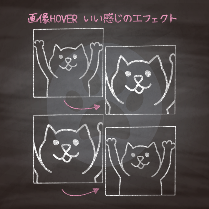
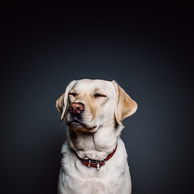
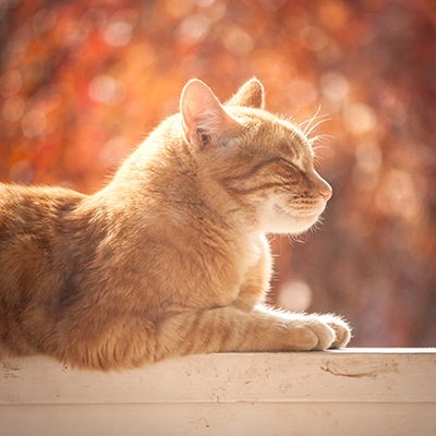
cssとhtmlのみで画像のホバー時のいい感じのエフェクトを集めました。
画像の雰囲気に合わせてエフェクトを組み合わせると、よりいい感じになります。
ベンダープレフィックスについては適宜外してください。
また、アニメーションは「transition-timing-function」を設定することで、時間ごとの変化量を変更することができます。
Ceaser – CSS Easing Animation Tool – Matthew Lein
Ceaser is an interactive CSS easing animation tool. It lets you build any kind of ease you want, and comes with many of the Penner Easing Equations.…

<div class="cp_imghover cp_zoomin">
	<img src="img.jpg">
</div>
.cp_imghover {
overflow: hidden;
width: 400px;
height: 400px;
margin: 2em auto;
border: 10px solid #ffffff;
box-shadow: 0 0 5px #cccccc;
cursor: pointer;
}
/*zoomin*/
.cp_zoomin img {
width: 400px;
height: 400px;
-webkit-transition: all 1s ease;
transition: all 1s ease;
}
.cp_zoomin img:hover {
-webkit-transform: scale(1.5,1.5);
transform: scale(1.5,1.5);
}
<div class="cp_imghover cp_zoomout">
	<img src="img.jpg">
</div>
.cp_imghover {
overflow: hidden;
width: 400px;
height: 400px;
margin: 20px auto;
border: 10px solid #ffffff;
box-shadow: 0 0 5px #cccccc;
cursor: pointer;
}
/*zoomout*/
.cp_zoomout img {
width: 600px;
height: 600px;
margin-left: 0;
-webkit-transition: all 1s ease;
transition: all 1s ease;
-webkit-transform: scale(1.5,1.5) translateX(65px);
transform: scale(1.5,1.5) translateX(65px);
}
.cp_zoomout img:hover {
width: 400px;
height: 400px;
-webkit-transform: scale(1,1) translateX(0px);
transform: scale(1,1) translateX(0px);
}
<div class="cp_imghover cp_rotate">
	<img src="img.jpg">
</div>
.cp_imghover {
overflow: hidden;
width: 400px;
height: 400px;
margin: 20px auto;
border: 10px solid #ffffff;
box-shadow: 0 0 5px #cccccc;
cursor: pointer;
}
/*Rotate*/
.cp_rotate img {
-webkit-transform: rotate(15deg) scale(1.4);
transform: rotate(15deg) scale(1.4);
-webkit-transition: 0.5s ease-in-out;
transition: 0.5s ease-in-out;
}
.cp_rotate img:hover {
-webkit-transform: rotate(0) scale(1);
transform: rotate(0) scale(1);
}
<div class="cp_imghover cp_sidepan">
	<img src="img.jpg">
</div>
.cp_imghover {
overflow: hidden;
width: 400px;
height: 400px;
margin: 20px auto;
border: 10px solid #ffffff;
box-shadow: 0 0 5px #cccccc;
cursor: pointer;
}
/*sidepan*/
.cp_sidepan img {
margin-left: 0;
-webkit-transition: margin 1s ease;
transition: margin 1s ease;
}
.cp_sidepan img:hover {
margin-left: -250px;
}
<div class="cp_imghover cp_vertpan">
	<img src="img.jpg">
</div>
.cp_imghover {
overflow: hidden;
width: 400px;
height: 400px;
margin: 20px auto;
border: 10px solid #ffffff;
box-shadow: 0 0 5px #cccccc;
cursor: pointer;
}
/*vertpan*/
.cp_vertpan img {
margin-top: 0;
-webkit-transition: margin 0.5s ease-out;
transition: margin 0.5s ease-out;
}
.cp_vertpan img:hover {
margin-top: -260px;
}
<div class="cp_imghover cp_tilt">
	<img src="img.jpg">
</div>
.cp_imghover {
overflow: hidden;
width: 400px;
height: 400px;
margin: 20px auto;
border: 10px solid #ffffff;
box-shadow: 0 0 5px #cccccc;
cursor: pointer;
}
/*TILT*/
.cp_tilt {
-webkit-transition: all 0.5s ease;
transition: all 0.5s ease;
}
.cp_tilt:hover {
-webkit-transform: rotate(-10deg);
transform: rotate(-10deg);
}
<div class="cp_imghover cp_morph">
	<img src="img.jpg">
</div>
.cp_imghover {
overflow: hidden;
width: 400px;
height: 400px;
margin: 20px auto;
border: 10px solid #ffffff;
box-shadow: 0 0 5px #cccccc;
cursor: pointer;
}
/*Morphing*/
.cp_morph {
-webkit-transition: all 0.5s ease;
transition: all 0.5s ease;
}
.cp_morph:hover {
-webkit-transform: rotate(360deg);
transform: rotate(360deg);
border-radius: 50%;
}
<div class="cp_imghover cp_focus">
	<img src="img.jpg">
</div>
.cp_imghover {
overflow: hidden;
width: 400px;
height: 400px;
margin: 20px auto;
border: 10px solid #ffffff;
box-shadow: 0 0 5px #cccccc;
cursor: pointer;
}
/*FOCUS*/
.cp_focus {
-webkit-transition: all 0.5s ease;
transition: all 0.5s ease;
}
.cp_focus:hover {
border: 10px solid #ffffff;
border-radius: 50%;
}
.cp_focus img {
width: 400px;
height: 400px;
-webkit-transition: all 1s ease;
transition: all 1s ease;
}
.cp_focus:hover img {
-webkit-transform: scale(1.5,1.5);
transform: scale(1.5,1.5);
}
<div class="cp_imghover cp_blur">
	<img src="img.jpg">
</div>
.cp_imghover {
overflow: hidden;
width: 400px;
height: 400px;
margin: 20px auto;
border: 10px solid #ffffff;
box-shadow: 0 0 5px #cccccc;
cursor: pointer;
}
/*BLUR*/
.cp_blur img {
-webkit-transition: all 1s ease;
transition: all 1s ease;
-webkit-filter: blur(5px);
filter: blur(5px);
}
.cp_blur img:hover {
-webkit-filter: blur(0px);
filter: blur(0px);
}
<div class="cp_imghover cp_bw">
	<img src="img.jpg">
</div>
.cp_imghover {
overflow: hidden;
width: 400px;
height: 400px;
margin: 20px auto;
border: 10px solid #ffffff;
box-shadow: 0 0 5px #cccccc;
cursor: pointer;
}
/*grayscale*/
.cp_bw {
-webkit-transition: all 1s ease;
transition: all 1s ease;
}
.cp_bw:hover {
-webkit-filter: grayscale(100%);
filter: grayscale(100%);
}
CSS3などで新たに追加された要素・装飾方法など、日々コードを書いていないと忘れてしまったり、ささっとプロトタイプを作る時などちょっとしたことに時間をかけている暇はない。そんな時に「あ〜、あれストックしときゃよかったなぁ」って困った自分用のストックブログです。カスタマイズなどがしやすいよう、昨今のweb制作に取り入れられる一般的なコードを中心に掲載しています。
@CopypetJp More Info