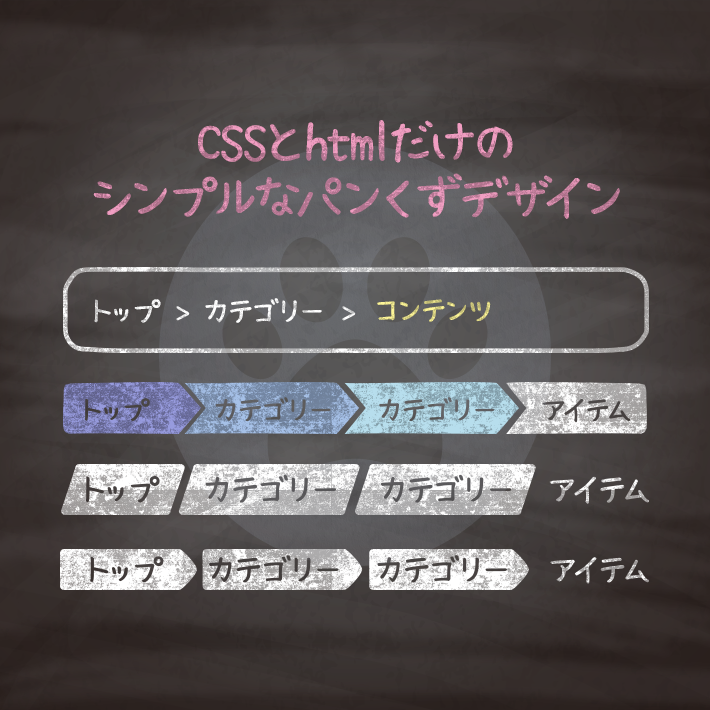
今サイト内のどこにいるのかを視覚的に分かりやすくするため、設置される「パンくず」。
大規模なサイトになればなるほど重要になってきます。
もちろん、SEO的にも大事ですね。
シンプルでわかりやすいパンくずデザインを集めました。

<div class="cp_breadcrumb">
	<ul class="breadcrumbs">
	<li><a href="#">Home</a></li>
	<li><a href="#">Category</a></li>
	<li><a href="#">Sub Category</a></li>
	<li>Contents</li>
	</ul>
</div>
.cp_breadcrumb *, .cp_breadcrumb *:after, .cp_breadcrumb *:before {
-webkit-box-sizing: border-box;
box-sizing: border-box;
}
.cp_breadcrumb {
margin: 1em auto;
padding: 1em 2em;
background-color: #3949AB;
color: #fff;
border-radius: 0.5em;
}
.cp_breadcrumb a {
text-decoration: none;
color: #7986CB;
}
.cp_breadcrumb .breadcrumbs {
padding-left: 0;
margin-top: 0;
margin-bottom: 0;
list-style: none;
display: flex;
flex-wrap: wrap;
}
.cp_breadcrumb li {
display: inline-block;
position: relative;
padding-right: calc(16px + 8px);
margin-right: 8px;
color: #7986CB;
}
.cp_breadcrumb li::before {
content: '›';
width: 1em;
height: 1em;
line-height: 1;
text-align: center;
font-size: 1em;
color: inherit;
position: absolute;
top: 50%;
right: 0;
-webkit-transform: translateY(-50%);
transform: translateY(-50%);
}
.cp_breadcrumb li:last-child {
margin-right: 0;
padding-right: 0;
color: #ffffff;
}
.cp_breadcrumb li:last-child::before {
content: normal;
}<ul class="cp_breadcrumb">
<li><a href="">Home</a></li>
<li><a href="">Category</a></li>
<li><a href="">Sub Category</a></li>
<li><a href="">Sub Category</a></li>
<li><a href="">Contents</a></li>
</ul>.cp_breadcrumb *, .cp_breadcrumb *:after, .cp_breadcrumb *:before {
-webkit-box-sizing: border-box;
box-sizing: border-box;
}
.cp_breadcrumb {
overflow: hidden;
width: 100%;
margin: 1em auto;
padding: 0;
list-style: none;
}
.cp_breadcrumb li {
display: inline-block;
padding: 0;
margin: 0 0 0.5em 0;
}
.cp_breadcrumb a {
position: relative;
display: inline-block;
margin: 0;
padding: 0.7em 1em 0.7em 2em;
text-decoration: none;
color: #ffffff;
background-color: #e91e63;
}
.cp_breadcrumb li:first-child a {
padding-left: 1em;
border-radius: 5px 0 0 5px;
}
.cp_breadcrumb a::after,
.cp_breadcrumb a::before {
position: absolute;
top: 50%;
right: -1.5em;
margin-top: -1.48em;
content: '';
border-top: 1.48em solid transparent;
border-bottom: 1.48em solid transparent;
border-left: 1.5em solid;
}
.cp_breadcrumb a::after {
z-index: 2;
border-left-color: #e91e63;
}
.cp_breadcrumb a::before {
z-index: 1;
right: -1.8em;
border-left-color: #ffffff;
}
.cp_breadcrumb li:nth-child(2) a { background: #EC407A; }
.cp_breadcrumb li:nth-child(2) a:after { border-left-color: #EC407A; }
.cp_breadcrumb li:nth-child(3) a { background: #F06292; }
.cp_breadcrumb li:nth-child(3) a:after { border-left-color: #F06292; }
.cp_breadcrumb li:nth-child(4) a { background: #F48FB1; }
.cp_breadcrumb li:nth-child(4) a:after { border-left-color: #F48FB1; }
.cp_breadcrumb li:nth-child(5) a { background: #F8BBD0; }
.cp_breadcrumb li:nth-child(5) a:after { border-left-color: #F8BBD0; }
.cp_breadcrumb li:last-child a {
cursor: default;
pointer-events: none;
color: black;
background: #f7d7e2;
border-radius: 0 5px 5px 0;
}
.cp_breadcrumb li:last-child a:hover {
background: none;
}
.cp_breadcrumb li:last-child a::before,
.cp_breadcrumb li:last-child a::after {
content: normal;
}<ul class="cp_breadcrumb">
<li><a href="">Home</a></li>
<li><a href="">Category</a></li>
<li><a href="">Sub Category</a></li>
<li><a href="">Sub Category</a></li>
<li><a href="">Contents</a></li>
</ul>.cp_breadcrumb *, .cp_breadcrumb *:after, .cp_breadcrumb *:before {
-webkit-box-sizing: border-box;
box-sizing: border-box;
list-style: none;
}
.cp_breadcrumb {
overflow: hidden;
margin: 1em auto;
padding: 0 0 0 1em;
}
.cp_breadcrumb li {
display: inline-block;
margin: 0 1em 0.5em 0;
}
.cp_breadcrumb a {
position: relative;
padding: 0.7em 1em;
text-decoration: none;
color: #ffffff;
background: #C0CA33;
display: inline-block;
height: 40px;
line-height: 1em;
-webkit-transition:all 0.3s;
transition: all 0.3s;
}
.cp_breadcrumb a:hover {
background: #D4E157;
}
.cp_breadcrumb a::before,
.cp_breadcrumb a::after {
position: absolute;
top: 0;
bottom: 0;
padding: 1.21em 0.4em;
content: '';
transform: skew(-10deg);
background: #C0CA33;
-webkit-transition:all 0.3s;
transition: all 0.3s;
}
.cp_breadcrumb a::before {
left: -0.5em;
border-radius: 5px 0 0 5px;
}
.cp_breadcrumb a:hover::before {
background: #D4E157;
}
.cp_breadcrumb a::after {
right: -0.5em;
border-radius: 0 5px 5px 0;
}
.cp_breadcrumb a:hover::after {
background: #D4E157;
}
.cp_breadcrumb li:last-child a {
font-style: italic;
padding-left: 0;
cursor: default;
pointer-events: none;
color: #333333;
background: transparent !important;
}
.cp_breadcrumb li:last-child a:hover {
background: none;
}
.cp_breadcrumb li:last-child a::before,
.cp_breadcrumb li:last-child a::after {
content: normal;
}<ul class="cp_breadcrumb">
<li><a href="">Home</a></li>
<li><a href="">Category</a></li>
<li><a href="">Sub Category</a></li>
<li><a href="">Sub Category</a></li>
<li><a href="">Contents</a></li>
</ul>.cp_breadcrumb *, .cp_breadcrumb *:after, .cp_breadcrumb *:before {
-webkit-box-sizing: border-box;
box-sizing: border-box;
}
.cp_breadcrumb {
overflow: hidden;
width: 100%;
margin: 1em auto;
padding: 0;
list-style: none;
}
.cp_breadcrumb li {
display: inline-block;
margin: 0 1em 0.5em 0;
}
.cp_breadcrumb a {
position: relative;
z-index: 1;
padding: 0.7em 1em 0.7em 2em;
text-decoration: none;
color: #ffffff;
border-radius: 0.4em 0 0 0.4em;
background: #FF5722;
display: inline-block;
height: 40px;
line-height: 1em;
-webkit-transition:all 0.3s;
transition: all 0.3s;
}
.cp_breadcrumb a:hover {
background: #FFAB91;
}
.cp_breadcrumb a::after{
background: #FF5722;
content: "";
height: 2em;
position: absolute;
right: -1em;
top: calc(50% - 1em);
width: 2em;
z-index: -1;
transform: rotate(45deg);
border-radius: .4em;
-webkit-transition:all 0.3s;
transition: all 0.3s;
}
.cp_breadcrumb a:hover::after {
background: #FFAB91;
}
.cp_breadcrumb li:last-child a {
cursor: default;
pointer-events: none;
color: black;
background: transparent !important;
font-weight: bold;
}
.cp_breadcrumb li:last-child a:hover {
background: none;
}
.cp_breadcrumb li:last-child a::before,
.cp_breadcrumb li:last-child a::after {
content: normal;
}<ul class="cp_breadcrumb">
<li><a href="">Home</a></li>
<li><a href="">Category</a></li>
<li><a href="">Sub Category</a></li>
<li><a href="">Sub Category</a></li>
<li><a href="">Contents</a></li>
</ul>.cp_breadcrumb *, .cp_breadcrumb *:after, .cp_breadcrumb *:before {
-webkit-box-sizing: border-box;
box-sizing: border-box;
}
.cp_breadcrumb {
overflow: hidden;
width: 100%;
margin: 1em auto;
padding: 0;
list-style: none;
}
.cp_breadcrumb li {
display: inline-block;
margin: 0 1em 0.5em 0;
}
.cp_breadcrumb a {
position: relative;
display: inline-block;
height: 48px;
margin: 0;
padding: 0.7em 1em 0.7em 2em;
text-decoration: none;
color: #444444;
background-image: linear-gradient(to right, #ffffff, #26C6DA);
-webkit-transition:all 0.3s ease;
transition: all 0.3s ease;
}
.cp_breadcrumb li:first-child a {
padding-left: 1em;
border-radius: 5px 0 0 5px;
}
.cp_breadcrumb a:hover {
background: #ffffff;
}
.cp_breadcrumb a::after,
.cp_breadcrumb a::before {
position: absolute;
top: 50%;
right: -0.9em;
margin-top: -1.5em;
content: '';
border-top: 1.5em solid transparent;
border-bottom: 1.5em solid transparent;
border-left: 1em solid;
-webkit-transition:all 0.3s ease;
transition: all 0.3s ease;
}
.cp_breadcrumb a::after {
z-index: 2;
border-left-color: #26C6DA;
}
.cp_breadcrumb a::before {
z-index: 1;
right: -1em;
border-left-color: #00ACC1;
}
.cp_breadcrumb a:hover::after {
border-left-color: #ffffff;
}
.cp_breadcrumb li:last-child a {
cursor: default;
pointer-events: none;
color: black;
background: transparent !important;
font-weight: bold;
}
.cp_breadcrumb li:last-child a:hover {
background: none;
}
.cp_breadcrumb li:last-child a::before,
.cp_breadcrumb li:last-child a::after {
content: normal;
}
CSS3などで新たに追加された要素・装飾方法など、日々コードを書いていないと忘れてしまったり、ささっとプロトタイプを作る時などちょっとしたことに時間をかけている暇はない。そんな時に「あ〜、あれストックしときゃよかったなぁ」って困った自分用のストックブログです。カスタマイズなどがしやすいよう、昨今のweb制作に取り入れられる一般的なコードを中心に掲載しています。
@CopypetJp More Info