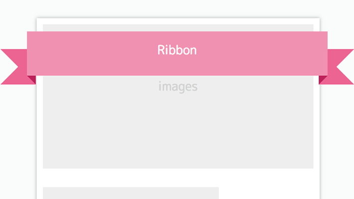
ブロックの上にかかったリボンデザインです。
両端がV字にカットしたものです。
リボンは[clip-path]を利用して作ることも可能です。
<div class="cp_card">
コンテンツ
  <div class="cp_ribbon12">
    <div class="cp_ribbon">Ribbon</div>
  </div>
</div>
.cp_card {
position: relative;/*リボンをかけたいコンテンツボックスにセット*/
width: 300px;
height: 300px;
background: #ffffff;
margin: auto;
padding: 70px 5px 0;
box-shadow: 0 0 5px rgba(0, 0, 0, 0.3);
}
/*リボンの設定*/
.cp_ribbon12 {
position: absolute;
top: 15px;
left: -10px;
width: calc(100% + 20px);
}
/*リボンの帯部分*/
.cp_ribbon12 .cp_ribbon {
position: relative;
display: flex;
justify-content: center;
align-items: center;
height: 40px;
color: #ffffff;
background: #F48FB1;
z-index: 0;
}
/*カットされたリボンの共通設定*/
.cp_ribbon12:before,
.cp_ribbon12:after {
position: absolute;
bottom: -10px;
content: '';
width: 0;
height: 0;
border-width: 20px 20px;
border-style: solid;
border-color: #F06292 #F06292 #F06292 transparent;
z-index: -1;
}
.cp_ribbon12:before {
left: -30px;
}
.cp_ribbon12:after {
right: -30px;
transform: scale(-1, 1);/*左右反転*/
}
/*リボンの影の共通設定*/
.cp_ribbon12 .cp_ribbon:before,
.cp_ribbon12 .cp_ribbon:after {
position: absolute;
bottom: -10px;
content: '';
width: 0;
height: 0;
border-top: 10px solid #C2185B;
border-left: 10px solid transparent;
}
.cp_ribbon12 .cp_ribbon:before {
left: 0;
}
.cp_ribbon12 .cp_ribbon:after {
right: 0;
transform: scale(-1, 1);/*左右反転*/
}
CSS3などで新たに追加された要素・装飾方法など、日々コードを書いていないと忘れてしまったり、ささっとプロトタイプを作る時などちょっとしたことに時間をかけている暇はない。そんな時に「あ〜、あれストックしときゃよかったなぁ」って困った自分用のストックブログです。カスタマイズなどがしやすいよう、昨今のweb制作に取り入れられる一般的なコードを中心に掲載しています。
@CopypetJp More Info