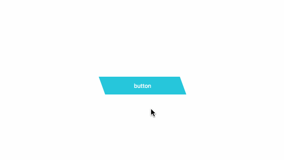
<button class="cp_button05">button</button>.cp_button05 {
position: relative;
display: flex;
justify-content: center;
align-items: center;
width: 160px;
padding: 1em;
cursor: pointer;
color: #ffffff;
background: transparent;
border: none;
transition: color 0.3s cubic-bezier(0.02,0.01,0.47,1),transform 0.3s cubic-bezier(0.02,0.01,0.47,1);
z-index: 1;
}
.cp_button05:before {
position: absolute;
top: 0;
left: 0;
content: '';
width: 100%;
height: 100%;
background: #26c6da;
transition: box-shadow 0.2s cubic-bezier(0.02,0.01,0.47,1);
transform: skewX(20deg);
z-index: -1;
}
.cp_button05:after {
position: absolute;
top: 0;
left: 0;
width: 0;
content: '';
height: 100%;
background: #1a237e;
transition: opacity 0.2s cubic-bezier(0.02,0.01,0.47,1),width 0.15s cubic-bezier(0.02,0.01,0.47,1);
transform: skewX(20deg);
opacity: 0;
z-index: -1;
}
.cp_button05:hover {
color: #ffffff;
transform: translateX(5px);
}
.cp_button05:hover:after {
width: 5px;
opacity: 1;
}
.cp_button05:hover:before {
box-shadow: inset 0 -1px 0 #1a237e, inset 0 1px 0 #1a237e, inset -1px 0 0 #1a237e;
}
.cp_button05:active:before {
box-shadow: inset 0 -3px 0 #1a237e, inset 0 3px 0 #1a237e, inset -3px 0 0 #1a237e;
}
.cp_button05:focus,
.cp_button05:focus:hover {
color: #ffffff;
}
CSS3などで新たに追加された要素・装飾方法など、日々コードを書いていないと忘れてしまったり、ささっとプロトタイプを作る時などちょっとしたことに時間をかけている暇はない。そんな時に「あ〜、あれストックしときゃよかったなぁ」って困った自分用のストックブログです。カスタマイズなどがしやすいよう、昨今のweb制作に取り入れられる一般的なコードを中心に掲載しています。
@CopypetJp More Info