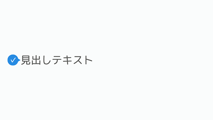
擬似要素で左に吹き出しをつけてそこにチェックマーク入れた見出しです。
チェックマークはfontawesomeの利用が不可の時などに代わりに使える、機種依存文字を利用しています。
clip-pathは使えるようになると、いろんな形が作れるようになるので、便利です。
最近はジェネレータもあるので、使ってみてください。

CSS Clip Path Generator Online | 10015 Tools
Online CSS Clip Path Generator is a free tool for generating CSS clip path. You can mask your images with CSS clip-path property by previewing the path online.……
<h1 class="cp_h1title">見出しテキスト</h1>.cp_h1title {
position: relative;
display: flex;
align-items: center;
padding-left: 1.5em;
}
.cp_h1title:before,
.cp_h1title:after {
position: absolute;
background: #1E88E5;
text-align: center;
}
.cp_h1title:before{
content: ".cp_h1title {
position: relative;
display: flex;
align-items: center;
padding-left: 1.5em;
}
.cp_h1title:before,
.cp_h1title:after {
position: absolute;
background: #1E88E5;
text-align: center;
}
.cp_h1title:before{
content: "\002713";/*チェックマーク*/
color: #fff;
font-size: 0.7em;
left: 0;
width: 1.5em;
height: 1.5em;
clip-path: circle(50% at 50% 50%);/*丸*/
}
.cp_h1title:after {
content: '';
left: 1em;
width: 8px;
height: 10px;
clip-path: polygon(0 0, 0% 100%, 100% 50%);/*三角形*/
}
2713";/*チェックマーク*/
color: #fff;
font-size: 0.7em;
left: 0;
width: 1.5em;
height: 1.5em;
clip-path: circle(50% at 50% 50%);/*丸*/
}
.cp_h1title:after {
content: '';
left: 1em;
width: 8px;
height: 10px;
clip-path: polygon(0 0, 0% 100%, 100% 50%);/*三角形*/
}
CSS3などで新たに追加された要素・装飾方法など、日々コードを書いていないと忘れてしまったり、ささっとプロトタイプを作る時などちょっとしたことに時間をかけている暇はない。そんな時に「あ〜、あれストックしときゃよかったなぁ」って困った自分用のストックブログです。カスタマイズなどがしやすいよう、昨今のweb制作に取り入れられる一般的なコードを中心に掲載しています。
@CopypetJp More Info