<button class="cp_button01">button</button>.cp_button01 {
position: relative;
display: inline-block;
width: 160px;
padding: 1em;
line-height: 1.4em;
cursor: pointer;
color: #26c6da;
background: transparent;
border: 1px solid #26c6da;
border-radius: 0;
transition: transform 0.2s, color 0.2s;
transform: translate(0.5em -0.4em);
z-index: 1;
}
.cp_button01:before {
position: absolute;
top: 0;
left: 0;
content: '';
display: block;
width: 100%;
height: 100%;
background-color: rgba(38,198,218,0.5);
transition: all 0.2s ease-in-out;
transform: translate(0.6em, -0.3em);
z-index: -1;
}
/*hover時の設定*/
.cp_button01:hover {
transform: translate(0.2em, -0.1em);
color: #ffffff;
}
.cp_button01:hover:before {
transform: translate(-0.4em, 0.4em);
}
/*active時の設定*/
.cp_button01:active {
transition-duration: 0.1s;
transform: translate(0, 0);
}
.cp_button01:active:before {
transition-duration: 0.1s;
transform: translate(0, 0);
background-color: rgba(38,198,218,0.5);
}
/*focus時の設定*/
.cp_button01:focus {
color: #26c6da;
border: 1px solid #26c6da;
}
.cp_button01:focus:hover {
color: #ffffff;
}
.cp_button01:focus:before {
background-color: rgba(38,198,218,0.5);
}<button class="cp_button02">button</button>.cp_button02 {
display: flex;
justify-content: center;
align-items: center;
width: 160px;
padding: 1em;
cursor: pointer;
color: #ec407a;
background: transparent;
border: none;
border-radius: 12% / 50%;
box-shadow: 0 0 0 1px rgba(0, 0, 0, 0.1);
transition: all 0.2s ease-in-out;
}
/*hover時の設定*/
.cp_button02:hover {
color: #ec407a;
box-shadow: 0 1px 6px 1px rgba(0, 0, 0, 0.2);
transform: scale(1.02);
}
/*active時の設定*/
.cp_button02:active {
box-shadow: 0 2px 3px 1px rgba(0, 0, 0, 0.15) inset;
transition-duration: 0.05s;
transform: scale(0.99);
}
/*focus時の設定*/
.cp_button02:focus,
.cp_button02:focus:hover {
color: #ec407a;
}<button class="cp_button03">button</button>.cp_button03 {
position: relative;
display: flex;
justify-content: center;
align-items: center;
width: 160px;
padding: 1em;
cursor: pointer;
color: #52c11f;
background: transparent;
border: 1px solid #52c11f;
border-radius: 0;
transition: color 0.4s, transform 0.4s cubic-bezier(0.645, 0.045, 0.355, 1);
z-index: 1;
}
.cp_button03:hover {
color: #ffffff;
border: 1px solid #52c11f;
}
.cp_button03:before,
.cp_button03:after {
position: absolute;
top: 0;
left: 0;
content: '';
display: block;
width: 100%;
height: 100%;
z-index: -1;
}
.cp_button03:before {
background-color: #52c11f;
transition: transform cubic-bezier(1, 0, 0, 1) 0.4s;
transform: scaleY(0);
transform-origin: top center;
}
.cp_button03:after {
top: -6px;
left: -6px;
border: 1px solid #52c11f;
transition: transform cubic-bezier(0.645, 0.045, 0.355, 1) 0.4s;
}
.cp_button03:hover:before {
border: 1px solid #52c11f;
transform: scaleY(1);
}
.cp_button03:hover:after {
border: 1px solid #52c11f;
transform: translate(6px, 6px);
}
.cp_button03:active {
transition-duration: 0.05s;
transform: translate(6px, 6px);
}
.cp_button03:active:after {
transition-duration: 0.05s;
transform: translate(0, 0);
}
.cp_button03:focus {
color: #52c11f;
border: 1px solid #52c11f;
}
.cp_button03:focus:hover {
color: #ffffff;
}
.cp_button03:focus:before {
background-color: #52c11f;
}<button class="cp_button04">button</button>.cp_button04 {
position: relative;
display: flex;
justify-content: center;
align-items: center;
padding: 1em;
width: 160px;
color: #F4511E;
background: transparent;
border: 1px solid #F4511E;
border-radius: 0;
cursor: pointer;
vertical-align: bottom;
transition: transform 0.3s cubic-bezier(0.645, 0.045, 0.355, 1);
z-index: 1;
}
.cp_button04:before {
position: absolute;
top: 0;
left: 0;
content: '';
width: 100%;
height: 100%;
background-color: #ff7043;
transition: transform 0.3s, background-color 0.3s;
transform: scale(0.3, 0.2) translate(12%, -20%);
transform-origin: 5% -5%;
z-index: -1;
}
.cp_button04:hover:before {
transform: scale(0.85, 1) translate(8%, -15%);
}
.cp_button04:active:before {
transition-timing-function: cubic-bezier(0.175, 0.885, 0.32, 1.275);
transition-duration: 0.15s;
transform: scale(1, 1) translate(0%, 0%);
}
.cp_button04:hover,
.cp_button04:active {
color: #ffffff;
border: 1px solid #ff7043;
}
.cp_button04:focus {
color: #ff7043;
border: 1px solid #ff7043;
}
.cp_button04:focus:hover {
color: #ffffff;
border: 1px solid #ff7043;
}
.cp_button04:focus:before {
background-color: #ff7043;
}<button class="cp_button05">button</button>.cp_button05 {
position: relative;
display: flex;
justify-content: center;
align-items: center;
width: 160px;
padding: 1em;
cursor: pointer;
color: #ffffff;
background: transparent;
border: none;
transition: color 0.3s cubic-bezier(0.02,0.01,0.47,1),transform 0.3s cubic-bezier(0.02,0.01,0.47,1);
z-index: 1;
}
.cp_button05:before {
position: absolute;
top: 0;
left: 0;
content: '';
width: 100%;
height: 100%;
background: #26c6da;
transition: box-shadow 0.2s cubic-bezier(0.02,0.01,0.47,1);
transform: skewX(20deg);
z-index: -1;
}
.cp_button05:after {
position: absolute;
top: 0;
left: 0;
width: 0;
content: '';
height: 100%;
background: #1a237e;
transition: opacity 0.2s cubic-bezier(0.02,0.01,0.47,1),width 0.15s cubic-bezier(0.02,0.01,0.47,1);
transform: skewX(20deg);
opacity: 0;
z-index: -1;
}
.cp_button05:hover {
color: #ffffff;
transform: translateX(5px);
}
.cp_button05:hover:after {
width: 5px;
opacity: 1;
}
.cp_button05:hover:before {
box-shadow: inset 0 -1px 0 #1a237e, inset 0 1px 0 #1a237e, inset -1px 0 0 #1a237e;
}
.cp_button05:active:before {
box-shadow: inset 0 -3px 0 #1a237e, inset 0 3px 0 #1a237e, inset -3px 0 0 #1a237e;
}
.cp_button05:focus,
.cp_button05:focus:hover {
color: #ffffff;
}<button class="cp_button06">button</button>.cp_button06 {
position: relative;
display: flex;
justify-content: center;
align-items: center;
padding: 1em;
width: 160px;
cursor: pointer;
transition: color .3s cubic-bezier(.02,.01,.47,1),border-color .3s cubic-bezier(.02,.01,.47,1);
color: #F06292;
background: #fff;
border: 1px solid #F06292;
border-radius: 100px;
overflow: hidden;
z-index: 1;
}
.cp_button06:after,
.cp_button06:before {
position: absolute;
top: 0;
left: 0;
width: 100%;
height: 120%;
content: '';
transition: transform 0.15s cubic-bezier(0.02,0.01,0.47,1),opacity 0.15s cubic-bezier(0.02,0.01,0.47,1);
opacity: 0;
z-index: -1;
}
.cp_button06:before {
background: #D81B60;
transform: translate3d(-110%,-10%,0) skewX(-20deg);
}
.cp_button06:after {
background: #F06292;
transform: translate3d(110%,-10%,0) skewX(-20deg);
}
.cp_button06:hover {
color: #ffffff;
background: #E91E63;
border: 1px solid #F06292;
box-shadow: 0 1px 6px rgba(0,0,0,0.3);
transition: all 0.5s cubic-bezier(0.02,0.01,0.47,1);
}
.cp_button06:hover:after, .cp_button06:hover:before {
transition: transform 0.25s cubic-bezier(0.02,0.01,0.47,1),opacity 0.25s cubic-bezier(0.02,0.01,0.47,1);
transform: translate3d(50%,-10%,0) skewX(-20deg);
opacity: 1;
}
.cp_button06:active {
opacity: 0.5;
color: #F06292;
}
.cp_button06:focus {
color: #F06292;
border: 1px solid #F06292;
}
.cp_button06:focus:hover {
color: #ffffff;
border: 1px solid #F06292;
}<button class="cp_button07">button</button>.cp_button07 {
position: relative;
display: flex;
justify-content: center;
align-items: center;
width: 160px;
padding: 1em;
cursor: pointer;
background: #009688;
color: #ffffff;
border: none;
border-radius: 100px;
transition: color 0.3s cubic-bezier(0.02,0.01,0.47,1),transform 0.3s cubic-bezier(0.02,0.01,0.47,1);
overflow: hidden;
z-index: 1;
}
.cp_button07:after,
.cp_button07:before {
position: absolute;
right: 0;
bottom: 0;
content: '';
width: 100px;
height: 100px;
border-radius: 50%;
background: #009688;
transition: transform 0.15s cubic-bezier(0.02,0.01,0.47,1),opacity 0.15s cubic-bezier(0.02,0.01,0.47,1);
transform: translate(100%,-25%) translateZ(0);
opacity: 0;
z-index: -1;
}
.cp_button07:after, .cp_button07:before {
background: #ffffff;
}
.cp_button07:hover {
color: #ffffff;
box-shadow: 0 1px 8px rgba(0,0,0,0.3);
transition: all 0.5s cubic-bezier(0.02,0.01,0.47,1);
transform: scale(1.1) translateZ(0);
}
.cp_button07:hover:before {
transition: transform 0.2s cubic-bezier(0.02,0.01,0.47,1),opacity 0.2s cubic-bezier(0.02,0.01,0.47,1);
transform: translate3d(50%,0,0) scale(0.9);
opacity: 0.15;
}
.cp_button07:hover:after {
transition: transform 0.2s cubic-bezier(0.02,0.01,0.47,1) 0.05s,opacity 0.2s cubic-bezier(0.02,0.01,0.47,1) 0.05s;
transform: translate(50%) scale(1.1);
opacity: 0.25;
}
.cp_button07:active {
opacity: 0.5;
}
.cp_button07:focus {
color: #ffffff;
}<button class="cp_button08">button</button>.cp_button08 {
display: flex;
justify-content: center;
align-items: center;
width: 160px;
padding: 1em;
cursor: pointer;
color: #7e57c2;
background: transparent;
border: 1px solid #7e57c2;
border-radius: 0.2em;
transition: background-color 0.2s, color 0.2s, width 0.2s cubic-bezier(0.175, 0.885, 0.32, 1.275), border-radius 0.2s;
}
.cp_button08:hover {
width: 180px;
color: #ffffff;
border-radius: 0.5em;
background-color: #7e57c2;
}
.cp_button08:active {
border-color: #5e35b1;
background-color: #5e35b1;
}
.cp_button08:focus {
color: #7e57c2;
border: 1px solid #7e57c2;
}
.cp_button08:focus:hover {
color: #ffffff;
}<button class="cp_button09">button</button>.cp_button09 {
display: flex;
justify-content: center;
align-items: center;
width: 160px;
padding: 1em;
cursor: pointer;
color: #4caf50;
background: transparent;
border: 3px solid #4caf50;
border-radius: 0.5em;
box-shadow: 3px 0 0 0 #4caf50, 3px 3px 0 0 #4caf50, 0 3px 0 0 #4caf50;
transition: transform 0.3s cubic-bezier(0.175, 0.885, 0.32, 1.275), box-shadow 0.3s 0.3s cubic-bezier(0.175, 0.885, 0.32, 1.275), background-color 0.3s;
}
.cp_button09:hover {
color: #4caf50;
border: 3px solid #4caf50;
box-shadow: 5px 0 0 0 #4caf50, 5px 5px 0 0 #4caf50, 0 5px 0 0 #4caf50;
transform: translate(-2px, -2px);
}
.cp_button09:active {
color: #ffffff;
background: #4caf50;
border: 3px solid #4caf50;
box-shadow: 2px 0 0 0 #4caf50, 2px 2px 0 0 #4caf50, 0 2px 0 0 #4caf50;
transition-duration: 0.1s;
transform: translate(4px, 4px);
}<button class="cp_button10">button</button>.cp_button10 {
position: relative;
display: flex;
justify-content: center;
align-items: center;
width: 160px;
padding: 1em;
cursor: pointer;
color: #ffffff;
background: #FFB300;
border: 1px solid #FFB300;
border-radius: 0.25rem;
overflow: hidden;
}
.cp_button10:after {
position: absolute;
display: block;
content: '';
margin-bottom: -100%;
margin-left: -120%;
padding-top: 240%;
padding-left: 240%;
border-radius: 50%;
background: rgba(255,255,255,0.3);
transition: all 1s;
opacity: 0;
}
.cp_button10:hover {
color: #ffffff;
border-color: #FF8F00;
background-color: #FF8F00;
}
.cp_button10:active:after {
margin-top: 0;
margin-left: 0;
padding-top: 0;
padding-left: 0;
transition: 0s;
opacity: 1;
}
.cp_button10:focus {
color: #ffffff;
border: 1px solid #FFB300;
}<button class="cp_button11">button</button>.cp_button11 {
display: flex;
justify-content: center;
align-items: center;
width: 160px;
margin: 0.4em;
padding: 1em;
cursor: pointer;
text-decoration: none;
color: #ec407a;
background: transparent;
border: 1px solid #ec407a;
border-radius: 0;
box-shadow: 0 0 1px rgba(0, 0, 0, 0);
transition: background-color 0.3s;
transform: translateZ(0);
}
.cp_button11:before {
position: absolute;
top: -16px;
right: -16px;
bottom: -16px;
left: -16px;
content: '';
border: 4px solid rgba(236,64,122,0.5);
transition-duration: 0.3s;
transition-property: top right bottom left;
opacity: 0;
}
.cp_button11:hover:before {
top: -8px;
right: -8px;
bottom: -8px;
left: -8px;
opacity: 1;
}
.cp_button11:active {
color: #ffffff;
background-color: #ec407a;
}
.cp_button11:active:before {
top: -17px;
right: -17px;
bottom: -17px;
left: -17px;
}
.cp_button11:hover,
.cp_button11:focus {
color: #ec407a;
border: 1px solid #ec407a;
}<button class="cp_button12">button</button>.cp_button12 {
display: flex;
justify-content: center;
align-items: center;
width: 160px;
margin: 0.4em;
padding: 1em;
color: #ffffff;
background: #29b6f6;
border: 1px solid #29b6f6;
border-radius: 0;
box-shadow: 0 0 1px rgba(0, 0, 0, 0);
cursor: pointer;
transform: translateZ(0);
}
.cp_button12:before {
position: absolute;
top: 0;
right: 0;
bottom: 0;
left: 0;
content: '';
border: rgba(41,182,246,0.5) solid 4px;
transition-duration: 0.3s;
transition-property: top right bottom left;
}
.cp_button12:hover:before {
top: -8px;
right: -8px;
bottom: -8px;
left: -8px;
opacity: 1;
}
.cp_button12:active {
color: #ffffff;
background-color: #0288d1;
}
.cp_button12:active:before {
top: -3px;
right: -3px;
bottom: -3px;
left: -3px;
}
.cp_button12:focus:hover,
.cp_button12:focus,
.cp_button12:active:hover,
.cp_button12:hover {
color: #ffffff;
border: 1px solid #29b6f6;
}<button class="cp_button13">button</button>.cp_button13 {
position: relative;
display: flex;
justify-content: center;
align-items: center;
width: 160px;
padding: 1em;
cursor: pointer;
color: #2e7d32;
background: #d4e157;
border: 0;
border-radius: 0;
transition: transform 0.3s;
z-index: 1;
}
.cp_button13:before {
position: absolute;
top: 100%;
left: 5%;
content: '';
width: 90%;
height: 10px;
transition:transform 0.3s,opacity 0.3s;
background: radial-gradient(ellipse at center, rgba(46,125,50, 0.35) 0%, rgba(46,125,50, 0) 80%);
opacity: 0;
z-index: -1;
}
.cp_button13:hover {
transform: translateY(-6px);
animation: button13 1.5s linear infinite alternate 0.3s;
color: #2e7d32;
}
.cp_button13:hover:before {
transform: translateY(6px);
animation: button13_shadow 1.5s linear infinite alternate 0.3s;
opacity: 0.4;
}
/*アニメーションの設定*/
@keyframes button13 {
50% { transform: translateY(-3px);}
100% { transform: translateY(-6px);}
}
@keyframes button13_shadow {
0% { transform: translateY(6px); opacity: 0.4;}
50% { transform: translateY(3px); opacity: 1;}
100% { transform: translateY(6px); opacity: 0.4;}
}<button class="cp_button14">button</button>.cp_button14 {
display: flex;
justify-content: center;
align-items: center;
width: 160px;
padding: 1em;
cursor: pointer;
color: #283593;
background: #26c6da;
border: 0;
border-radius: 50px;
box-shadow: 0 0 1px rgba(0, 0, 0, 0);
transition: transform 0.2s, background-color 0.2s;
transform: translateZ(0);
}
.cp_button14:hover {
animation: button14 1s ease-in-out;
color: #283593;
}
.cp_button14:active {
background: #00acc1;
transform: translate(2px, 2px);
}
/*アニメーション設定*/
@keyframes button14 {
16.65% { transform: translateX(8px);}
33.3% { transform: translateX(-6px);}
49.95% { transform: translateX(4px);}
66.6% { transform: translateX(-2px);}
83.25% { transform: translateX(1px);}
100% { transform: translateX(0);}
}<button class="cp_button15">button</button>.cp_button15 {
display: flex;
justify-content: center;
align-items: center;
width: 160px;
padding: 1em;
cursor: pointer;
text-decoration: none;
color: #ec407a;
background: transparent;
border: 3px solid #ec407a;
border-radius: 8px;
box-shadow: 0 0 1px rgba(0, 0, 0, 0);
transition: all 0.2s;
transform: translateZ(0);
transform-origin: 0 100%;
}
.cp_button15:hover {
color: #ec407a;
border: 3px solid #ec407a;
animation: button15 1s ease-in-out;
}
.cp_button15:active {
border-radius: 5% / 50%;
color: #ec407a;
background: rgba(236,64,122,0.2);
border: 3px solid #ec407a;
transform: translate(1px, 1px);
}
.cp_button15:focus:hover,
.cp_button15:focus {
color: #ec407a;
border: 3px solid #ec407a;
}
@keyframes button15 {
16.65% { transform: skew(-12deg);}
33.3% { transform: skew(10deg);}
49.95% { transform: skew(-6deg);}
66.6% { transform: skew(4deg);}
83.25% { transform: skew(-2deg);}
100% { transform: skew(0);}
}
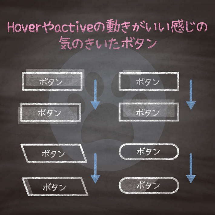
コピペでできる!CSSとhtmlだけの使い勝手のいいボタンデザイン15選 | copypet.jp|パーツで探す、web制作に使えるコピペサイト。
htmlとcssだけでできるボタンデザイン15選です。 使い勝手のいいものをピックアップしました。…
CSS3などで新たに追加された要素・装飾方法など、日々コードを書いていないと忘れてしまったり、ささっとプロトタイプを作る時などちょっとしたことに時間をかけている暇はない。そんな時に「あ〜、あれストックしときゃよかったなぁ」って困った自分用のストックブログです。カスタマイズなどがしやすいよう、昨今のweb制作に取り入れられる一般的なコードを中心に掲載しています。
@CopypetJp More Info