htmlとcssだけでできるボタンデザイン15選です。
使い勝手のいいものをピックアップしました。
色は好みで変えていただければ、かまいません。
色には6桁の16進数のカラーコード(#000000)も使えますが、他に、
なども使用できます。
RGBA値での指定は、サポートしていないブラウザだと、透明度だけが無視されるのではなく、色指定そのものが認識されずに無効となるので注意が必要です。
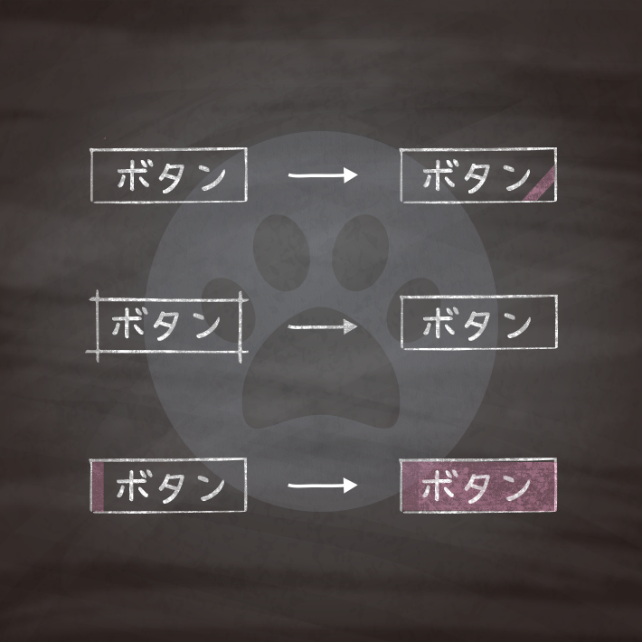
ちなみによく出てくる擬似要素の::beforeと::afterって何よ?って方はこちらをご覧ください。

で?そもそも擬似要素の::before(:before)と::after(:after)って何がどうなってどう使えるの? | copypet.jp|パーツで探す、web制作に使えるコピペサイト。
copypet.jpでも頻繁に使っている::before(:before)と::after(:after)ですが、コピペだけしていると調整やプラスアルファのデザインを加えたい時に悩んでしまうこともあるでしょう。 とりあえずコピペすりゃええと思うが、だがしかし・・・何がどうなっているかは知っておきたい。とこっそり思っておられる方のために「何とな〜くわかる」から「知ってる!知ってる!」ぐらいになるよう説明しておきます。…

<a href="#" class="cp_btn">button</a>a.cp_btn {
position: relative;
display: block;
width: 160px;
padding: 0.8em;
text-align: center;
text-decoration: none;
color: #FFF;
background: #26C6DA;
border-bottom: 2px solid #00838F;
border-radius: 4px;
box-shadow: inset 0 2px 0 rgba(255,255,255,0.2), 0 2px 2px rgba(0, 0, 0, 0.2);
}
a.cp_btn:active {
border-bottom: 2px solid #26C6DA;
box-shadow: 0 0 2px rgba(0, 0, 0, 0.3);
}<a href="#" class="cp_btn">button</a>a.cp_btn {
display: block;
width: 160px;
padding: 0.8em;
text-align: center;
text-decoration: none;
color: #EC407A;
border: 2px solid #EC407A;
border-radius: 3px;
transition: .4s;
}
a.cp_btn:hover {
background: #EC407A;
color: #fff;
}<a href="#" class="cp_btn">button</a>a.cp_btn {
position: relative;
display: block;
width: 160px;
padding: 0.8em;
text-align: center;
font-weight: bold;
text-decoration: none;
color: #4CAF50;
}
a.cp_btn:before {
position: absolute;
content: '';
width: 100%;
height: 4px;
top:100%;
left: 0;
border-radius: 3px;
background:#4CAF50;
transition: .4s;
}
a.cp_btn:hover:before {
top: calc(100% - 3px);
}<a href="#" class="cp_btn">button</a>a.cp_btn {
position: relative;
display: block;
width: 160px;
padding: 0.8em;
text-align: center;
font-weight: bold;
text-decoration: none;
color: #FF9800;
transition: .4s;
}
a.cp_btn:before,
a.cp_btn:after {
position: absolute;
left: 0;
content: '';
width: 100%;
height: 4px;
border-radius: 3px;
background:#FF9800;
transition: .4s;
}
a.cp_btn:before{
top:100%;
}
a.cp_btn:after{
top:0;
}
a.cp_btn:hover:before {
top: calc(100% - 3px);
}
a.cp_btn:hover:after {
top: 3px;
}<a href="#" class="cp_btn">button</a>a.cp_btn {
position: relative;
display: block;
width: 160px;
padding: 0.8em;
text-align: center;
font-weight: bold;
text-decoration: none;
color: #2196F3;
transition: .4s;
}
a.cp_btn:before,
a.cp_btn:after {
position: absolute;
top: 0;
content: '';
width: 4px;
height: 100%;
border-radius: 3px;
background:#2196F3;
transition: .2s ease-in;
}
a.cp_btn:before {
left: 0;
}
a.cp_btn:after {
left: 100%;
}
a.cp_btn:hover:before,
a.cp_btn:hover:after {
transform: rotate(20deg);
}<a href="#" class="cp_btn">button</a>a.cp_btn {
position: relative;
display: block;
width: 160px;
padding: 0.8em;
text-align: center;
font-weight: bold;
text-decoration: none;
color: #8E24AA;
text-shadow: 0 0 5px white;
background: repeating-linear-gradient(-45deg, #CE93D8, #CE93D8 3px,#E1BEE7 3px, #E1BEE7 7px);
border-radius: 4px;
transition: .4s ease-in-out;
}
a.cp_btn:hover {
background: repeating-linear-gradient(-45deg, #CE93D8, #CE93D8 5px,#E1BEE7 5px, #E1BEE7 9px);
transition: .4s ease-in-out;
}<a href="#" class="cp_btn">button</a>a.cp_btn {
position: relative;
display: block;
width: 160px;
padding: 0.8em;
text-align: center;
font-weight: bold;
text-decoration: none;
color: #FFF;
text-shadow: 0 0 5px rgba(255, 255, 255, 0.0);
background: #1A237E;
border-radius: 4px;
transition: .4s ease-in-out;
}
a.cp_btn:hover {
text-shadow: -6px 0px 15px rgba(255, 255, 240, 0.83), 6px 0px 15px rgba(255, 255, 240, 0.83);
transition: .4s ease-in-out;
}<a href="#" class="cp_btn">button</a>a.cp_btn {
display: flex;
align-items: center;
justify-content: center;
width: 120px;
height: 120px;
text-decoration: none;
color: #FF5722;
border: double 4px #FF5722;
border-radius: 50%;
transition: .6s ease-in-out;
}
a.cp_btn:hover {
transform: rotateY(360deg);
}<a href="#" class="cp_btn"><span>button</span></a>a.cp_btn {
display: block;
width: 160px;
padding: 0.8em;
text-align: center;
text-decoration:none;
color: #FFF;
border-radius: 4px;
background: #4DD0E1;
}
a.cp_btn span {
display: inline-block;
transition: .5s ease-in-out;
}
a.cp_btn:hover span {
transform: rotateX(360deg);
}<a href="#" class="cp_btn">button</a>a.cp_btn {
position: relative;
display: inline-block;
width: 160px;
padding: 0.8em;
text-align: center;
text-decoration: none;
font-weight: bold;
color: #FBC02D;
border-top: 2px solid #FBC02D;
border-bottom: 2px solid #FBC02D;
}
a.cp_btn:before,
a.cp_btn:after {
position: absolute;
top: -7px;
width: 2px;
content: '';
height: calc(100% + 14px);
background-color: #FBC02D;
transition: .3s ease-in-out;
}
a.cp_btn:before {
left: 7px;
}
a.cp_btn:after {
right: 7px;
}
a.cp_btn:hover:before,
a.cp_btn:hover:after {
top: 0;
height: 100%;
}
a.cp_btn:hover:before{
left:0;
}
a.cp_btn:hover:after{
right: 0;
}<a href="#" class="cp_btn">button</a>a.cp_btn {
position: relative;
display: block;
width: 160px;
padding: 0.8em;
text-align: center;
text-decoration: none;
color: #fff;
background: #2196F3;
border:solid 1px #fff;
overflow: hidden;
}
a.cp_btn:before {
position: absolute;
top: -25px;
left: -20px;
content:'';
height:90px;
width:20px;
background : #fff;
opacity: 0.3;
transform: rotate(40deg);
transition: 0.4s ease-in-out;
}
a.cp_btn:hover:before {
left:98%;
}<a href="#" class="cp_btn">button</a>a.cp_btn {
position: relative;
display: block;
width: 160px;
padding: 0.8em;
text-align: center;
text-decoration: none;
color: #fff;
background: #EC407A;
border:1px solid #fff;
}
a.cp_btn:before {
position: absolute;
top: 0px;
left: -90%;
content:'';
height: 100%;
width: 100%;
background : #fff;
opacity: 0.3;
transition: .4s ease-in-out;
}
a.cp_btn:hover:before {
left:0;
}<a href="#" class="cp_btn">button</a>a.cp_btn {
position: relative;
display: block;
width: 160px;
padding: 0.8em;
text-align: center;
text-decoration: none;
color: #fff;
background: #455A64;
border:1px solid #fff;
overflow: hidden;
}
a.cp_btn:after {
position: absolute;
content:'';
top: -100%;
left: -100%;
height: 100%;
width: 100%;
background : #fff;
opacity: 0.3;
transition: .4s ease-in-out;
}
a.cp_btn:hover:after {
top: 0;
left: 0;
}<a href="#" class="cp_btn">button</a>a.cp_btn {
position: relative;
display: block;
width: 160px;
padding: 0.8em;
text-align: center;
text-decoration: none;
color: #fff;
border:1px solid #8BC34A;
background: #8BC34A;
overflow: hidden;
z-index: 0;
}
a.cp_btn:after {
position: absolute;
top: 50%;
left: 50%;
content:'';
height: 0;
width: 100%;
background : #fff;
opacity: 0;
transform: translate(-50%,-50%) rotate(45deg);
transition: 0.3s;
z-index: -1;
}
a.cp_btn:hover {
color: #8BC34A;
}
a.cp_btn:hover:after {
height: 250%;
opacity: 1;
}
a.cp_btn:active:after {
height: 350%;
opacity: 1;
}<a href="#" class="cp_btn">button</a>a.cp_btn {
position: relative;
display: block;
width: 160px;
padding: 0.8em;
text-align: center;
border: 3px solid #9C27B0;
text-decoration: none;
transition: all .4s ease-in-out;
}
a.cp_btn::before,
a.cp_btn::after {
position: absolute;
top: -3px;
right: -3px;
bottom: -3px;
left: -3px;
content: '';
z-index: 2;
transition: all .4s ease-in-out;
}
a.cp_btn::before {
border-top: 3px solid #FF5722;
border-bottom: 3px solid #FF5722;
transform: scale(0, 1);
}
a.cp_btn::after {
border-right: 3px solid #FF5722;
border-left: 3px solid #FF5722;
transform: scale(1, 0);
}
a.cp_btn:hover {
color: #FF5722;
}
a.cp_btn:hover::after,
a.cp_btn:hover::before {
transform: scale(1);
}
コピペでできる!cssとhtmlのみで作るホバーがいい感じの気のきいたボタンデザイン15種 | copypet.jp|パーツで探す、web制作に使えるコピペサイト。
htmlとcssだけでできるボタンデザイン15選です。 こちらはホバーやフォーカス時の動きがちょっと可愛いものが多いです。…
CSS3などで新たに追加された要素・装飾方法など、日々コードを書いていないと忘れてしまったり、ささっとプロトタイプを作る時などちょっとしたことに時間をかけている暇はない。そんな時に「あ〜、あれストックしときゃよかったなぁ」って困った自分用のストックブログです。カスタマイズなどがしやすいよう、昨今のweb制作に取り入れられる一般的なコードを中心に掲載しています。
@CopypetJp More Info