テキスト<a href="#" class="cp_textlink01">リンクテキスト-link text-</a>テキスト.cp_textlink01 {
position: relative;
padding: 5px;
color: #FB8C00;
text-decoration: none;/*元々のアンダーラインを非表示にしておく*/
}
.cp_textlink01::after {
position: absolute;
bottom: 0;
left: 0;
content: '';
width: 100%;
transition: all 0.3s ease;
opacity: 1;
border-bottom-width: 1px;
border-bottom-style: dotted;
border-bottom-color: #FB8C00;
}
.cp_textlink01:hover::after {
opacity: 1;
border-bottom-width: 2px;
border-bottom-style: dashed;
}テキスト<a href="#" class="cp_textlink02">リンクテキスト-link text-</a>テキスト
.cp_textlink02 {
  position: relative;
  padding: 5px;
  text-decoration: none;
  color: #00bcd4;
}
.cp_textlink02::before {
  position: absolute;
  bottom: -2px;
  left: 0;
  content: '';
  width: 100%;
  height: 1px;
  transition: all 0.3s ease;
  background-color: #00bcd4;
}
.cp_textlink02:hover::before {
  transform: scaleY(4);/*hover時にラインを縦4倍のサイズにする*/
}テキスト<a href="#" class="cp_textlink03">リンクテキスト-link text-</a>テキスト
.cp_textlink03 {
  position: relative;
  display: inline-block;
  padding: 5px;
  color: #009688;
  text-decoration: none;/*元々のアンダーラインを非表示にしておく*/
}
/*hover前 通常の表示*/
.cp_textlink03::after,
.cp_textlink03::before {
  position: absolute;
  bottom: -2px;
  left: -2px;
  content: '';
  width: 100%;
  transition: all 0.3s ease;
  border-bottom: 2px solid #009688;
}
.cp_textlink03::before {
  opacity: 0;/*通常は非表示にしておく*/
}
/*hover時上のラインの位置*/
.cp_textlink03:hover:after {
  bottom: 0;
  left: 4px;
}
/*hover時下のラインの位置 非表示にしていたものを表示*/
.cp_textlink03:hover:before {
  bottom: -4px;
  opacity: 1;
}テキスト<a href="#" class="cp_textlink04">リンクテキスト-link text-</a>テキスト
.cp_textlink04 {
  position: relative;
  padding: 5px;
  transition: all 0.3s ease;
  color: #EC407A;
  text-decoration: none;/*元々のアンダーラインを非表示にしておく*/
}
/*hover時の表示(共通)*/
.cp_textlink04::before,
.cp_textlink04::after {
  position: absolute;
  left: 0;
  content: '';
  transition: all 0.3s ease;
}
/*hover前の表示(背景塗りつぶし)*/
.cp_textlink04::before {
  bottom:0;
  width: 100%;
  height: 0;
  opacity: 0;
  background-color: #EC407A;
  border-radius: 50px;
}
/*hover時の表示(背景塗りつぶし)*/
.cp_textlink04:hover::before {
  height: 100%;
  opacity: 0.4;
}
/*hover前の表示(アンダーライン)*/
.cp_textlink04::after {
  bottom: -1px;
  width: 100%;
  height: 2px;
  border-bottom: 2px solid #EC407A;
  opacity: 1;
}
/*hover時の表示(アンダーライン)真ん中を起点に消える*/
.cp_textlink04:hover::after {
  left: 50%;
  right: 50%;
  width: 0%;
  opacity: 0;
}テキスト<a href="#" class="cp_textlink05">リンクテキスト-link text-</a>テキスト
.cp_textlink05 {
  position: relative;
  display: inline-block;
  padding: 5px;
  color: #3949AB;
  text-decoration: none;/*元々のアンダーラインを非表示にしておく*/
}
/*擬似要素の設定(共通)*/
.cp_textlink05::before,
.cp_textlink05:after {
  position: absolute;
  bottom: 0;
  content: '';
  transition: all 0.3s ease;
}
/*hover前の表示(背景塗りつぶし)*/
.cp_textlink05:before {
  right: 50%;
  left: 50%;
  width: 0;
  height: 100%;
  border-radius: 3px;
  background-color: #3949AB;
  opacity: 0.3;
}
/*hover時の表示(背景塗りつぶし)*/
.cp_textlink05:hover:before {
  left: 0;
  width: 100%;
}
/*hover前の表示(ライン)*/
.cp_textlink05::after {
  left: 0;
  width: 100%;
  height: 100%;
  border-top: 1px solid #3949AB;
  border-bottom: 1px solid #3949AB;
}
/*hover時の表示(ライン)真ん中を起点に消える*/
.cp_textlink05:hover::after {
  right: 50%;
  left: 50%;
  width: 0%;
}テキスト<a href="#" class="cp_textlink06">リンクテキスト-link text-</a>テキスト
.cp_textlink06 {
  position: relative;
  display: inline-block;
  padding: 5px;
  color: #FF8F00;
  text-decoration: none;/*元々のアンダーラインを非表示にしておく*/
}
/*hover時の表示(背景塗りつぶし設定)*/
.cp_textlink06:after {
  position: absolute;
  bottom: 50%;
  left: 0;
  content: '';
  width: 100%;
  height: 2px;
  border-radius: 20px;
  background-color: #FF8F00;
  opacity: 0;
  transition: all 0.3s ease;
}
.cp_textlink06:hover:after {
  bottom: 0;
  height: 100%;
  opacity: 0.3;
}テキスト<a href="#" class="cp_textlink07">リンクテキスト-link text-</a>テキスト
.cp_textlink07 {
  position: relative;
  display: inline-block;
  padding: 5px;
  color: #9C27B0;
  text-decoration: none;/*元々のアンダーラインを非表示にしておく*/
}
/*擬似要素の設定(共通)*/
.cp_textlink07::before,
.cp_textlink07::after {
  position: absolute;
  content: '';
  border-radius: 3px;
}
/*hover前の表示(背景塗りつぶし)*/
.cp_textlink07::before {
  bottom: 0;
  left: 0;
  width: 100%;
  height: 100%;
  background: rgba(156,39,176 ,.4);
  transition: all 0.3s ease;
}
/*hover時の表示(背景塗りつぶし)*/
.cp_textlink07:hover:before {
  background: rgba(156,39,176 ,.2);
}
/*hover前の表示(ライン)*/
.cp_textlink07::after {
  top: -4px;
  bottom: -4px;
  left: -4px;
  right: -4px;
  width: calc(100% + 6px);
  height: calc(100% + 6px);
  border: 1px solid #9C27B0;
  opacity: 0;
  transition: all 0.3s;
}
/*hover時の表示(ライン)*/
.cp_textlink07:hover:after {
  top: 2px;
  left: 2px;
  width: calc(100% - 6px);
  height: calc(100% - 6px);
  opacity: 1;
}
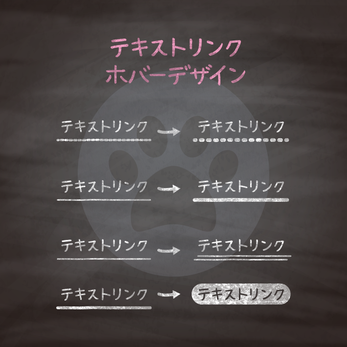
コピペでできる!CSSとhtmlだけのテキストリンクデザイン12選 | copypet.jp|パーツで探す、web制作に使えるコピペサイト。
htmlとcssだけでできるテキストリンクデザイン12選です。…
CSS3などで新たに追加された要素・装飾方法など、日々コードを書いていないと忘れてしまったり、ささっとプロトタイプを作る時などちょっとしたことに時間をかけている暇はない。そんな時に「あ〜、あれストックしときゃよかったなぁ」って困った自分用のストックブログです。カスタマイズなどがしやすいよう、昨今のweb制作に取り入れられる一般的なコードを中心に掲載しています。
@CopypetJp More Info