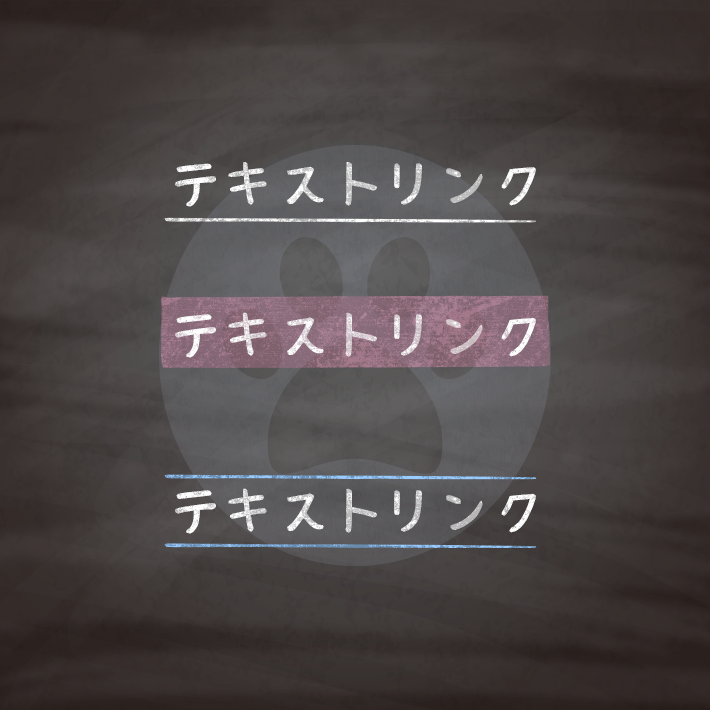
htmlとcssだけでできるテキストリンクデザイン12選です。
色は好みで変えていただければ、かまいません。
色には6桁の16進数のカラーコード(#000000)も使えますが、他に、
なども使用できます。
RGBA値での指定は、サポートしていないブラウザだと、透明度だけが無視されるのではなく、色指定そのものが認識されずに無効となるので注意が必要です。

<a href="#" class="cp_link">リンクテキスト-link text-</a>.cp_link {
padding: 5px;
transition: all .3s;
}
.cp_link:hover {
color: #fff;
background-color: #00BCD4;
}<a href="#" class="cp_link">リンクテキスト-link text-</a>.cp_link {
display: inline-block;
padding: 5px;
transition: .3s;
color: #F4511E;
}
.cp_link:hover {
transform: scale(1.1);/*1.1倍大きく*/
}<a href="#" class="cp_link">リンクテキスト-link text-</a>.cp_link {
display: inline-block;
padding: 5px;
color: #00897B;
}
.cp_link:hover {
animation: zoom .3s ease-in-out;
}
@keyframes zoom {
50% {transform: scale(1.05);}
}<a href="#" class="cp_link">リンクテキスト-link text-</a>.cp_link {
display: inline-block;
transition: .3s ease-in-out;
color: #EC407A;
}
.cp_link:hover {
transform: rotate(2deg);
}<a href="#" class="cp_link">リンクテキスト-link text-</a>.cp_link {
display: inline-block;
color: #7CB342;
transition: all .5s ease-in-out;
}
.cp_link:hover {
transform: rotateX(360deg);
}<a href="#" class="cp_link">
<span data-text="リンクテキスト-link text-">リンクテキスト-link text-</span>
</a>.cp_link {
display: inline-block;
perspective: 1000px;
perspective-origin: 50% 50%;
vertical-align: bottom;
overflow: hidden;
}
/*hover途中の動き*/
.cp_link:hover span {
background-color: #dafbff;
transform: translate3d(0, 0, -30px) rotateX(90deg);
}
/*hover時に表示される部分*/
.cp_link span {
display: inline-block;
position: relative;
padding: 5px;
transition: .4s;
transform-origin: 50% 0%;
transform-style: preserve-3d;
}
.cp_link span:after {
display: inline-block;
position: absolute;
padding: 5px;
left: 0;
top: 0;
content: attr(data-text);/*hover時に表示されるテキスト*/
color: #fff;
background-color: #00ACC1;
transform-origin: 50% 0%;
transform: translate3d(0, 105%, 0) rotateX(-90deg);
}<a href="#" class="cp_link">リンクテキスト-link text-</a>.cp_link {
position: relative;
padding: 5px;
color: #ff9800;
z-index: 0;
transition: .5s ease-in-out .1s;/*テキストは0.1遅れて色が変わる*/
}
/*hover後の表示*/
.cp_link::after {
position: absolute;
content: '';
top: 0;
left: 0;
width: 0%;
height: 100%;
background: #ff9800;
z-index: -1;
transition: .5s;
}
.cp_link:hover {
color: #fff;/*hover時の色*/
}
.cp_link:hover::after {
width: 100%;/*hover時*/
}<a href="#" class="cp_link">リンクテキスト-link text-</a>.cp_link {
position: relative;
padding: 5px;
color: #2196f4;
z-index: 0;
transition: .5s ease-in-out .1s;/*テキストは0.1遅れて色が変わる*/
}
/*hover後の表示*/
.cp_link::after {
position: absolute;
content: '';
bottom: 0;
left: 0;
width: 100%;
height: 00%;
background: #2196f4;
z-index: -1;
transition: .5s;
}
.cp_link:hover {
color: #fff;/*hover時の色*/
}
.cp_link:hover::after {
height: 100%;/*hover時*/
}<a href="#" class="cp_link">リンクテキスト-link text-</a>.cp_link {
padding: 5px;
position: relative;
display: inline-block;
transition: .3s;
color: #FF8F00;
text-decoration: none;/*元々のアンダーラインを非表示にしておく*/
}
/*hover時のアンダーライン*/
.cp_link::after {
position: absolute;
bottom: 5px;
left: 0;
content: '';
width: 100%;
height: 1px;
background-color: #FF8F00;
opacity: 0;
transition: .3s;
}
.cp_link:hover::after {
bottom: 0;
opacity: 1;
}<a href="#" class="cp_link">リンクテキスト-link text-</a>.cp_link {
padding: 5px;
position: relative;
display: inline-block;
transition: .3s;
color: #AB47BC;
text-decoration: none;/*元々のアンダーラインを非表示にしておく*/
}
.cp_link::after {
position: absolute;
bottom: 0;
left: 0;
content: '';
width: 0;
height: 1px;
background-color: #AB47BC;
transition: .3s;
}
.cp_link:hover::after {
width: 100%;
}<a href="#" class="cp_link">リンクテキスト-link text-</a>.cp_link {
position: relative;
padding: 5px;
display: inline-block;
transition: .3s;
color: #00ACC1;
text-decoration: none;/*元々のアンダーラインを非表示にしておく*/
}
/*hover時の表示*/
.cp_link::before,
.cp_link::after {
position: absolute;
content: '';
width: 0;
height: 1px;
background-color: #00ACC1;
transition: .3s;
}
/*hover時にどこを基準にスタートするかを設定*/
.cp_link::before {/*左上を基準に設定*/
top: 0;
left: 0;
}
.cp_link::after {/*右下を基準に設定*/
bottom: 0;
right: 0;
}
.cp_link:hover::before,
.cp_link:hover::after {
width: 100%;
}<a href="#" class="cp_link">リンクテキスト-link text-</a>.cp_link {
position: relative;
padding: 5px;
display: inline-block;
transition: .3s;
color: #FFA000;
text-decoration: none;/*元々のアンダーラインを非表示にしておく*/
}
/*hover時の表示*/
.cp_link::after {
position: absolute;
bottom: 0;
left: 50%;
content: '';
width: 0;
height: 1px;
background-color: #FFA000;
transition: .3s;
transform: translateX(-50%);
}
.cp_link:hover::after {
width: 100%;
}
コピペでできる!CSSとhtmlのみのシュッとしたテキストリンク 7選 | copypet.jp|パーツで探す、web制作に使えるコピペサイト。
htmlとcssだけでできるテキストリンクデザイン12選です。…
CSS3などで新たに追加された要素・装飾方法など、日々コードを書いていないと忘れてしまったり、ささっとプロトタイプを作る時などちょっとしたことに時間をかけている暇はない。そんな時に「あ〜、あれストックしときゃよかったなぁ」って困った自分用のストックブログです。カスタマイズなどがしやすいよう、昨今のweb制作に取り入れられる一般的なコードを中心に掲載しています。
@CopypetJp More Info